Corporate logos clutter the built environment, our homes, and our screens. While corporate logo design at its best can be a minor art, ubiquitous brand logos often become so familiar as to be rendered invisible, barely meriting a second look. That is, until a designer somewhere in the world decides to mess with a brand’s iconography by redesigning it as a style exercise or giving omnipresent logos hand-drawn, neon, or other stylistic makeovers that make us see them with fresh eyes.
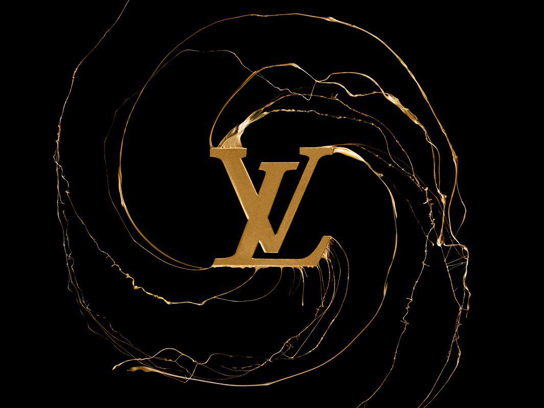
Louis Vuitton.
Manuel Mittelpunkt
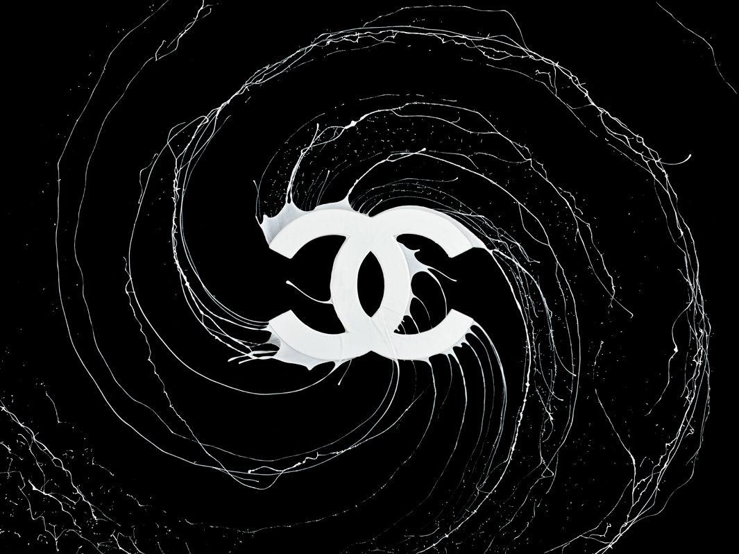
Chanel.
Manuel Mittelpunkt
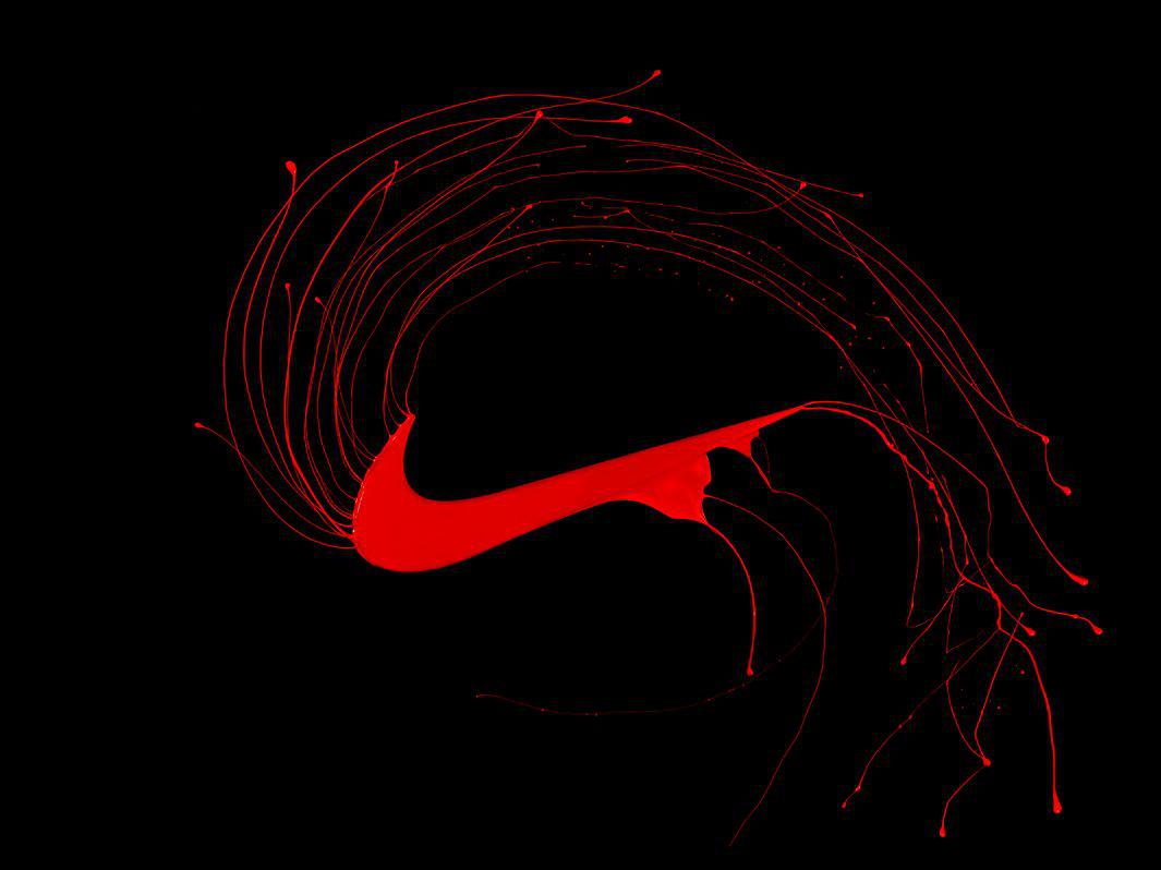
Nike.
Manuel Mittelpunkt
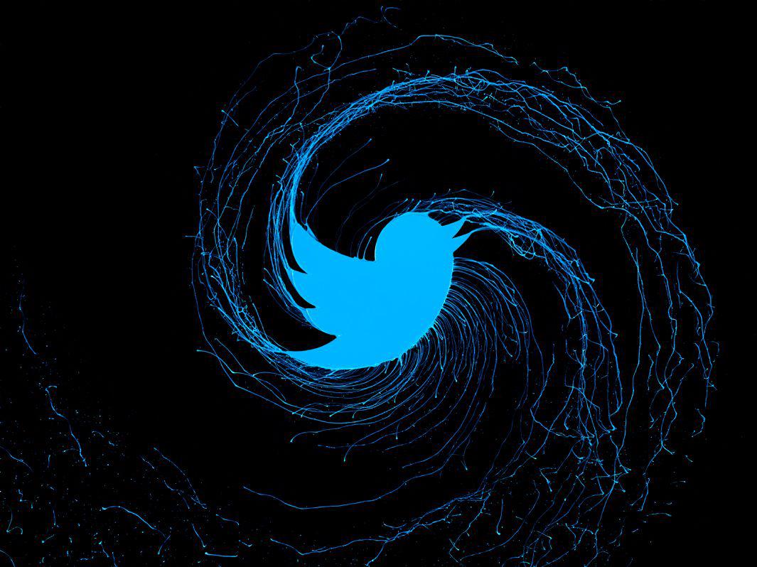
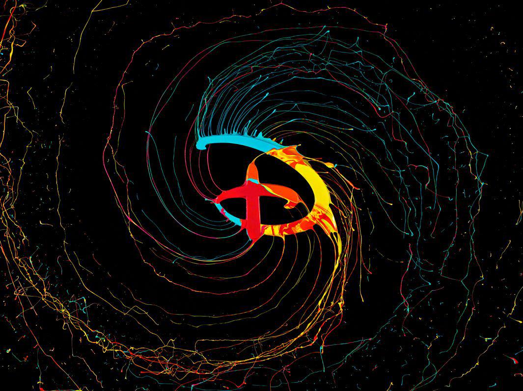
German designer Matthias Grund teamed up with photographer Manuel Mittelpunkt to create “Liquid Brands,” a series of paint-dipped corporate logos that give familiar brands a dynamic visual twist.
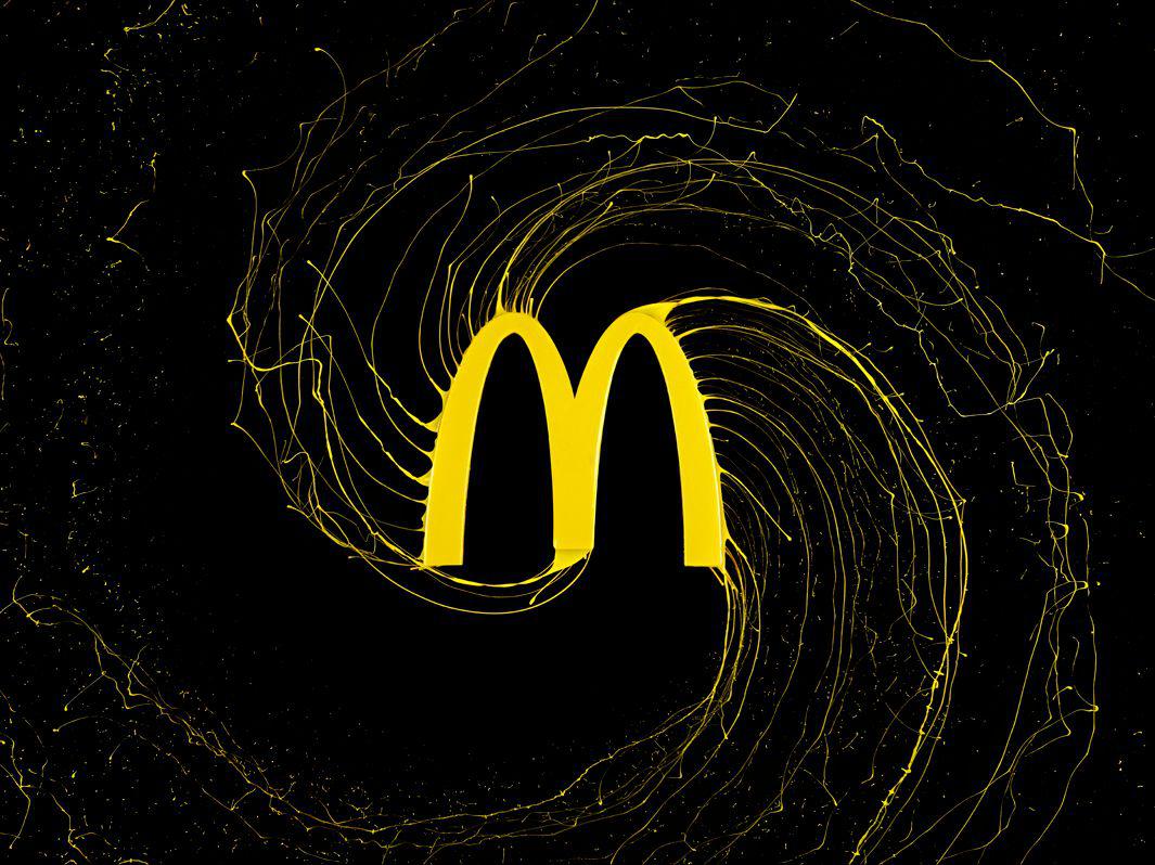
McDonald’s.
Manuel Mittelpunkt
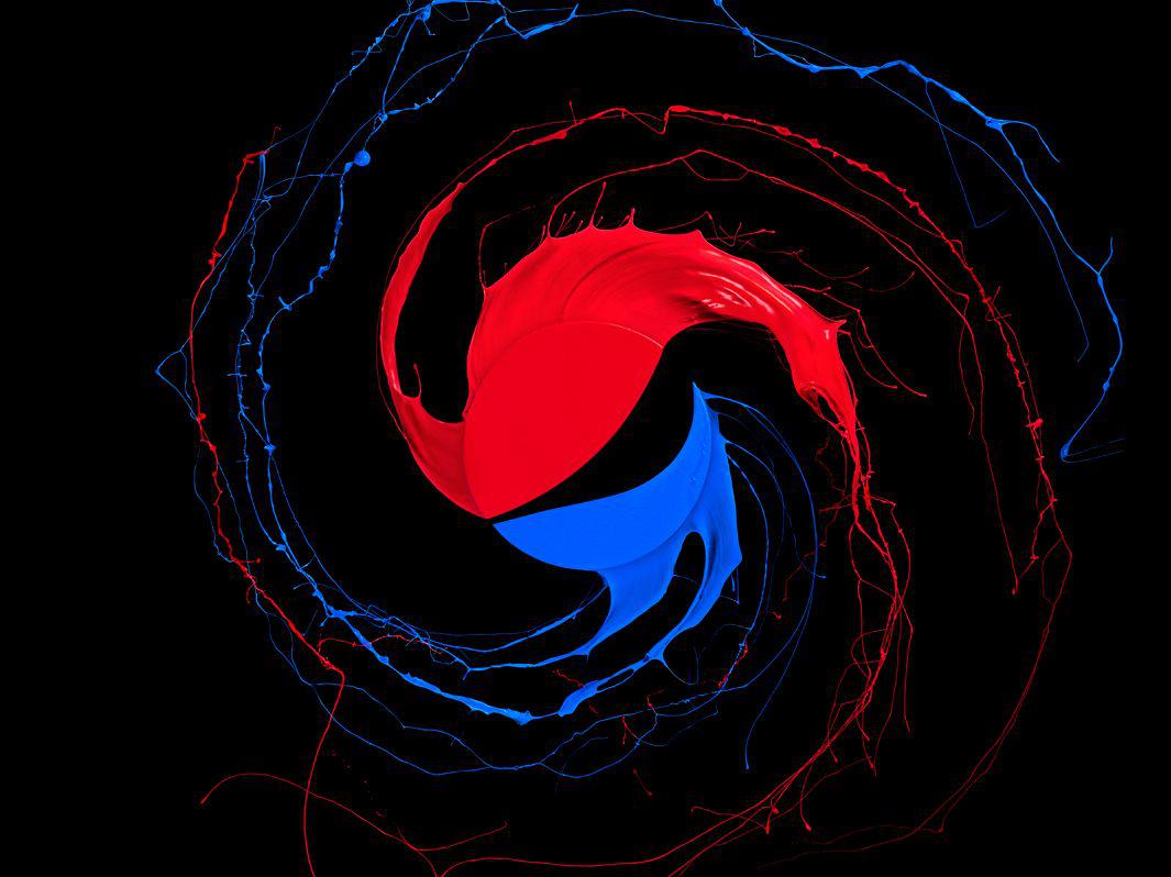
Pepsi.
Manuel Mittelpunkt
“There a lot photographers doing liquid shots, but we realized that the pictures are often totally abstract or commercialized,” Grund told me in an email. “Moreover the products and the liquids are often not used together in the shoot itself but brought together in the post production.”
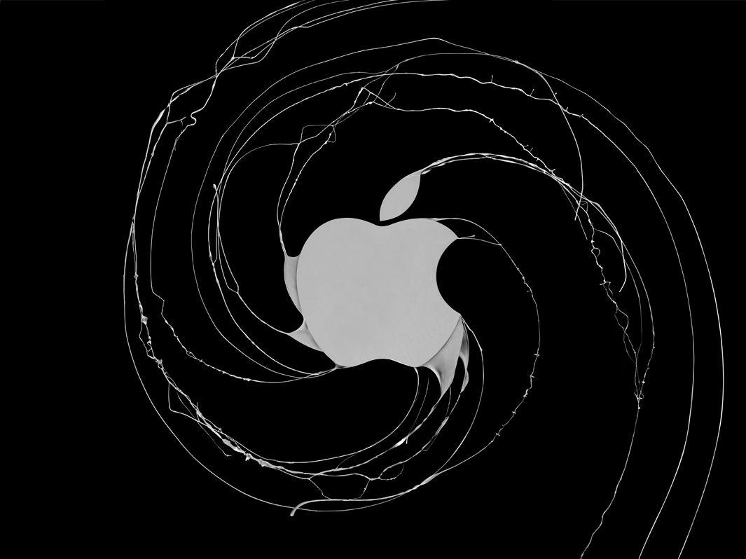
Apple.
Manuel Mittelpunkt
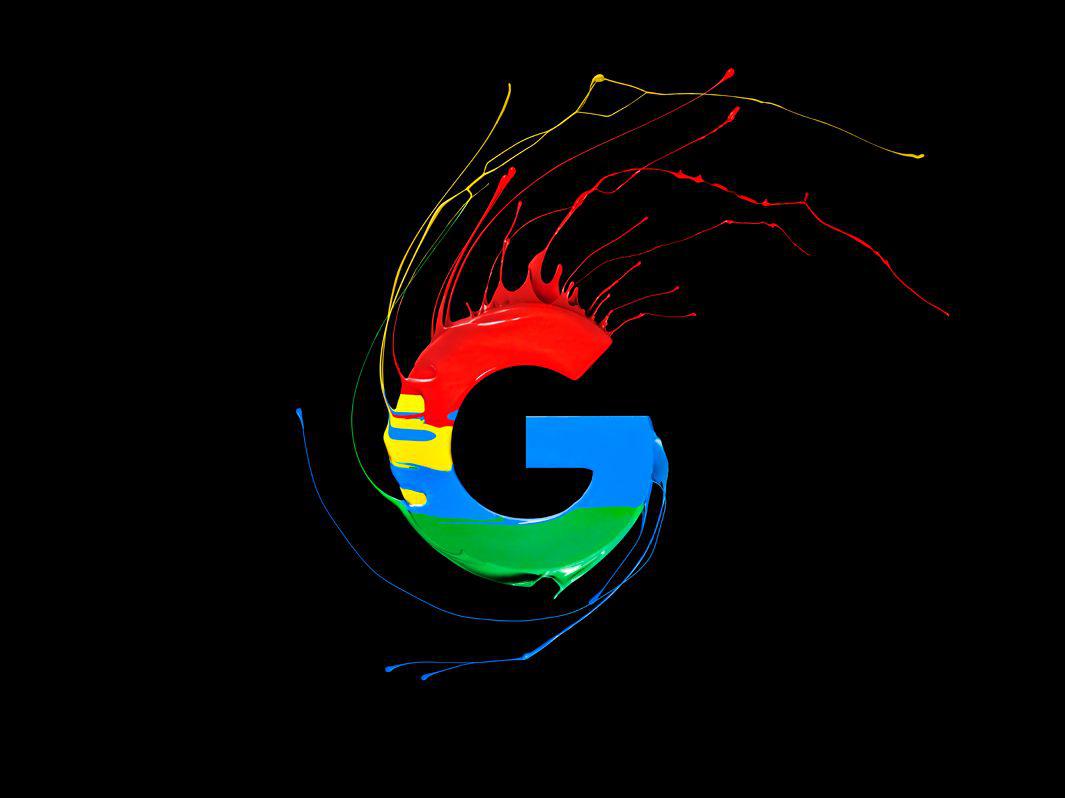
Google.
Manuel Mittelpunkt
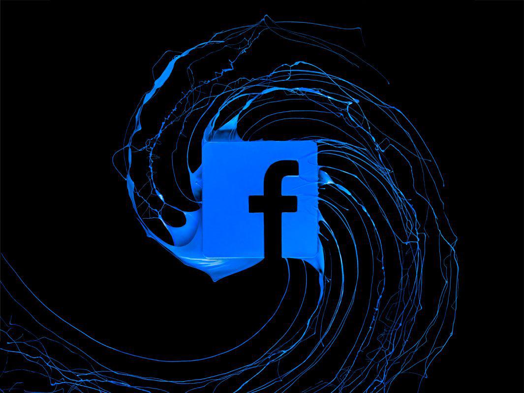
Facebook.
Manuel Mittelpunkt
To explore the visual effects of high-speed photography in combination with liquids, Grund took a more hands-on approach, heading to the workshop to create laser-cut logos made of wood that were attached to a multifunction spinning tool.
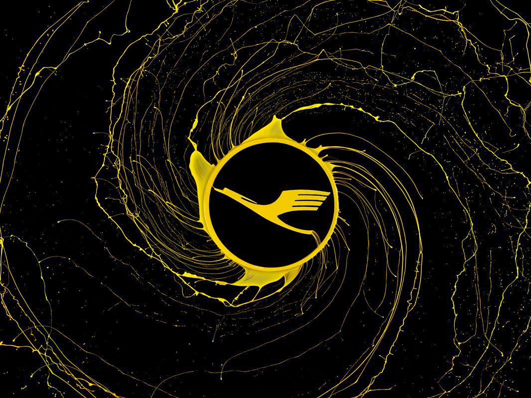
Lufthansa.
Manuel Mittelpunkt
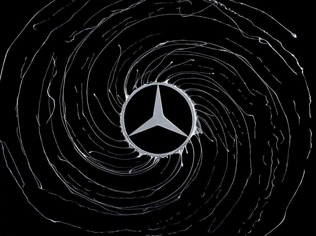
Mercedes.
Manuel Mittelpunkt
When it was time to shoot the photographs, he and Mittelpunkt trickled paint on the logos and started to rotate them, experimenting with different ratios of paint mixed with water and varying speeds on the spinning tool until they achieved the desired result.
Disney.
Manuel Mittelpunkt
“This was a very important process,” Grund said, “because you get a totally different result when you change the parameters. If the liquid is too [fluid], the splashes are too delicate. If the speed is too high, you do not get an effect at all, because the camera cannot catch the scene.”
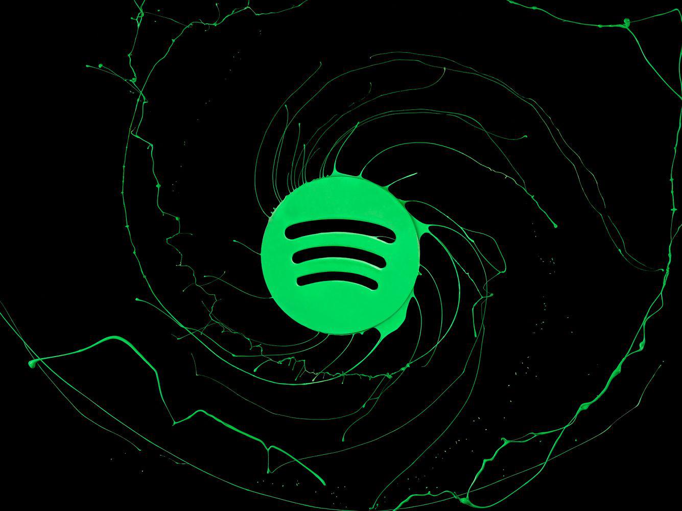
Spotify.
Manuel Mittelpunkt
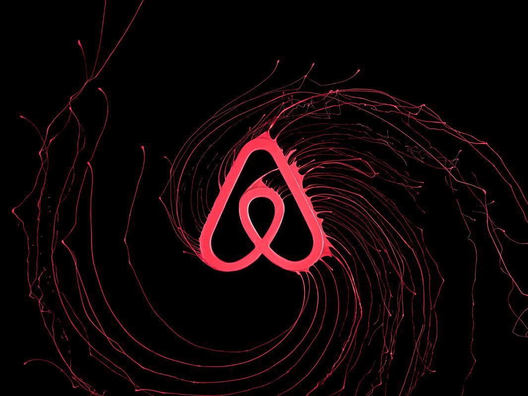
Airbnb.
Manuel Mittelpunkt

Vodafone.
Manuel Mittelpunkt
Grund said the project is a reflection of the fact that logos aren’t merely tools to convey corporate identity. “Our generation reacts very [emotionally] towards brands,” he said, “and people have strong relationships with products and brands they like.” The creative duo didn’t want “to overthink it,” he said, adding that they “just thought it would look cool and would be fun to combine these graphic elements with photography.”