Emoji might be fast becoming America’s most popular second language, but not everybody is a fan of these supposedly adorable pictograms. The prevailing design aesthetic of emojis—which were originally developed as communications devices for teenagers in the late 1990s in Japan, where they are no longer considered cool—has only become more hokey and juvenile since Western designers translated them for smartphones. While the range of icons has continued to expand, the design language suffers from a case of arrested development that can make them embarrassing for grown-ups to use.
Courtesy of Emoji Redesign Project
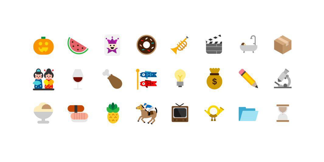
Maybe this is why you love them. But for those whose barrier to embracing the language of emoji is their corny aesthetic, Italian art director Vittorio Perotti and illustrator Giulia Zoavo have decided to offer a redesign.
Courtesy of Emoji Redesign Project
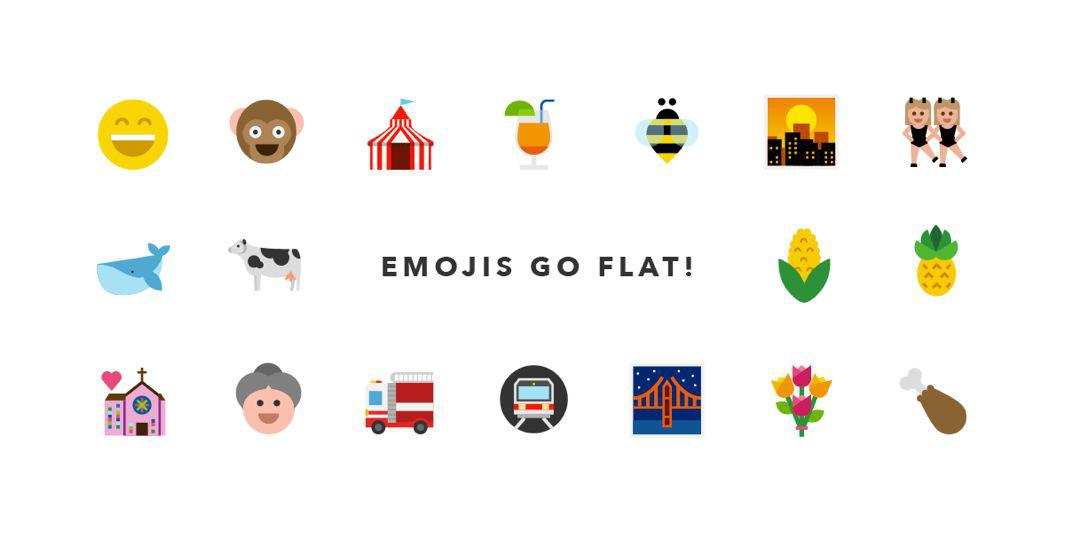
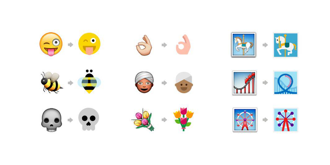
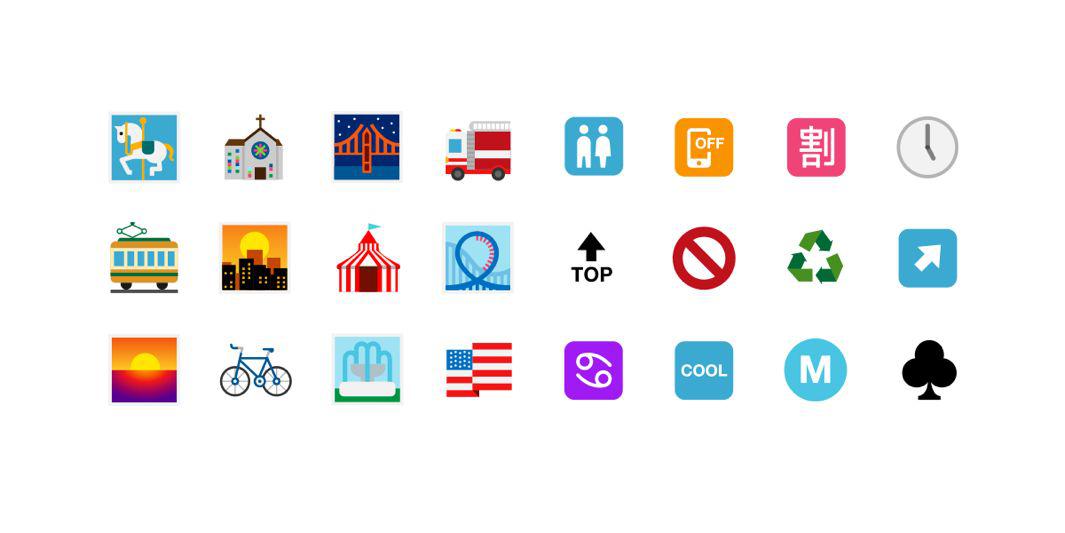
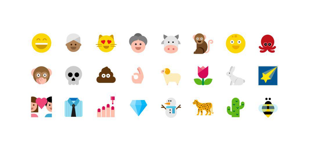
For their ongoing Emoji Redesign Project, Perotti and Zoavo have reimagined 845 emojis with a flat, streamlined design that respects original pixels and grids, and uses a limited palette of 90 colors.
Courtesy of Emoji Redesign Project
The designers write in a press release that they wanted to maintain the “meaning and soul” of emojis while giving them a “contemporary style” that is “fresh, flat and simple.”
Courtesy of Emoji Redesign Project
Their goal? “To see [these] emojis on every phone.”