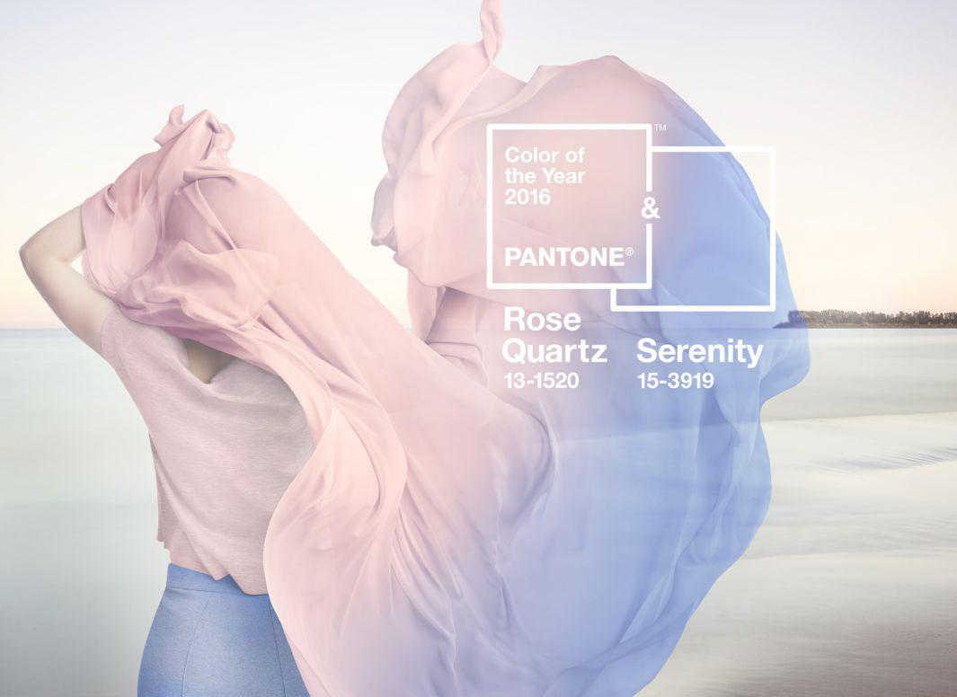
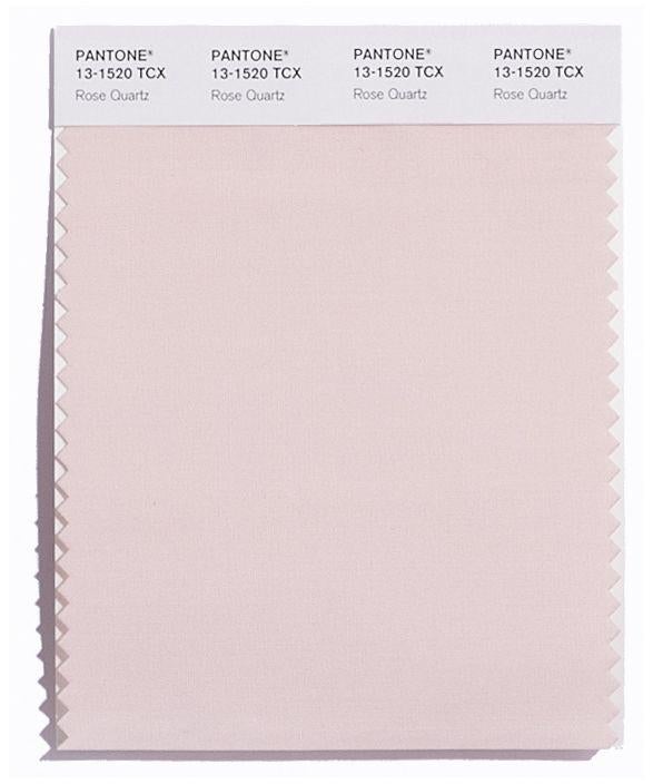
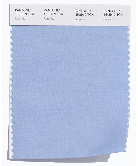
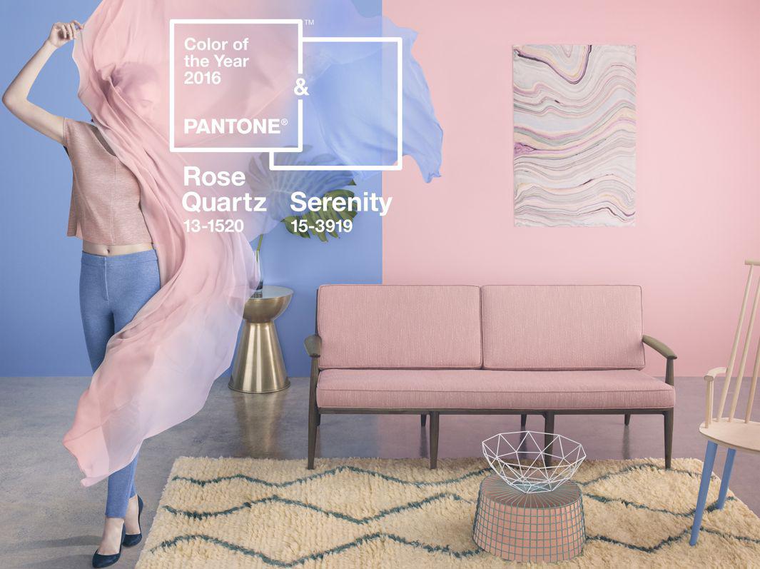
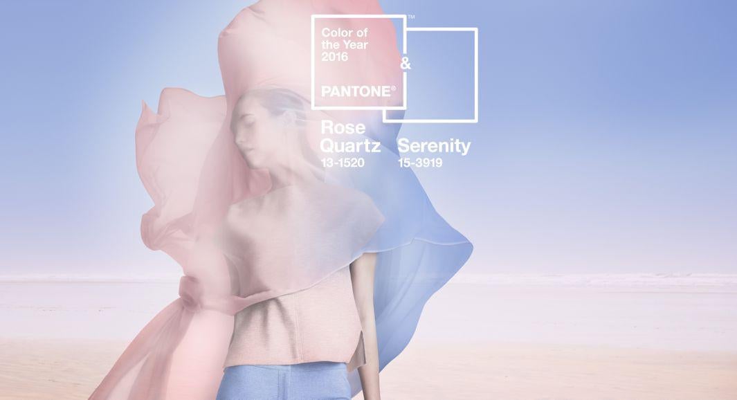
Everyone hated Marsala, Pantone’s 2015 color of the year, a dark red that critics widely slandered with comparisons to blood, rust, and meatloaf. This year, the company known as the world’s leading authority on color made an unprecedented move by nominating not one bold color but “the blending of two shades”—Rose Quartz (baby pink) and Serenity (baby blue)—as the 2016 Pantone color(s) of the year, according to a press release.
The color-of-the-year award is a fun annual marketing stunt that gets people talking about color, and the Pantone Color Institute collaborates with tastemakers in fashion, beauty, interiors, and product and graphic design to push its trend forecasts on the masses.
Pantone said in the release that “as consumers seek mindfulness and well-being as an antidote to the stress of modern day lives, welcoming colors that psychologically fulfill the yearning for reassurance and security are becoming more prominent.” Explaining its color selection, the company described Serenity as “weightless and airy, like the expanse of the blue sky above us,” adding that it “comforts with a calming effect, bringing feelings of respite and relaxation even in turbulent times.” Rose Quartz, on the other hand, “is a persuasive yet gentle tone that conveys compassion and a sense of composure.”
Courtesy of Pantone
Courtesy of Pantone
Pantone calls this year’s duo of whispery hues “a softer take on color” and “a harmonious pairing of inviting shades that embody a mindset of tranquility and inner peace.” It’s undeniable that pastels have been a prevailing runway and interior design trend in recent years. And yes, pink and blue are a go-to feel-good color combo for Mother Nature herself (think pastel sunsets or cherry blossoms against a blue sky).
But if this co-mingling of unsurprising colors feels a little contrived, maybe it’s because the choice of these subdued shades was also a rather heavy-handed political gesture from Pantone, which asserts that the combination of cool pale blue and warm soft pink “also challenges some more traditional perceptions around color association,” according to the press material.
Courtesy of Pantone
That’s right: Pantone’s mashup of the most clichéd possible visual color cues for boys and girls in a year when gender fluidity has risen to the forefront of the collective cultural consciousness is as obvious a nod to gender equality as it seems. That they chose to blend two expected colors rather than come up with an alternative (like parents who paint their nurseries yellow) unfortunately makes the discussion about what the colors mean more interesting than the colors themselves.
“In many parts of the world we are experiencing a gender blur as it relates to fashion, which has in turn impacted color trends throughout all other areas of design,” said Leatrice Eiseman, executive director of the Pantone Color Institute. “This more unilateral approach to color is coinciding with societal movements toward gender equality and fluidity, the consumers’ increased comfort with using color as a form of expression which includes a generation that has less concern about being typecast or judged, and an open exchange of digital information that has opened our eyes to different approaches to color usage.”
Courtesy of Pantone