Graphic Design Visionaries is a new book by Caroline Roberts that highlights 75 creatives whose forward-thinking, original ideas have shaped the visual world. Here at the Eye, Roberts shares an excerpt from the book about the 85-year-old British stamp designer David Gentleman, who revolutionized the face of British stamps.
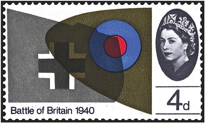
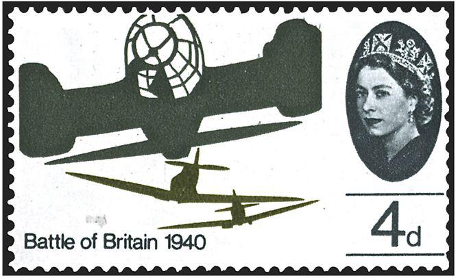
David Gentleman literally changed the face of British stamps. With more than 103 of his designs issued so far, and many more that were never used, he rightly deserves the accolade of “most prolific and acclaimed stamp designer in Britain.”
His first stamps were issued in 1962. However, it was in 1965, as part of an experimental project commissioned by then–Postmaster General Tony Benn, that Gentleman first proposed representing the Queen’s head with a simple cameo. This and other suggestions were included in what became known as the Gentleman Album, a work that outlined new themes and a new format for an exciting collection of commemorative stamps and left a lasting legacy for British stamp design.
Courtesy of David Gentleman and Transport for London
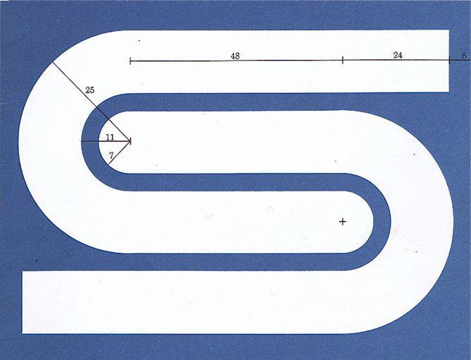
Gentleman’s prolific career is not defined entirely by his stamp designs. He has also designed numerous book covers, including the extensive New Penguin Shakespeare series; posters, including several series for the National Trust; and identities, such as his British Steel logotype, which was in use for 30 years. His 330-foot mural at Charing Cross Underground Station in London is seen by millions of commuters every year.
Courtesy of David Gentleman and British Steel Corporation
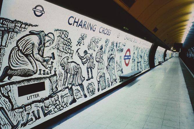
Courtesy of David Gentleman and Transport for London
Gentleman’s work has always had an unashamedly popular appeal—his self-penned reportage books, including David Gentleman’s Britain, David Gentleman’s Italy, and David Gentleman’s India, were all best-sellers and combined his love of travel with his expressive watercolor illustrations. Closer to home, his 2012 book, London, You’re Beautiful, demonstrates his ongoing fascination with the capital with a series of drawings created over the span of a year.
It is perhaps Gentleman’s fierce independence that is most impressive. He has stuck to his original intention not to teach, commute to an office, or work with anyone else. This might seem par for the course now, when all you need to be a designer is a laptop and Internet access, but in Gentleman’s early career, such a stance was very unusual.
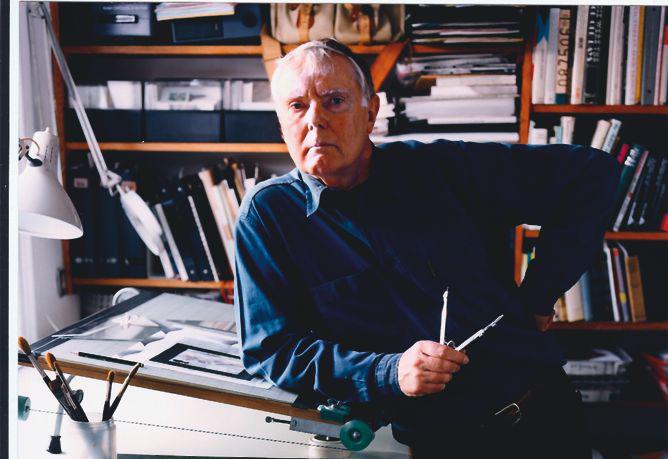
Photo by by Barry Lewis. Courtesy of Laurence King.
Gentleman has also never shied away from taking a political stand. His 1987 book A Special Relationship was a powerful comment on the U.K.’s somewhat sycophantic relationship with the U.S. under the Thatcher government, but it did not make much impact due to its book format. (Gentleman regretted not creating a series of posters instead.)
His posters and placards for the Stop the War Coalition, starting in 2003, had a much greater impact, and they played an important and very visible part in its ongoing campaign against the Iraq war. His “Bliar” poster, in particular, was a great example for a new generation of graphic designers of the power of graphic design to both express and galvanize public opinion.
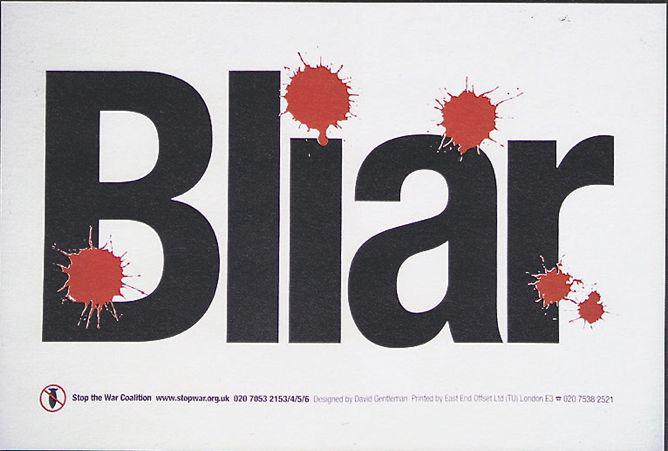
Courtesy of David Gentleman and Stop the War Coalition
Reprinted with permission from the book Graphic Design Visionaries by Caroline Roberts, published by Laurence King, copyright 2015.