Pablo Picasso called the great 20th-century Italian graphic designer Bruno Munari “the Leonardo of our time.” A creative polymath of the first order, Munari painted, sculpted, photographed, taught, and designed his way through life until his death in 1998 at the age of 90.*
Published last month, Munari’s Books by art historian Giorgio Maffei is a tantalizing primer of this spirited bookmaking genius who never stopped reinventing his preferred medium. The first English-language monograph to focus on Munari’s book designs over seven decades, the collection features 60 of the innovative, light-hearted, expressive, and compelling books he designed and sometimes wrote, some of which are still in circulation.
Courtesy of World Publishing Company, Cleveland, 1960
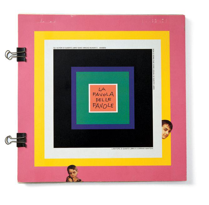
Courtesy of Graziano Peruffo, Mantua, 1960
Courtesy of Emanuele Prandi, Rome, 1942
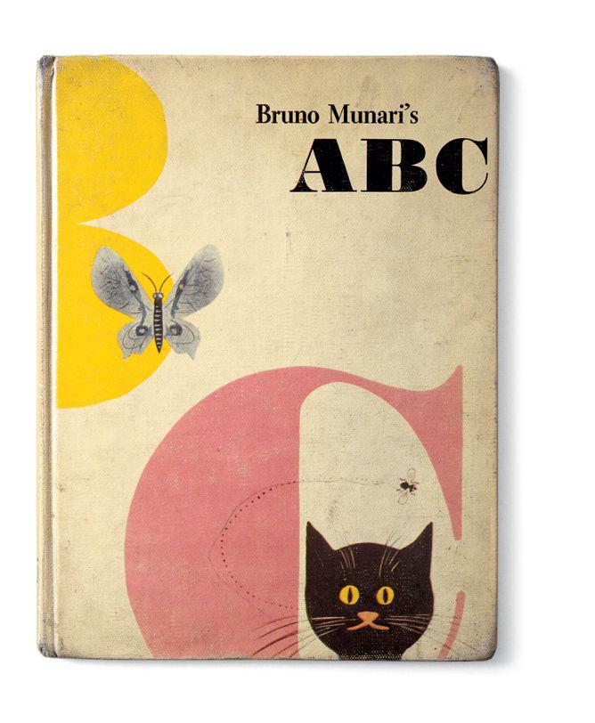
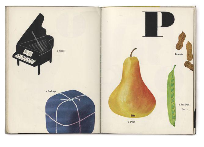
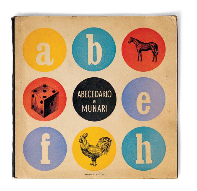
These include the simple, beautifully illustrated alphabet books for children and a photo book decoding Italian hand gestures that he called a “supplement to the Italian dictionary” meant for non-Italians and Italians alike.
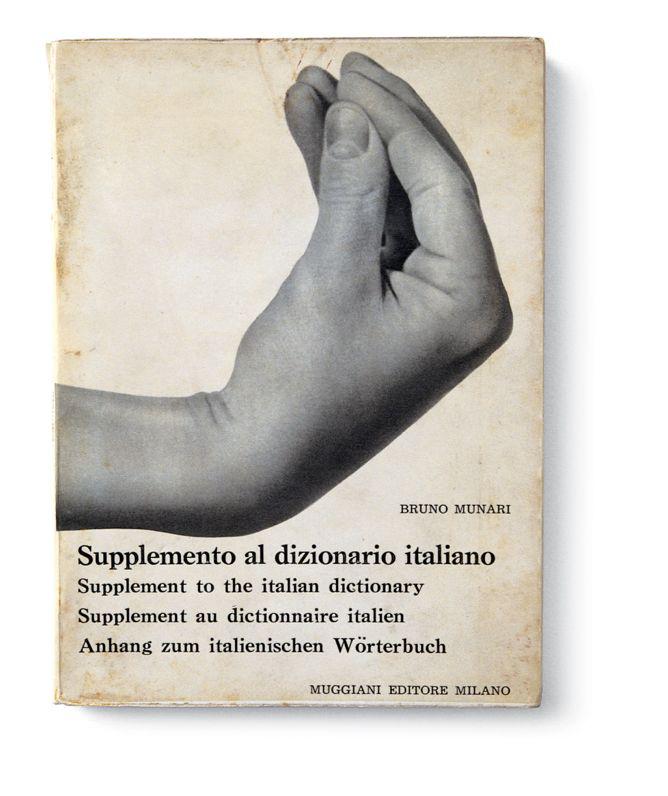
Courtesy of Muggiani editore, Milan, 1963
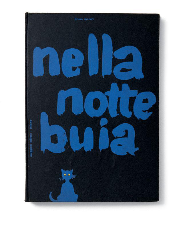
Courtesy of Muggiani editore, Milan, 1956
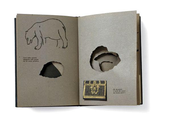
An inside spread from Nella Notte Buia featured a “cave punched into the paper and images printed in black ink,” Munari wrote in 1981, adding that it took several tries to find a publisher willing to produce the book.
Courtesy of Angelo Candiano, Turin, 1956
In 1963, Munari wrote a book called Good Design with an orange on the cover. His text critiquing nature’s design read:
Orange—The subject is a series of modulated, segmented containers, arranged in a circle around a vertical axis with their straight side leaning against the axis and the round side pointing outward to appear spherical. All these segments are packages with a well-characterized material and color: fairly hard on the outside and soft on the inside, to protect the outside and the containers. … Every container is made of plastic sheeting, which can contain the juice and still be easily moved. A very weak glue keeps all these containers together, so it can be taken apart at any time. The packaging—as is common nowadays—need not be returned to the manufacturer, but can be thrown away. … So this orange is an almost perfect object with absolute consistency between shape, functionality, and consumption. Even the color is right: blue would be a mistake.
Yet this witty man who took his time dissecting the design merits of an orange also was known for a series of boundary-pushing Libri Illeggibili (meaning illegible or unreadable books) first produced in 1950 that “completely abandoned the idea of communicating through writing in favor of pure aesthetics,” Maffei writes. He used transparent paper, splotches of color, and unusual folds; cut pages into different shapes and sizes; and pierced the paper with holes. The books were tactile, sensory experiences that required the participation and creativity of the reader, with meaning derived through the act of turning pages, from paying attention to rhythm and color and sound. “The purpose of this experimentation was to use the very material of books as a visual language,” Maffei writes of the books, “after exploring all its literary, philosophical, social … communication possibilities to the full.”

Courtesy of Angelo Candiano, Turin, 1953
*Correction, July 1, 2015: This post originally misstated Bruno Munari’s age when he died. He was 90, not 91.