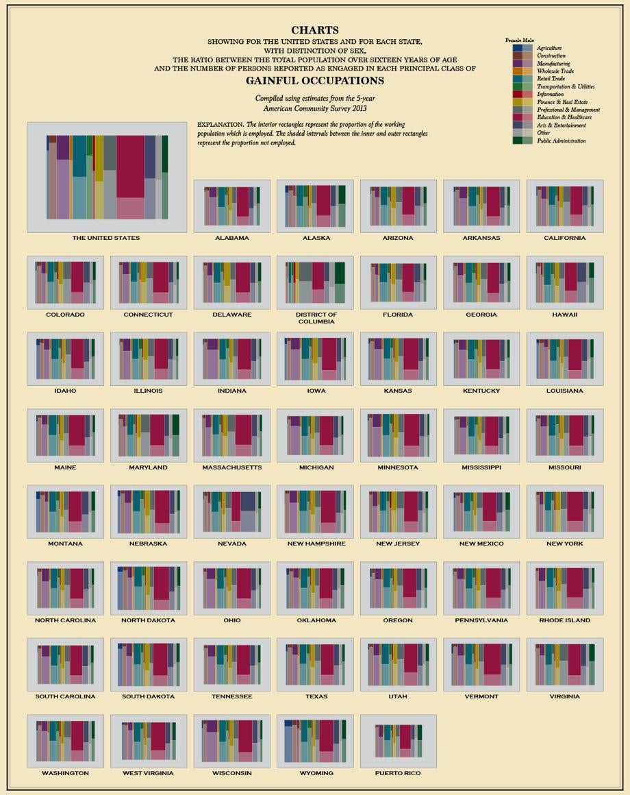
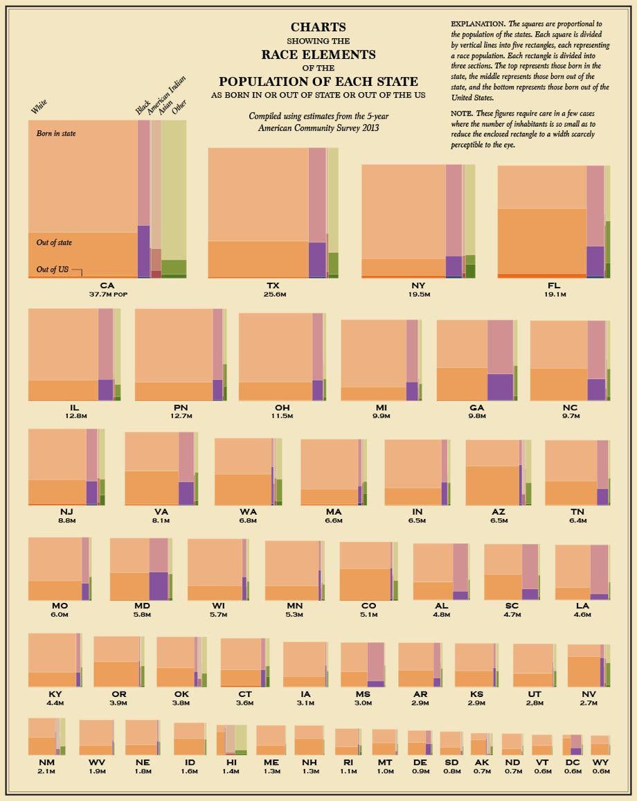
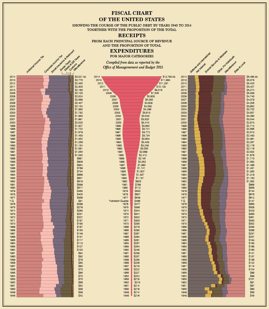
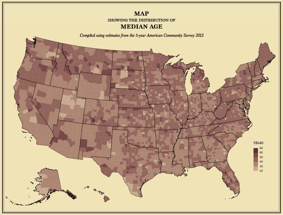
When statistician Nathan Yau of FlowingData came across the 56-page Statistical Atlas of the United States, first produced by the U.S. Census Bureau in 1874 using data from the 1870 census, he was annoyed to find that publishing of America’s stats in the beautiful maps and charts that were the precursors to modern-day infographics had ceased around 1920.
“With more data than ever, it seems like there should be one,” Yau writes on his website. “Maybe that’s why there’s isn’t one. Too much data, too much of an undertaking, and too many bureaucratic decisions to make.”
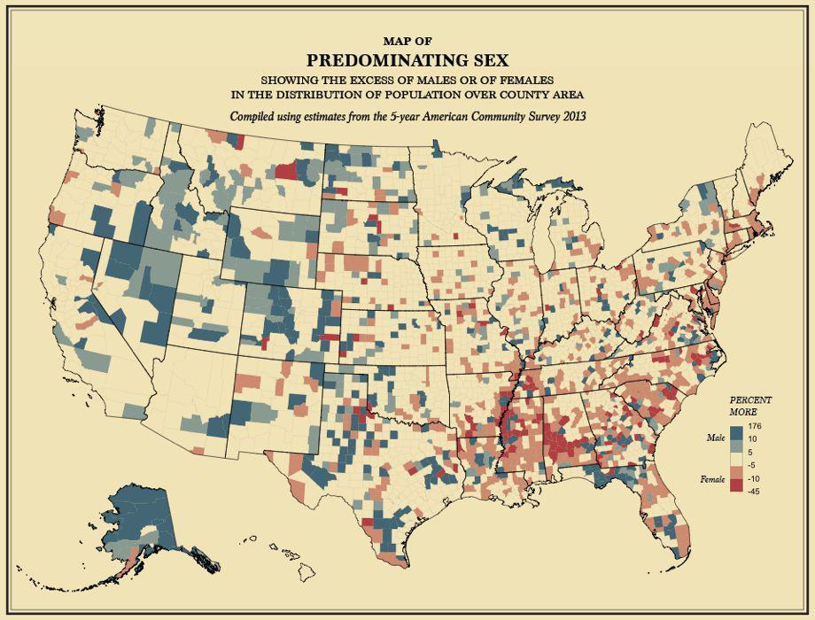
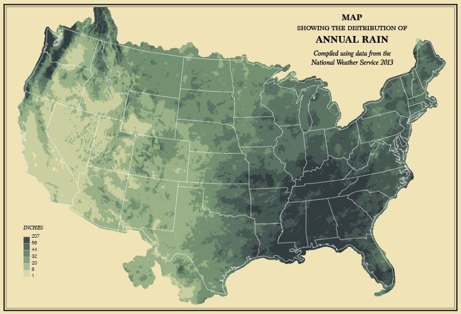
Courtesy of Nathan Yau
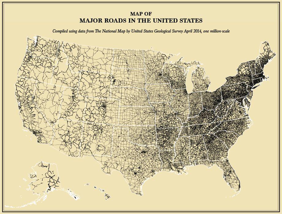
Courtesy of Nathan Yau
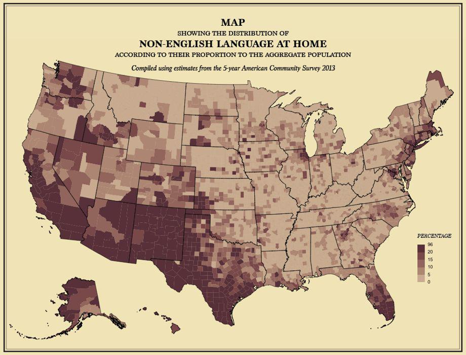
Courtesy of Nathan Yau
The Census Bureau revived the publication just once in 2007 with the Census Atlas of the United States, which it called “the first comprehensive atlas of population and housing produced by the Census Bureau since the 1920s.” It had nearly 800 maps on language, ancestry, housing patterns, and population in America, but it looked nothing like the hand-drawn first atlas, overseen by Francis Amasa Walker, the superintendent of the ninth census appointed in 1870.
Courtesy of Nathan Yau
Courtesy of Nathan Yau
Courtesy of Nathan Yau
When Yau learned that the 2010 atlas wouldn’t be produced due to budget cuts, he decided to make his own version.
“I went through each page of the 1874 edition,” Yau told me in an email. “I’d find the relevant data and then try to recreate the aesthetics of the original. But the visual form is different in a lot of places because the data is different from what Francis Walker had in 1870.”
Courtesy of Nathan Yau
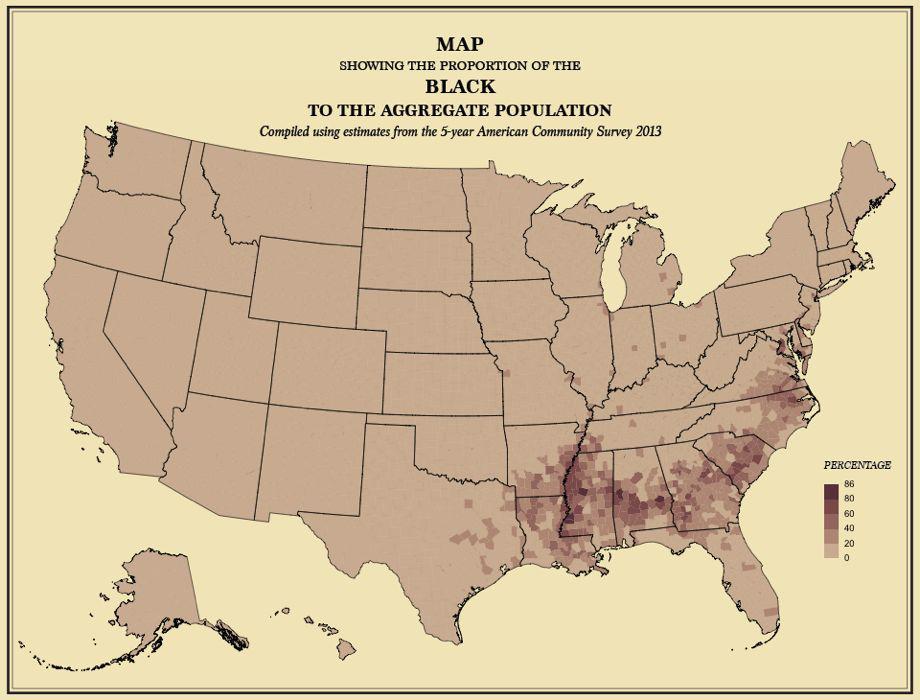
Courtesy of Nathan Yau
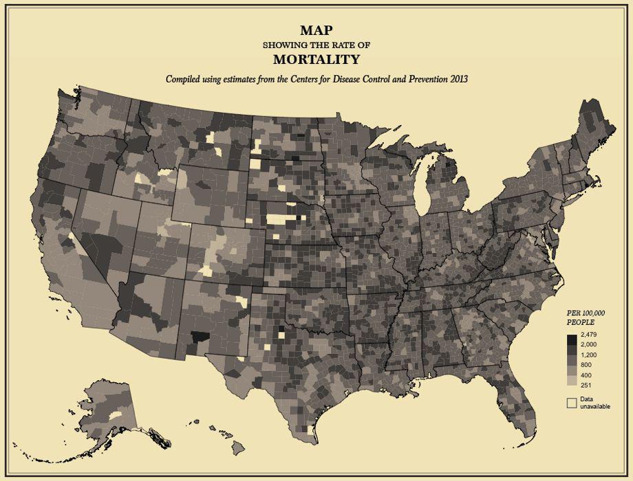
Courtesy of Nathan Yau
He built the maps and charts coding in R, a statistical computing language, doing text and layout in Illustrator. Yau said he tried to emulate the typeface of the original atlas, streamlining to make it more readable. “On some pages of the original, it feels like a hodgepodge of typefaces,” he said, “which I’m guessing [came] from the challenges of printing at the time.”
Check out all 59 maps and charts on the FlowingData website.