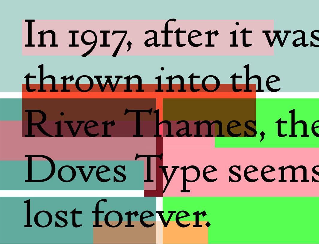
A feud between founder T.J. Cobden-Sanderson and partner Emery Walker of the Doves Press—whose masterpiece was the five-volume English Bible, printed in Doves Type circa 1905—culminated in Cobden-Sanderson stealthily hurling the last of the Doves Type letterpress blocks off London’s Hammersmith Bridge into the River Thames in 1917.
But last November designer Robert Green managed to recover 150 original metal letterpress blocks—with the help of divers from Port of London Authority—updating a digital facsimile of the typeface he had first issued in 2013 so that Doves Type could live on.
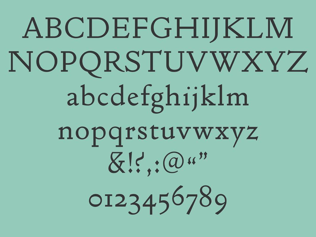
A sample of Thames Capsule, a reinterpretation of the early 20th-century Doves Type by Lausanne, Switzerland–based Faure & Verona.
Courtesy of Faure & Verona
Now Lausanne, Switzerland–based graphic designers Gaël Faure and Raphaël Verona have introduced the Thames Capsule Font Project, a contemporary reinterpretation of the storied font. Verona said in an email that the designers sought to “enhance the original Art & Craft qualities of the font, the richness of curves and the humanistic based shapes,” adding interpretive “wood-cut like details” to honor its early 20th-century character while updating the overall look.
“Our idea was to give this typeface a contemporary flavor, not a romantic one,” Verona said.
Courtesy of Faure & Verona
For more background about Doves Type and Green’s obsessive quest to rescue it from the depths of the Thames, check out this BBC News report: