
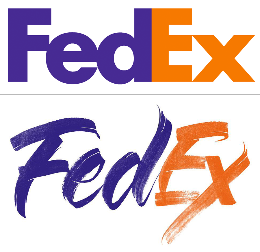
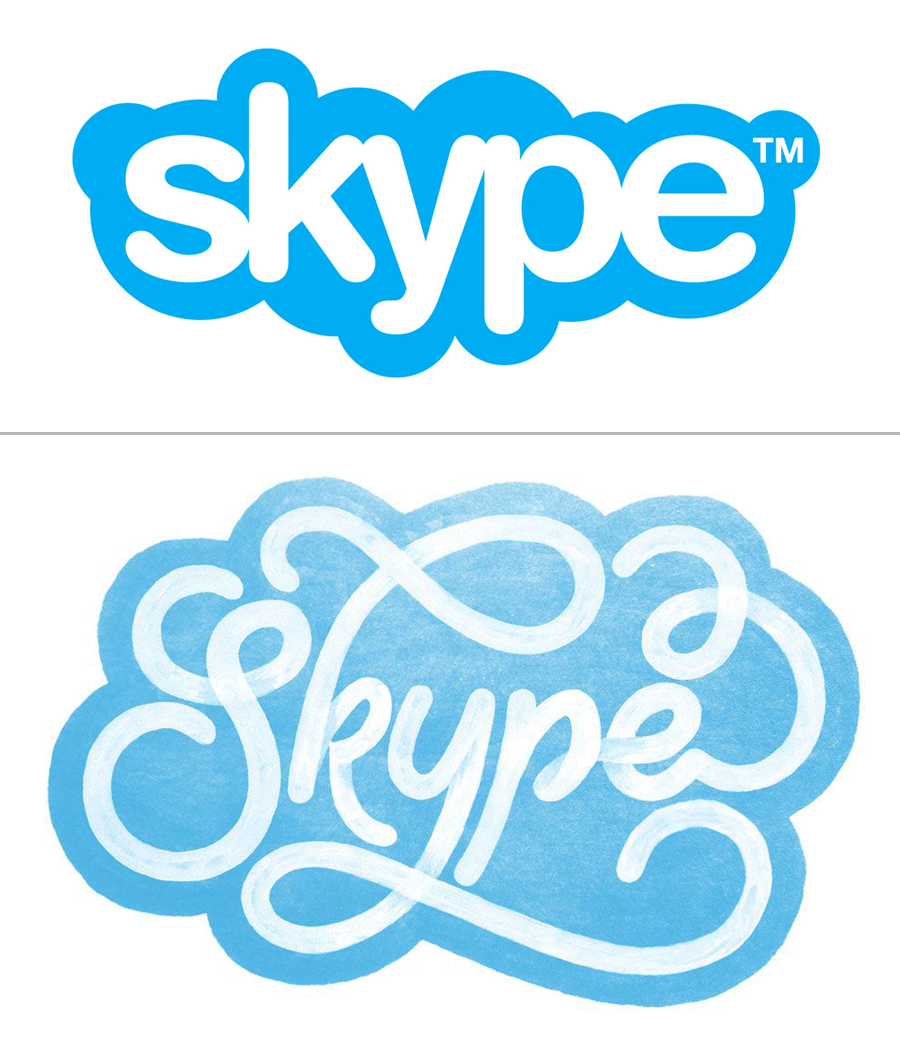
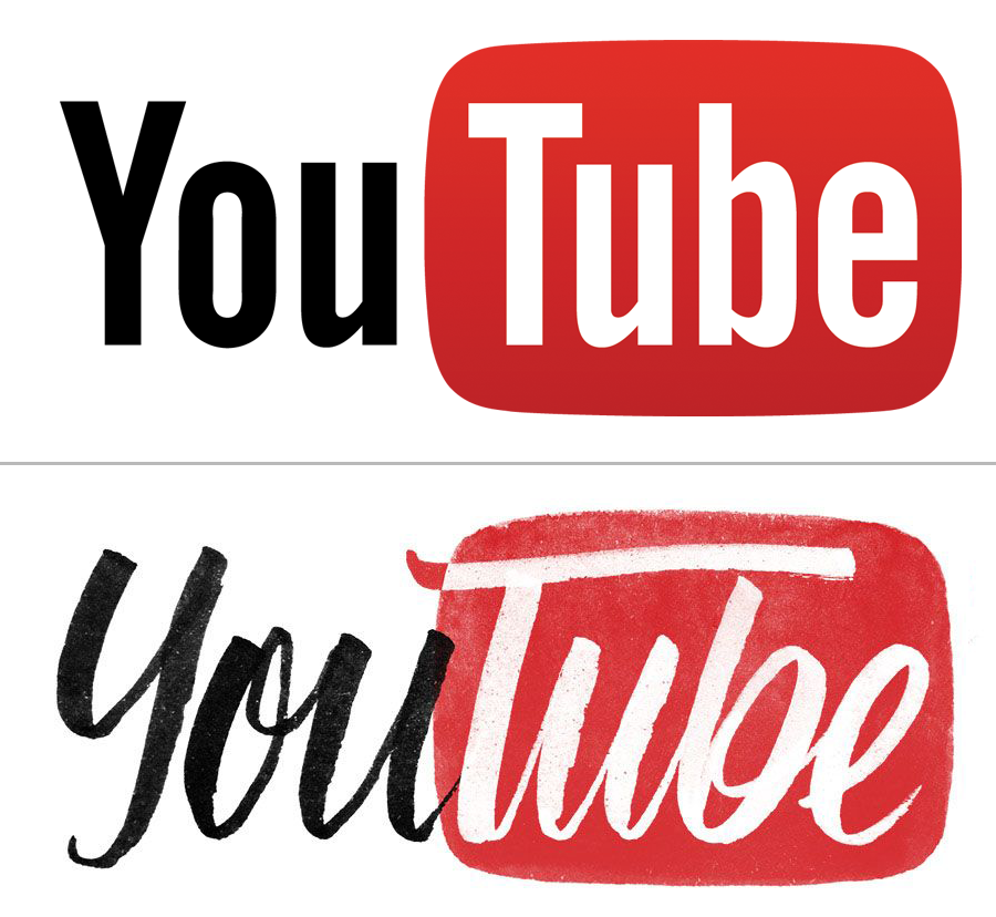
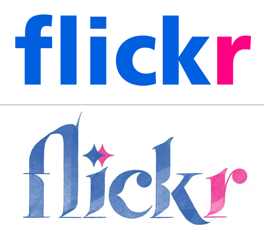
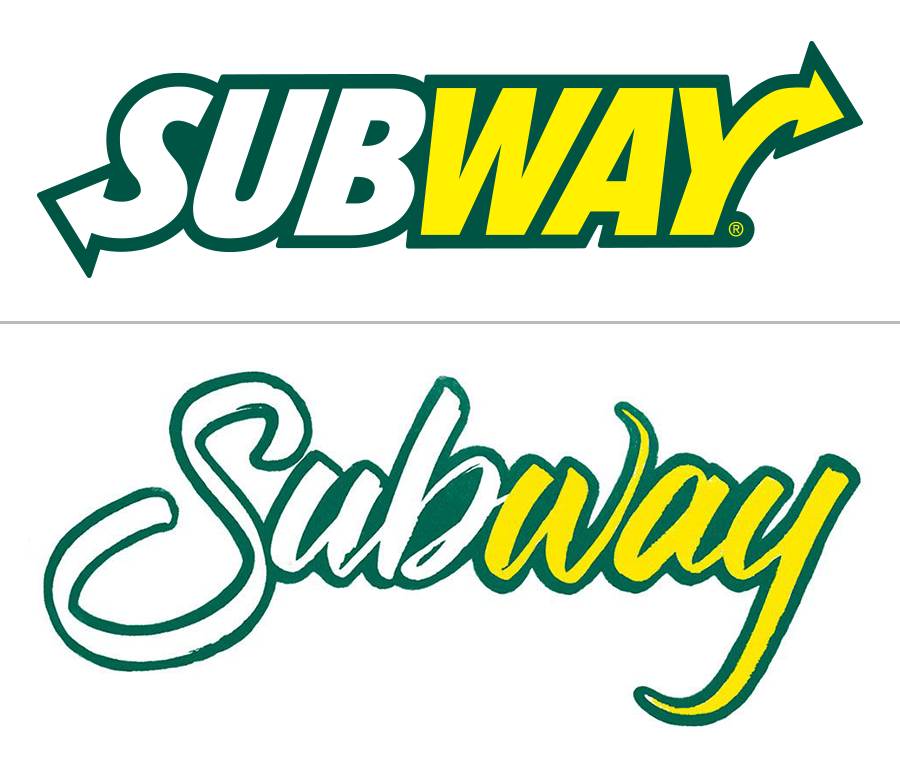
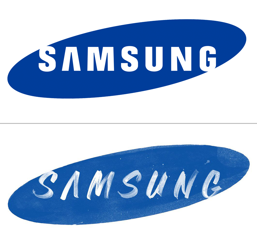
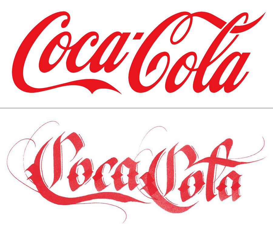
Brand by Hand from Auckland, New Zealand–based Sara Marshall is a student lettering project that reimagines the logos of faceless corporate brands using hand-lettering. Marshall has recently completed her bachelor’s in graphic design at the Auckland University of Technology and is now working as a freelance lettering artist and graphic designer.
Courtesy of Sara Marshall
“Major brands such as Apple and Google have steered corporate graphic design towards a flat, minimalist style,” Marshall writes in a project description. “Many other brands have shifted their brand identity to mirror these developments—think Starbucks or Shell.”
Courtesy of Sara Marshall
She points out that alongside the move toward minimalism, the trend of hand-lettering is booming, “characterised by imperfections, texture and embellishment,” she writes. “Brand by Hand is intended as an intersection of these two trends by introducing the personal, hand-treated and flowery nature of hand lettering into the cold corporate world.”
Courtesy of Sara Marshall
Using techniques including custom scripts, brushwork, calligraffiti, and contemporary sign-painting, Marshall reimagined familiar logos “while retaining key defining elements of their original branding. This will both investigate the essence of the brand and test the strength of their associations,” she writes.
Courtesy of Sara Marshall
While these are undeniably fun to look at, there’s a sinister undertone to the notion of making megacorporations seem more homespun with hand-lettering. If hand-lettering became a corporate style, then how would smaller independent companies, designers, and brands communicate the sense of authenticity that hand-lettering inevitably conjures up?
Courtesy of Sara Marshall
“The project was a reaction to several brand minimalism projects,” Marshall told me in an email. “I thought it’d be funny to go in the opposite direction as an experiment (so no, I don’t really consider it sinister to have rebranded large corporations).”
Courtesy of Sara Marshall
Marshall said that she doesn’t think that hand-lettering will become a corporate style and hasn’t approached or heard from any of the companies whose logos she made over, adding that the only corporate response she’s had has been “from someone I know personally who works for Coca-Cola, overseeing the design process and approving things before they go to print,” she said. “She pointed out that I didn’t include the hyphen in Coca-Cola!”
Courtesy of Sara Marshall