The designers responsible for the mesmerizing, elegantly crafted, Frank Underwood–endorsed game Monument Valley: An Illusory Adventure of Impossible Architecture and Forgiveness (which also won Apple’s design award last year) have something more prosaic on their minds these days.
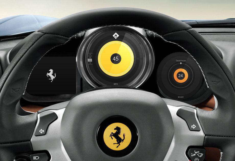
The designers at Ustwo are developing a prototype to redesign the instrument cluster—the speedometer, fuel gauge, and other indicators located on your car dashboard—which they describe as “one fundamental and ubiquitous element in cars which has lacked an effective redesign over the last few decades.”

Courtesy of Ustwo
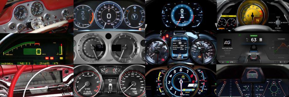
While doing research in partnership with Car Design Research, they write in a blog post, they discovered that even LCD clusters such as those found in the Mercedes S-Class are skeuomorphic recreations of mechanical dials in digital form. “There are some good reasons for this, such as consistency, familiarity, brand perception and so on but we feel this ought to be challenged,” they write.

Courtesy of Ustwo
The designers want to use technology to “make better use of the screen real estate by clearly showing the right information at the right time,” they write, helping drivers to increase situational awareness when driving near a school, in bad weather, during roadwork, and other challenging conditions. Equipping drivers with better, timelier information, they argue, would reduce distractions and prevent accidents.
“We would like to achieve all of this and still retain the positive aspects of the analogue approach: the ability to show relative information, a consistent design paradigm, and to confer a level of quality and reinforcement of the brand,” they write.

Courtesy of Ustwo

Courtesy of Ustwo
Check out the video below for a summary of the prototype and their in-depth blog post for more information about the overall concept, including a nonbranded interactive archetype of the cluster that you can test and that links to downloadable source code and design assets for car-tech geeks.
Via The Verge
