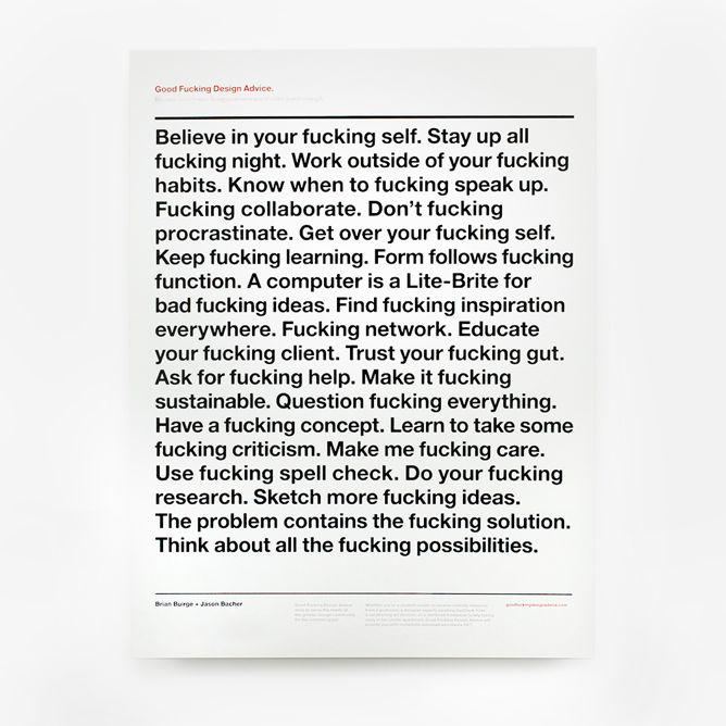
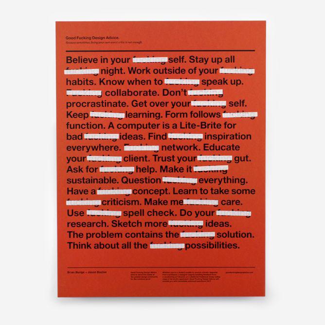
While reading the new profile of Apple design guru Jony Ive in the New Yorker, I found myself yearning for visuals when writer Ian Parker described the contents of Ive’s sketchbooks. Not to mention the décor of his office inside the Apple design studio: “Overlapping framed images leaned against the wall: a Banksy print of the Queen with the face of a chimpanzee, and a poster, well known in design circles, that begins, ‘Believe in your fucking self. Stay up all fucking night,’ and ends, many admonitions later, ‘Think about all the fucking possibilities.’ ”
So I wondered about the story behind the profane pep talk of an inspirational poster on the wall of the man who makes some of the most covetable design objects in the world.
Courtesy of GFDA
The poster is by Brian Buirge and Jason Bacher, who started Good Fucking Design Advice “on a whim” in 2010, they told me in an email.
“We were on a walk back from getting coffee one morning early in our graduate school experience at Kent State University and were joking around about creating a site where students could go for design advice,” they said. “As we got more and more caffeinated, we added in the foul-language component and found the idea hilarious like a couple of 10-year-olds. We immediately went back to the grad studio, dropped the rest of our work for the day, and got to work.”
Buirge stayed in Ohio, and Bacher is now based in Brooklyn, but they have since gone on to collaborate on posters, coffee mugs, and T-shirts. They travel around the country and beyond, giving talks and workshops at universities, startups, and chapters of the professional design organization AIGA.
Courtesy of GFDA
The GFDA website dispenses a rotating trove of advice tidbits (at 250 and counting) that the designers say they sourced from their own experiences as designers, students, teachers, and business owners. “When we sat down to design the poster, we picked our 25 favorites from that initial list,” they said. “The ordering of the first few pieces of advice and the last few were very deliberate, and the ones in the middle were admittedly ordered so we could get the best rag of type possible.”
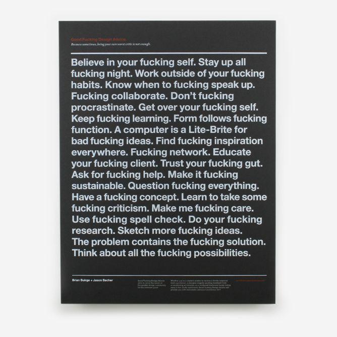
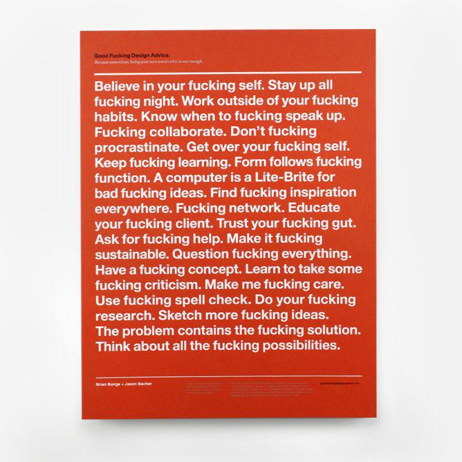
The designers said they chose a “visually neutral” approach for GFDA. “In that neutrality and minimalism, it allowed the advice, arguably the most important feature of the site, to sit as the most dominant element of the design,” they said. Knowing they were “designing for designers” led them to choose Helvetica in black, white, warm red, and silver/gray.
Courtesy of GFDA
So is their Classic Advice Print simply a gratuitously sweary version of conventional inspirational posters for creatives? Or is it actually a glowing testament to the galvanizing motivational power of the F-word?
“The site/poster/company was never in response to other inspirational posters,” they said. “The use of the F-word was certainly at first very funny to us in a tongue-in-cheek kind of way, but ultimately has grown to represent the passionate approach to being a creative that we often preach about and continue practice ourselves.”
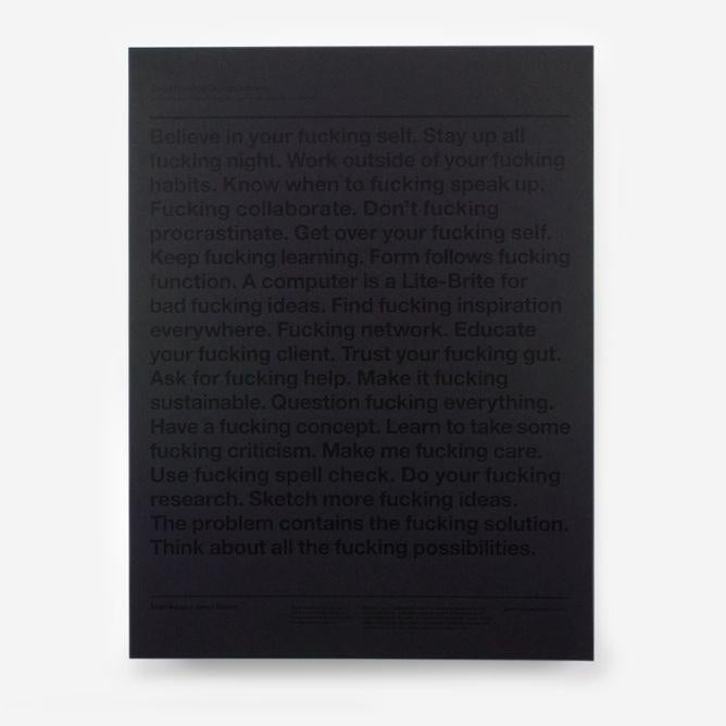
The designers have a “family friendly” button on their website offering a thinly veiled block on the offending expletive (and a similar version of the poster).
Courtesy of GFDA
“The family friendly poster (and feature on our site) was actually in response to some of the criticism we received about using the F-word,” they said. “In all honesty it was our way of snubbing our nose at the critics, because we made the poster such that you can still clearly tell what word is barely hidden from sight.”
I asked them what they thought about Ive having their poster on his Apple office wall. “Just gratitude,” they said.