The nearly 119-year-old New York Times Magazine is relaunching on Sunday with new features including a weekly poem, an updated logo, a new suite of fonts, and an abbreviated logo for use on social media.
Courtesy of the New York Times
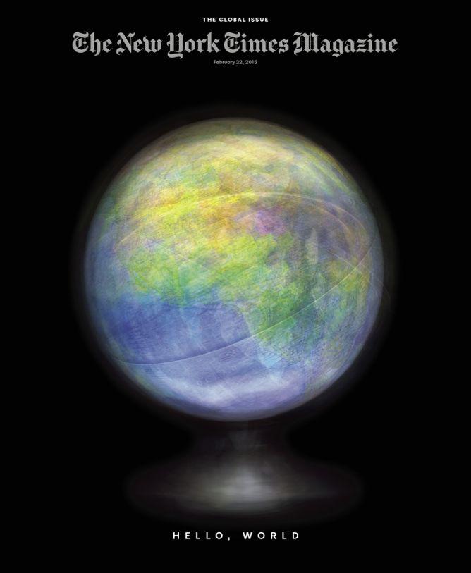
“We have used the hammer and the tongs but perhaps not the blowtorch; we sought to manufacture a magazine that would be unusual, surprising and original but not wholly unfamiliar,” Jake Silverstein writes an editor’s letter about the redesign, which launches Sunday with “The Global Issue.”
A press release issued Thursday about the magazine’s new look, which was last redesigned in 2011, describes its “bold, clean layout” designed by former GQ art director Anton Ioukhnovets. It says that the new magazine logo and fonts will help distinguish magazine content from regular daily coverage online. New responsive designs optimized for desktops and tablets include full-bleed images and a more interactive design.
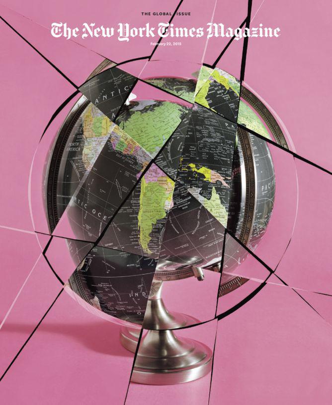
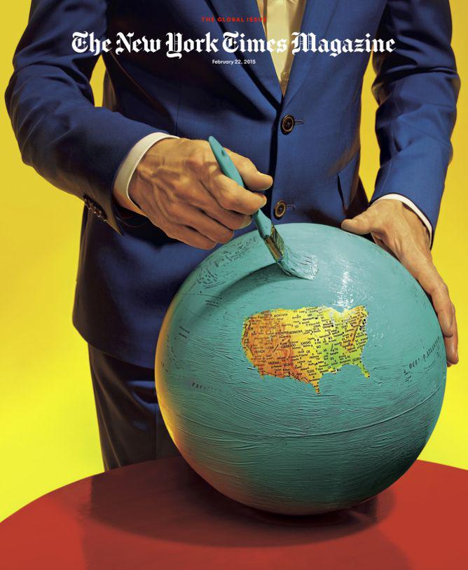
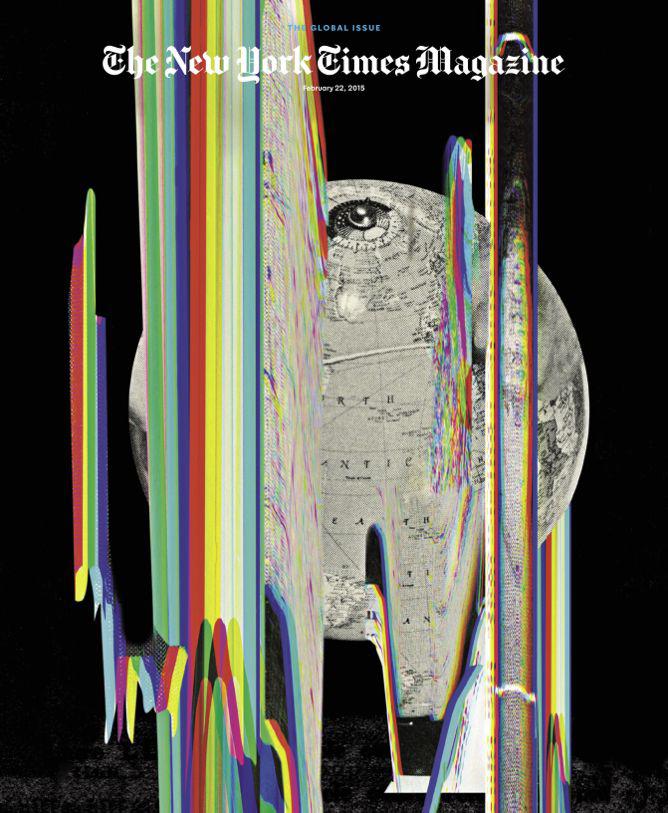
A sneak peek of some elements of the redesign, led by magazine design director Gail Bichler and art director Matt Willey, revealed a series of four covers, the first of which (top) struck me as a 2015 version of a Whole Earth Catalog cover. (The other three covers will appear in the magazine.)
Courtesy of the New York Times
Courtesy of the New York Times
Courtesy of the New York Times
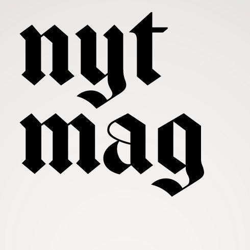
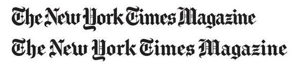
Bichler commissioned type designer Matthew Carter to subtly redraw the magazine’s familiar logo, which Silverstein calls “more modern, more graciously spaced.”
Courtesy of the New York Times
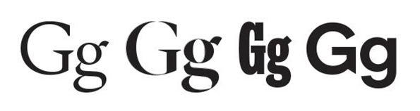
According to Silverstein, Bichler and Willey also oversaw the creation of a new series of typefaces designed by Henrik Kubel of A2-Type.
Courtesy of the New York Times
Perhaps anticipating the inevitable backlash from some of the magazine’s 4 million monthly readers, who tend to notice and take changes in typeface personally, Silverstein writes: “Not a single letter in this relaunch issue has ever seen the light of day. They are infants; treat them gently.” (Silverstein told Fast Company that they still haven’t named the newborn fonts.)