The recently published Earthquakes, Mudslides, Fires, and Riots: California and Graphic Design, 1936-1986, edited and designed by Louise Sandhaus, is a spirited, subjective, willfully undefinitive book that highlights some 250 examples of groundbreaking, offbeat 20th-century design from the Golden State.
In the book’s introduction, Sandhaus writes that California’s graphic design hasn’t received much attention, despite a body of work that “confirms all the stereotypes and expectations of a freewheeling West Coast culture where anything goes and everyone does her or his own thing.”

Courtesy of Metropolis Books
So what makes design Californian?
Sandhaus theorizes that California’s fluidity and sense of humor drives its design. “California has no terra firma—earthquakes, mudslides, fires, and the occasional civil uprising cause incessant upheaval and change,” she writes. Home to entertainment and technology industries and often defined by its consumerism, California “is a place of boundless reinvention and innovation … a place of great creativity, freedom, and social consciousness, where the status quo undergoes constant renovation. Without solid ground, tradition lacks secure footing; old rules go out the door and new motivations rush in, resulting in new and vibrant forms.”
Courtesy of Metropolis Books
Sandhaus, an award-winning designer and a professor at the California Institute of the Arts, is careful to point out that she is not a design scholar and that her book is not a comprehensive survey of California’s design history. It’s less a definitive guide, she says, than “a dinner party that serves only desserts. … The sugary offerings within these pages range from the obvious to the obscure. This is a heavily curated selection based on little more than the way the heart quickens when the eye encounters something radiant, wonderful, and new.”
Courtesy of Metropolis Books
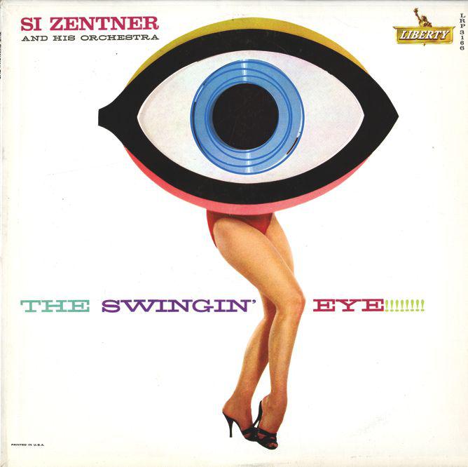
The vibrantly designed book explores the transformation of European traditions in California; the culture of screen graphics, from film titles to video games; the influential women who shaped 20th-century design in California; and 1960s California graphic design.
Courtesy of Metropolis Books
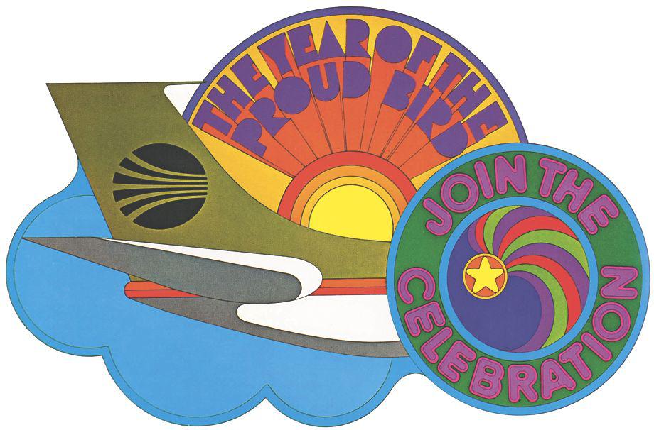
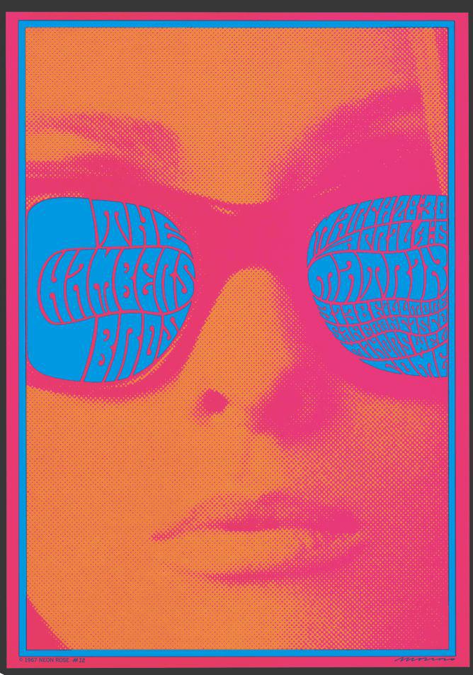
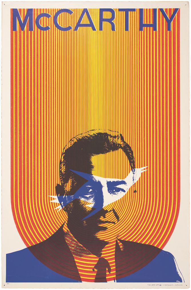
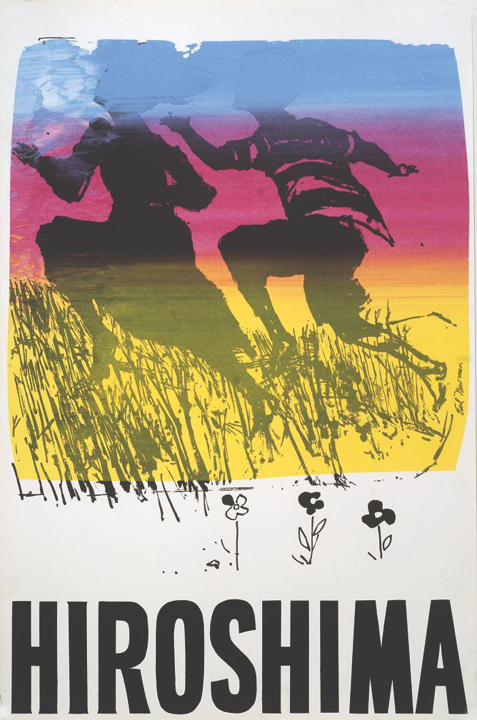
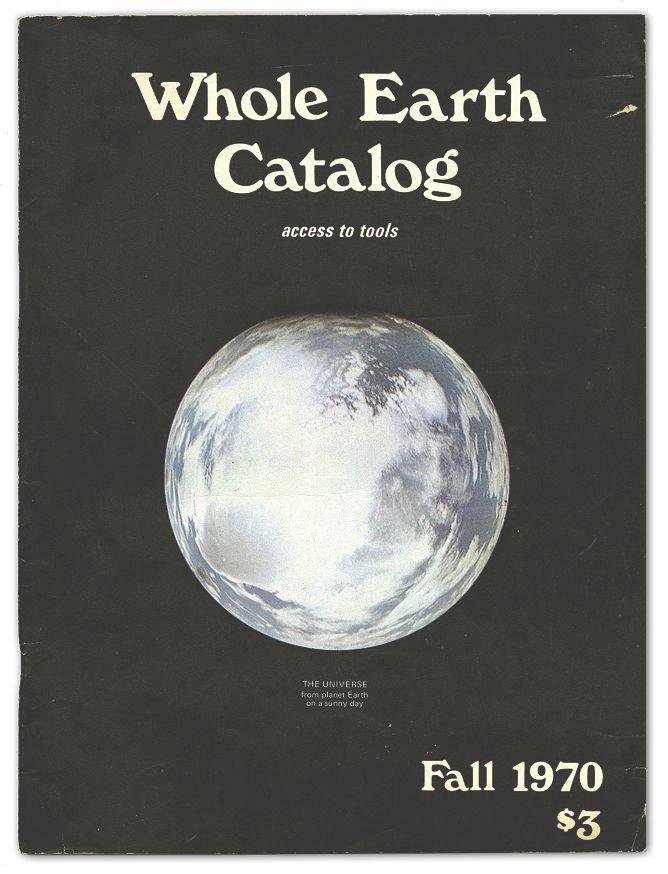
“In the popular imagination, California graphic design of the sixties tends to conjure visions of posters, and posters of a very specific kind: those with Art Nouveau–inspired lettering and undulating colors that would come alive when viewed under the influence of marijuana, acid, or ’shrooms,” Sandhaus writes.
Courtesy of Metropolis Books
But she points out that those familiar images are only part of the story.
“Variety would be the defining word for sixties California graphics,” she writes. The graphics were characterized by a range of colors, flavors, and voices, including Beats, hippies, and political activists. “If there was a common theme, be it conscious, subconscious, or unconscious, it lies someplace within the desire and commitment to remake the look of the world.”
Courtesy of Metropolis Books