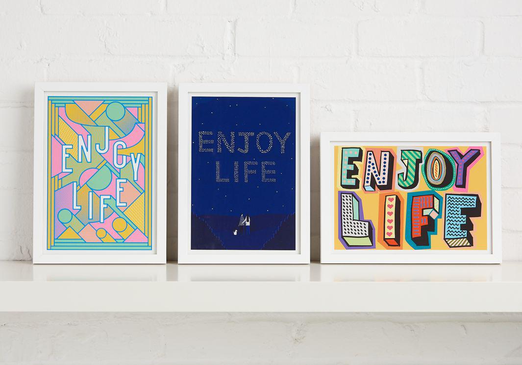
A life insurance policy document easily gets lost in the shuffle and is unearthed only once the policyholder is no longer around. To encourage customers to give the paper copies of their policies pride of place, British life insurance company Beagle Street worked with Intercity to commission professional illustrators to design a set of limited-edition covers to hang on walls. The colorful policy covers were given out to 600 new customers until the end of last month.
Courtesy of Rupert Meats/Rude
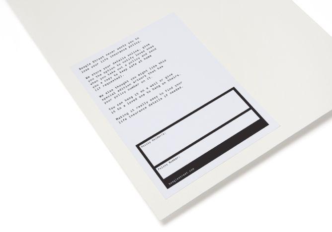
Beagle Street came up with the idea as part of its “never lost guarantee” service, according to a press release, inspired by research indicating that the average British adult will misplace more than 66,000 items in a lifetime, and more than one-quarter of people said they had “no idea” where their important paperwork was. (The research indicated that life insurance policies were among the “most commonly lost” paperwork.)
Courtesy of Beagle Street
“There are millions of pounds worth of unclaimed payouts in the U.K. and we want to make sure our customers and their loved ones never miss out on money owed to them,” Beagle Street managing director Matthew Gledhill said in a press release. “By turning our policies into works of art to hang on a wall, we’re making it really easy for people to find their life insurance policy if needed.”
Prints were designed by London-based illustrators Rose Blake, who has done work for clients including The New Yorker and Google; Rob Lowe, aka Supermundane, whose clients include Apple and the New York Times; and husband-and-wife team Abi Williams and Rupert Meats of Rude, which is known for its line of designer T-shirts.
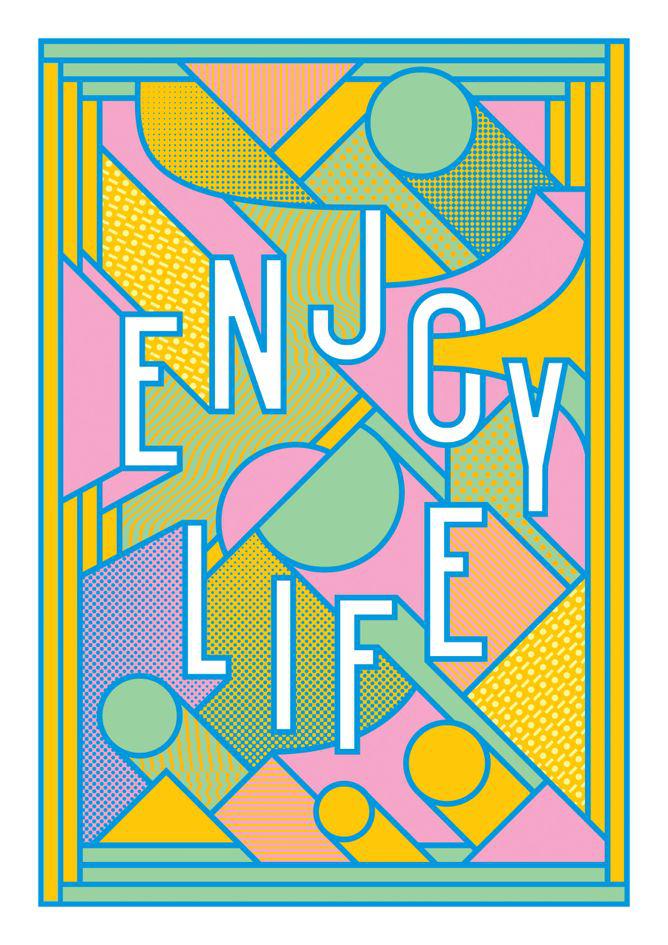
The designers each put their own whimsical stamps on Beagle Street’s upbeat tagline “Enjoy Life.” The covers were part of the company’s campaign to guarantee that policies won’t get lost, which also includes online storage.
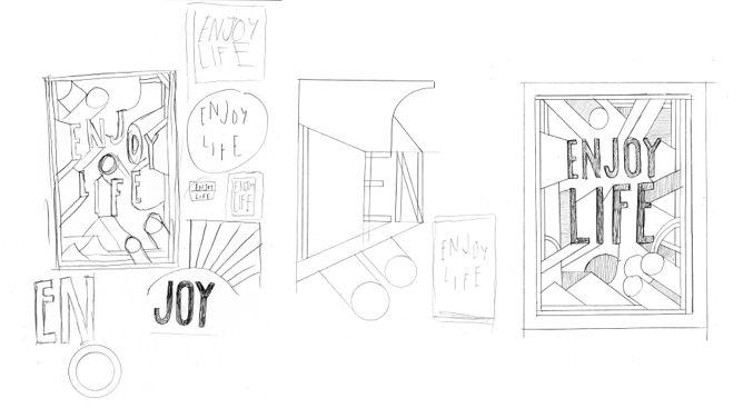
“I wanted it to be really joyous, full of movement and color and something that people would put on their walls,” Lowe told me in an email.
Courtesy of Rob Lowe/Supermundane
Courtesy of Rob Lowe/Supermundane
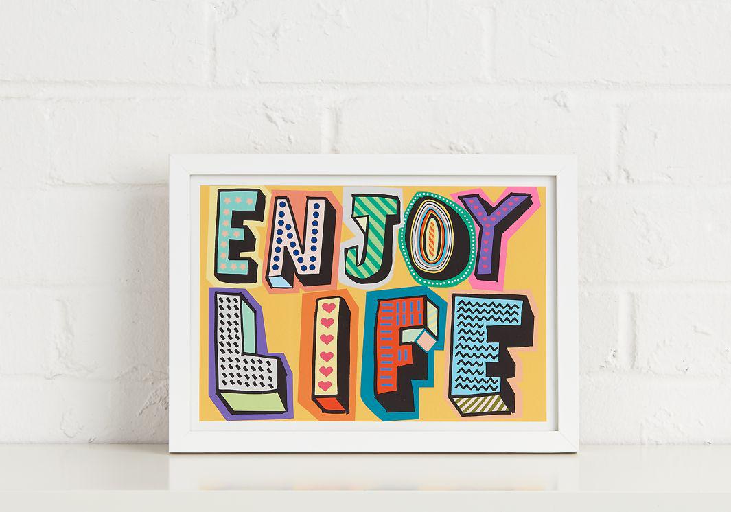
Meats wrote in an email that he and his wife split up projects depending on the style, but he chose to tackle the life insurance covers due to his love of colorful, hand-drawn type. “The phrase came from the client, but it is similar to phrase that we use for our screen prints,” he said. “We love saying[s] like ‘All About the Good Times’ and ‘It’s All Ace.’ ”
Did the somewhat macabre assignment of designing life insurance policy covers have any effect on his design choices? “We always use bold colors, but I love the idea of having a bright print hiding life insurance documents,” he said. “The message is ‘Got to make the most of it.’ ”
Via Design Week