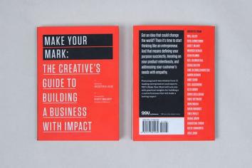
Make Your Mark: The Creative’s Guide to Building a Business With Impact from the folks at 99U bills itself as a business book for makers. In the following excerpt, Facebook’s Julie Zhuo makes a brief case for why in a time when innovation is often about experience rather than looks, the best design just might be invisible.
The word design has traditionally been used to describe the happy marriage of function and form. A chair can be comfortable and beautiful. An invitation can be clear and convey the personality of the event. Every object that serves a functional purpose can be made to not just work but be pleasurable to use and behold, representing the deep craftsmanship that we humans are capable of. But in this day and age, thinking of product design as form—as something purely visual—feels limiting.
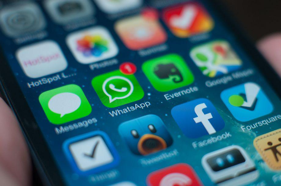
We are no longer constrained by what physical objects can afford, so the tasks made possible by the computers, phones, and gadgets in our lives are becoming increasingly complex. I can tell my husband the name of the restaurant we’re going to tonight while driving on the other side of town and not interrupt him if he’s in a meeting. I can find a French black-and-white coming-of-age movie to watch instantly in the comforts of my living room. I can go to dinner with 12 people and split the bill between us in a way that doesn’t involve a messy transfer of bills or forcing the restaurant to swipe 12 separate credit cards. In these examples, what something looks like becomes a smaller and smaller part of what makes the entire experience feel great. More often than not, the questions I ask myself when encountering a new innovation are: 1) Does this make my life better? and 2) Is it easy to use?

Courtesy of 99U
Many of the new services or products I appreciate the most tend to have little in the way of new visuals. In fact, they tend to achieve better ease of use by shifting toward invisible design—cutting out entire steps, ditching whole surface areas, or relying on existing patterns instead of inventing new ones. The result is experiences that feel seamless and intuitive, almost magical.
Consider the Internet directories and portals from the early 1990s—Yahoo, Lycos, AOL, and the like. When Yahoo first began in 1994, it was called “Jerry’s guide to the World Wide Web.” Even when the name changed to Yahoo, the original acronym stood for “Yet Another Hierarchical Officious Oracle.” In the infancy of the Web, when the number of websites was manageable, it made sense to group them into hierarchical buckets that you could dive into and explore further: arts and humanities, reference, science, government. Back then, the most successful businesses were the ones that did the best job of collecting and organizing the content across the Internet.
As the number of websites doubled, quadrupled, and grew exponentially, however, the question arose of how to go about improving these directories in the face of such massive scale. If you were solely focused on what was visible, you might be inclined to revamp the navigation of these directories—maybe add drop-down menus under each top-level category to help the user better narrow her focus while browsing. Or you might launch a series of new portal sites, each with well-curated content around a particular theme, to highlight for users the top destinations across the Internet.
But we all know how this story unfolds. A faster horse has nothing against the speed and comfort of a car, and so it was for improving directories. Ultimately, a single rectangular text field backed by a sophisticated algorithm proved to be a much better design than scores and scores of beautiful portal pages. The era of browsing was over; the era of search had begun.

Courtesy of 99U
A more recent example is the growing popularity of services like Dropbox and Box for syncing files across devices or with a group of people. Though there existed many options prior—uploading files via FTP, emailing them to yourself, using a version control system, transferring files through external drives, uploading and downloading via file-sharing sites designed to combat this very problem—Dropbox made syncing instantly understandable and seamless to use by adopting the same pattern that many people were already used to when dealing with their digital documents—that of native folders within the operating system. There were no new interfaces to learn, no new screens to get through. The familiarity of working within an existing, well-understood metaphor proved far easier to use than any new app could have been, no matter how simple or beautiful.
How, then, should we consider invisible design as we are building and evolving our own products? It boils down to three simple principles:
1. Don’t limit the shape of the solution too early. It’s common for people to approach building new products with technological constraints or preconceived notions of what the end solution should look like. Doing this hampers true innovation. Saying, “We need an app that … ” automatically assumes that the best solution is an app, when maybe it isn’t. Instead, as Tesla co-founder Elon Musk advises, work from “first principles.” Ask yourself what would need to happen for the problem to be resolved if you were free from all constraints. From there, work your way back into more practical solutions.
2. Reduce the number of steps required. Cut out as many stipulations, actions, unnecessary choices, and extraneous options as you can. An action menu with 20 items is harder to use than an action menu with two, because reading, processing, and deciding among 20 options requires your brain to take many more cognitive steps. Similarly, receiving a poorly packaged product in the mail will require you to get up, find a pair of scissors, do the work of dismantling the packaging, and get rid of annoying packing peanuts or Styrofoam, all of which involve more steps than getting a package with an easy-rip mechanism and no extraneous pieces to dispose of.
3. Look for opportunities to lean on familiar patterns or mental models. For instance, if you’re designing a gesture system for an app, conforming to the laws of the physical world makes it easier to understand. If flicking upward expands an object, flicking downward should dismiss it, and ideally all similar objects in the app should behave this way. Likewise, if you are designing an editing interface, don’t make the user flip between an “edit” mode with a bunch of input boxes and a “published” mode for display. As in the real world, editing should feel as close to direct manipulation as possible so users don’t have to perform a translation of these different models in their heads.
Design is expanding beyond what our eyes can see and beyond what our fingers can touch on a flat screen. The future of design is less and less about discrete objects and more and more about continuous experiences. In the same way that a successful restaurant isn’t just about the food but also about the décor, the layout, the service, the drinks, the crowd, and more, all blended together to create something memorable, a successful product is not just what it looks like or even what it can do, but what kind of experience it enables. One day soon, using our voices to get things done will be easier than tapping through a screen. One day soon, smart systems will optimize for us having a flawless experience without needing to pull us into every single minor decision.
For all the pieces of our experience that we do see, may they be beautiful to behold and a testament to craft at the highest level. But for all the things we don’t see—may they simply work, as if by magic.
