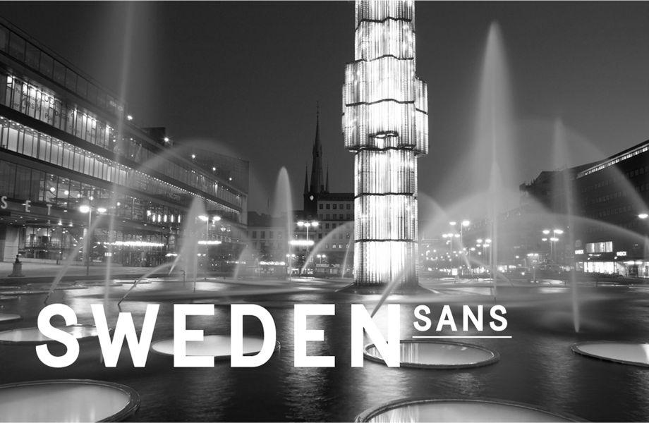
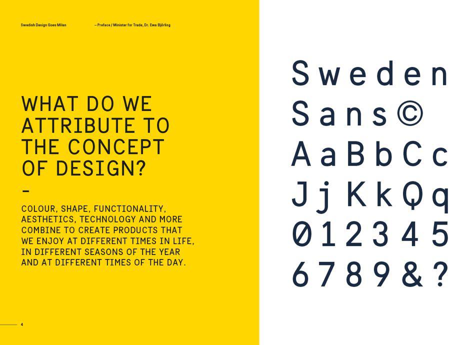
The news that the Swedish government commissioned a national font had my Slate colleagues talking last week. The font, Sweden Sans, was designed by Swedish agency Soderhavet in collaboration with Swedish font expert Stefan Hattenbach as part of a new branding effort.
“One purpose of the new brand identity for Sweden was to replace the many fragmented organizational identities of Swedish ministries, agencies and corporations with one integrated visual brand identity system, to unambiguously represent Sweden in the world,” Soderhavet’s Erik Lidsheim told me in an email, noting that the font is only used for the country’s international communications.* “In that sense [it’s] more or less doing the same job as any corporate brand identity.”
So Sweden has a national font to broadcast its identity to the world. Should the U.S.?
“This is so fun! We should have a national font,” said one Slate-ster. What would it look like? Should it be serious or ironic? “To me the jokier American flags and eagles and guns route is the way to go with this. Also it should allow no font size below 24,” said another.
I think the idea of a national font is creepy. And as a post on Matter points out, nationalism and fonts have dark historical echoes, such as Blackletter, “the thick, Gothic lettering that appeared in 12th century Europe and ended up synonymous with the Third Reich.”
Courtesy of Soderhavet
To get some perspective, I asked professional typeface designers for their thoughts about whether countries should have their own typefaces.
“This is a difficult question,” New York City–based Christian Schwartz told me in an email. “It depends on the country—a place with a strong visual identity like Switzerland is easier to sum up in one typeface than a sprawling and pluralistic society like the U.S., with our regional patchwork of visual cultures.”
New York City–based type designer and Eye contributor Tobias Frere-Jones (whose Gotham typeface is favored by Obama) told me in an email: “I’ve always been a little suspicious of anything ‘nationalistic,’ whether it’s politics or typography or anything else. It carries the implication that there is exactly one way to express the identity of a nation. I think an ‘American’ typeface would have an even harder time justifying itself—the whole idea behind [a] united group of states is that there isn’t a single (excluding) identity. It might be more plausible to have a series of typefaces based on the culture and history of its regions, and pile them together in a ‘family.’ ”
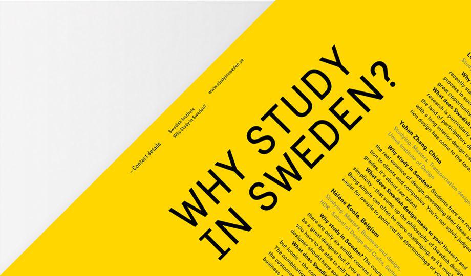
“Politically, I don’t see how the whole U.S. could ever agree on one typeface,” Schwartz says. “Some subset of states will inevitably feel unrepresented by the typeface and will opt out. Aside from this, where would it be used? We don’t have a central website for all government information, like gov.uk, or a general-purpose site for visitors like sweden.se. We don’t put as much effort into tourism advertising as countries like Brazil or Turkey. What would the context be for an American typeface?”
Courtesy of Soderhavet
Minneapolis-based typeface designer Jeremy Mickel also said that getting the U.S. to agree on a national typeface, let alone rolling one out in a successful way, would likely be difficult. He imagined a hypothetical U.S. typeface would take inspiration from historical U.S. sources, such as architecture, revolutionary documents (though he notes many of those used English fonts like Caslon), or other aspects of American design.
“Tobias Frere-Jones’ Gotham fits the bill quite nicely, having taken inspiration from mid-century American architectural lettering,” Mickel said in an email to me. “In many ways it is the USA typeface, having been used in both Obama presidential campaigns, adopted by the USPS in the most recent packaging, and appearing in the logos for countless Hollywood movies.”
Mickel called Sweden Sans “a successful typeface,” adding that it would “likely encourage other countries to attempt similar branding initiatives.” He pointed out that other cities or states have attempted to create official typefaces, “but without an aesthetic rooted in history, it can be hard for a new design to not feel like a novelty.”
He said that it makes sense for companies and organizations to have strict corporate style guides, which typically include fonts. Countries, he notes, are essentially gigantic organizations, with flags, colors, and symbols acting as their brand assets. “Where it becomes difficult is that an over-branded nation can start to feel like a totalitarian state. It’s often been said that the Nazi party was the most successful identity program of the 20th century. While a national font for Sweden is charming and design-centric, a state-mandated font in a hostile regime becomes a more menacing proposition,” Mickel said.
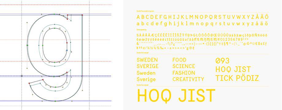
Courtesy of Soderhavet
Soderhavet’s Lidsheim said that the monospaced Swedish Sans “was designed both from practical and emotional perspectives. We wanted a distinct typeface that can stand alone, but which also works well with a broad range of other typefaces, in digital as well as analog channels. We decided to go with the feeling of old signs, of mono, of a classic sans serif with a Scandinavian heritage.”
A U.S. typeface, he said, would follow the same logic: “What works well from a practical view in your context, combined with aesthetics symbolizing how you would like to be perceived as a country. But we would certainly recommend one thing, and that is to design your own specific typeface for the purpose rather than using any of the existing ones. In that way you are in full ownership, plus you don’t need to pay any licenses or royalties when you use it.”
Correction, Oct. 28, 2014: Due to an editing error, this post originally stated that Sweden Sans is also used outside Sweden. It is only used outside Sweden for the country’s international communications. (Return.)