Infographics are a staple of modern media. At their best, they’re elegant, streamlined visual capsules of information that help us process complex data at a glance. In Infographic Designers’ Sketchbooks by Steven Heller and Rick Landers, out in October, more than 50 leading graphic designers and illustrators from around the world share their creative processes behind the art and science of data visualization.
Using graphic shorthand to convey complex information has been used in magazines and newspapers since the 19th century, Heller writes, but today “a greater number of platforms and media outlets means it is incumbent on designers, who a decade ago would never have thought of themselves as ‘information architects,’ to become makers of some form of information visualization.”
The book reveals various designers’ methods for developing and fleshing out ideas, from sketching drawings and doodles to digital mock-ups. “Making enticingly accurate infographics requires more than a computer drafting program or cut-and-paste template,” Heller writes. “The art of information display is every bit as artful as any other type of design or illustration, with the notable exception that it must tell a factual or linear story, rather than an expressive tale or polemical message.”
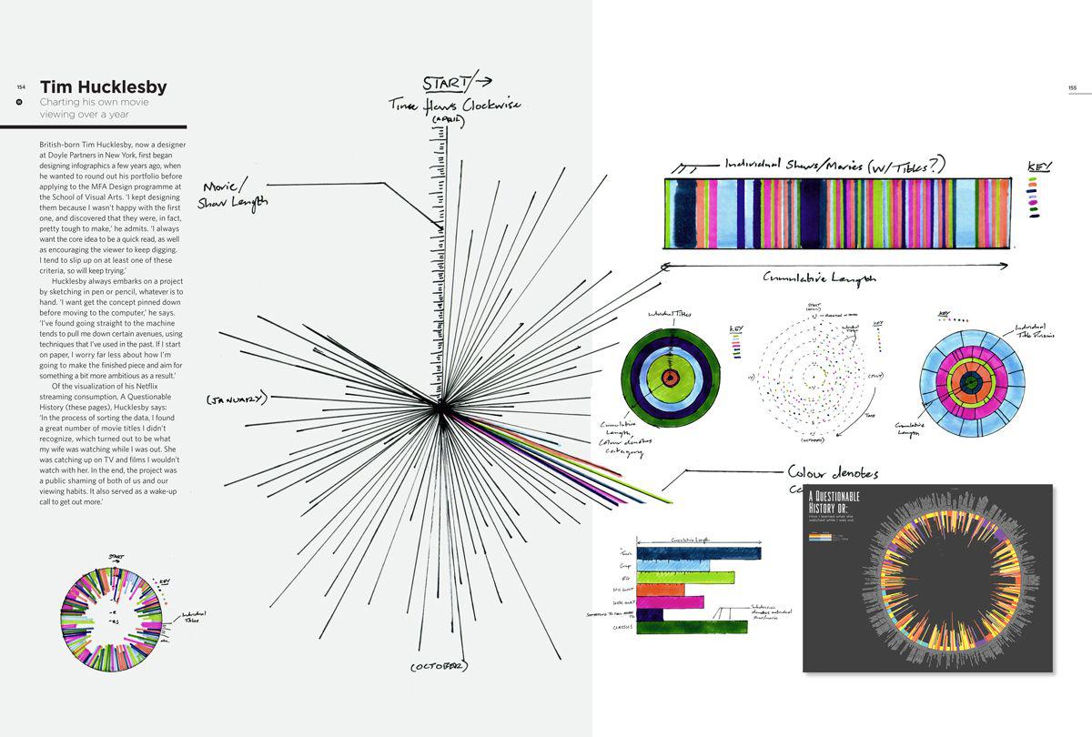
British-born designer Tim Hucklesby of Doyle Partners in New York always starts a project by sketching with pen or pencil. “I want to get the concept pinned down before moving to the computer,” he says in the book. “I’ve found going straight to the machine tends to pull me down certain avenues, using techniques that I’ve used in the past. If I start on paper, I worry far less about how I’m going to make the finished piece and aim for something a bit more ambitious as a result.”
In the infographic above, he charts his Netflix streaming consumption over the course of a year.
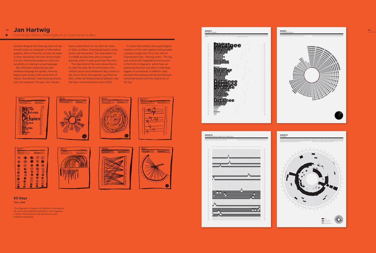
German designer Jan Hartwig starts every project with a sketch, whether on the computer or in a notebook on his desk. Below is an infographic he created to chart the daily life of one inmate in the military prison at Guantanamo Bay, based on the Secret Orcon Interrogation Log Detainee 063, written by Mohammed al-Qahtani, who has been imprisoned there since 2002.
Copyright Jan Hartwig
“It shows the complex and psychological relations of the interrogation and provides a unique insight into the life in the cells of Guantanamo Bay,” Hartwig says in the book. “The log was analytically regarded and structured in form of diagrams, which have an explaining function and refer to individual logged circumstances. In addition, they illustrate the existing contradiction between emotional events and the objectivity of the log.”
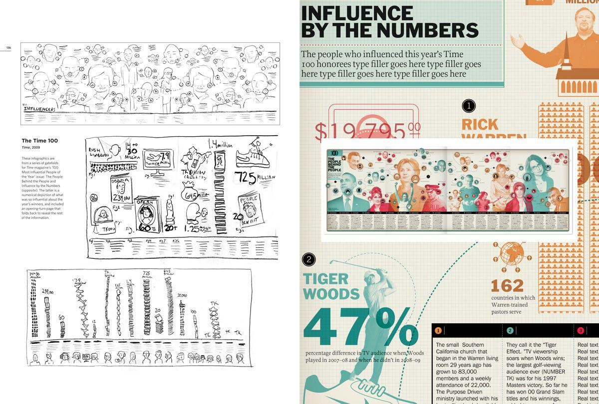
Philadelphia-based design Paul Kepple of Headcase Design tends toward heavily illustrated infographics and finds that starting by making pencil sketches helps him to create a more dynamic layout. “It’s a quick way to try out different layouts and compositions to see what works best,” he says in the book. “The client also needs to approve the concept and layout, so doing quick pencils keeps things moving on their end, and helps avoid time-consuming changes at a later stage.”
In 2009, he did a series of infographics gatefolds for Time magazine’s 100 Most Influential People of the Year issue that was a numerical depiction of what made the year’s winners so influential.
Copyright Paul Kepple/Headcase Design
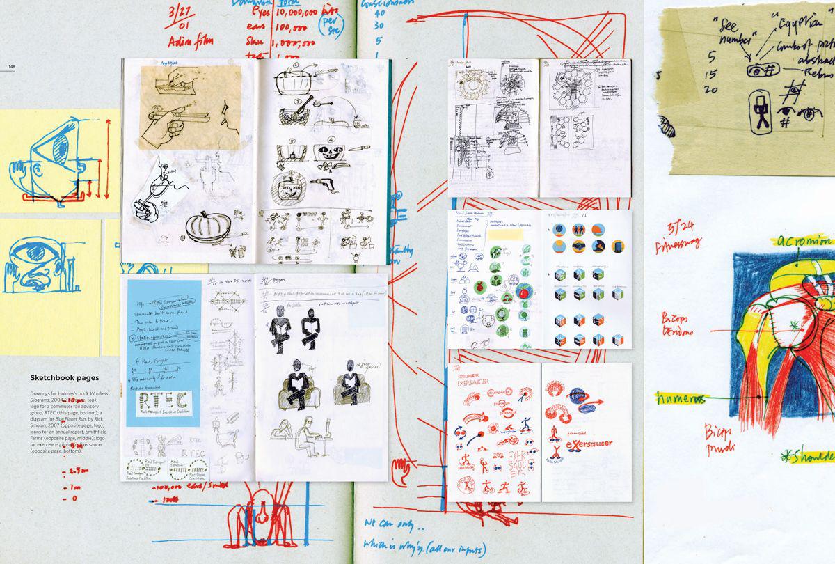
Connecticut-based designer Nigel Holmes is an infographics pioneer. “As graphics editor for Time magazine, Holmes arguably launched the data-visualization movement,” the authors write, adding that he has been “a devoted sketcher” since the 1960s, when students at his college were required to carry sketchbooks at all times. He created an infographic for USA Today based on the Department of Agriculture’s introduction of a new food pyramid in 2005 that was meant to be a simpler diagram to show people what they should be consuming on a daily basis.
Copyright Nigel Holmes
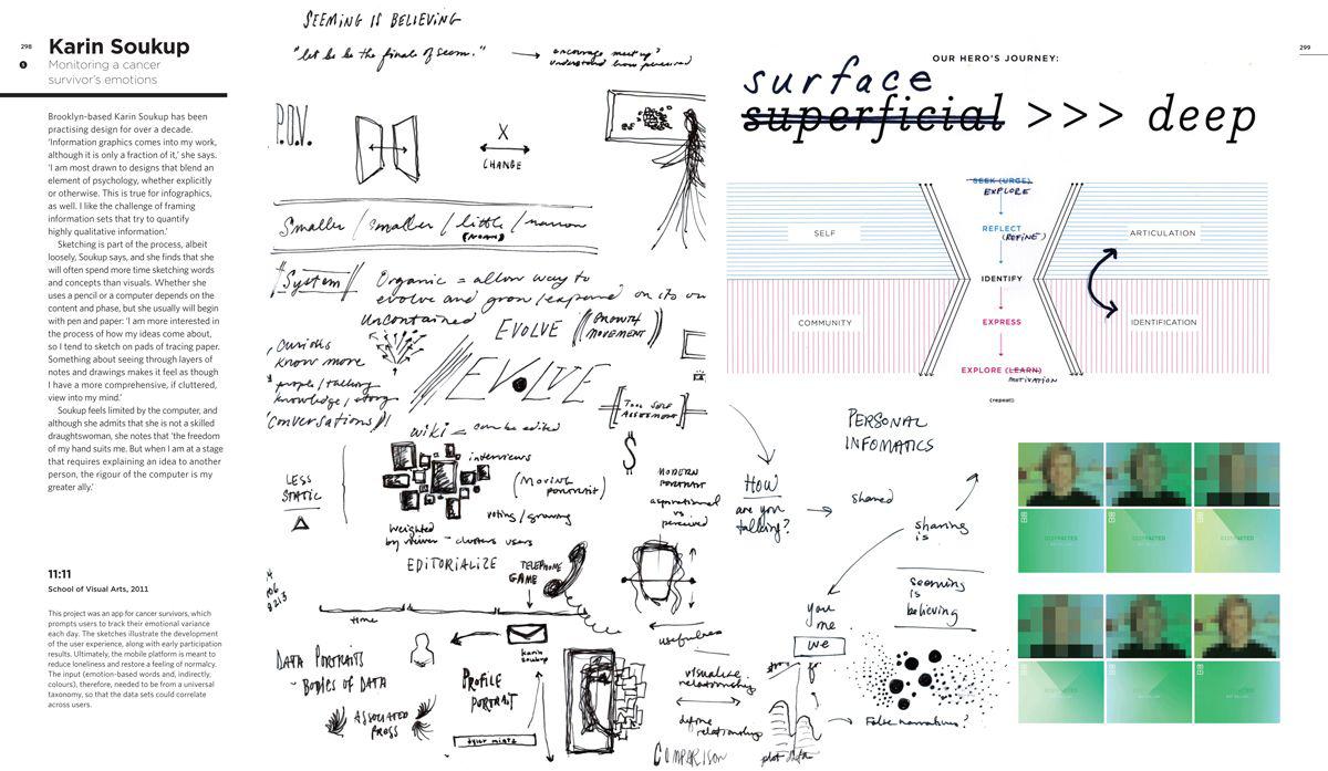
In 2011, Brooklyn-based designer Karin Soukup created an app for cancer survivors that prompts users to track their daily emotional ups and downs. She says that she is most drawn to designs that have a psychological component: “I like the challenge of framing information sets that try to quantify highly qualitative information.”
Copyright Karin Soukup