James I. Bowie is a sociologist at Northern Arizona University whose Emblemetric blog examines patterns and trends in logo design using quantitative analysis of data from the United States Patent and Trademark Office. Here at the Eye, Bowie shares a recent Emblemetric post about the design of the SEC’s perfectly anti-modern logo.
The Southeastern Conference has dominated America’s most popular college sport, football, in recent years, winning seven of the last eight national championships. It features 14 members from across the football-mad South, including such traditional college football powerhouses as the Alabama Crimson Tide and the Georgia Bulldogs. On Thursday, the SEC will parlay its on-field success into a lucrative television venture with the debut of the SEC Network, a cable channel operated under the aegis of ESPN.
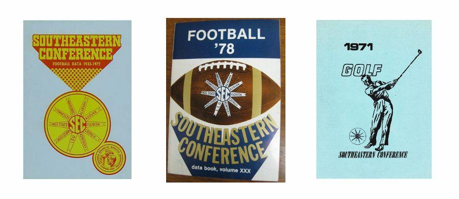
While the popularity of the SEC may be attributed primarily to its victories on the gridiron, the conference has also benefited from branding efforts that have resulted in a strong visual identity. Specifically, in 2007 the SEC began using, as part of a celebration of its 75th anniversary, a new logo featuring the conference initials confined within a circle (see above). But in fact the logo was not exactly new; it was a variation of a mark used by the conference for years, a “pinwheel” with banners for each of the conference members emanating from the central circular monogram.
Courtesy of eBay
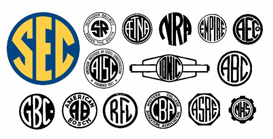
This pinwheel logo dated to a time when branding efforts by college athletic conferences were not afforded much concern. Indeed, the SEC circle mark was generic, derived from a common monogramming technique that produced many company logos (see above), and is still in use today for monogrammed personal items.
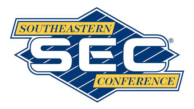
In 1988, the SEC attempted to adopt a contemporary image, implementing a new logo with its initials in a somewhat futuristic typeface over a diamond-shaped background of stripes.
Courtesy of GameFront
This “diamond” logo was used until 2007. Its replacement represented a realization by the SEC that its image and appeal were based not in the present, but in the past. Although college sports, and football in particular, have become multimillion-dollar businesses, what differentiates them from professional sports is a stronger sense of passion and loyalty among their fans, and a great concern with the long-held traditions surrounding the teams and the universities they represent.
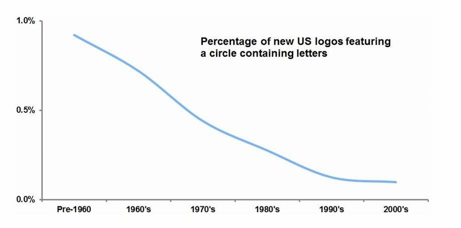
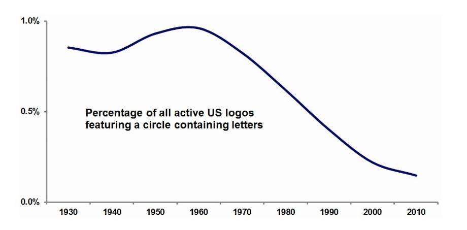
Analysis of logo design data from the United States Patent and Trademark Office clearly shows that the SEC logo is most closely associated with the period before 1960. U.S. logos featuring a circle containing letters have fallen out of fashion since that time; in the most recent decade, they made up less than .01 percent of new marks.
Courtesy of Emblemetric
The genius of SEC branding is that it wholeheartedly embraces a logo with such an antiquated style. Doing so allows the conference to project an image steeped in tradition, heritage, and authenticity, one that resonates with its fans, particularly in the South, where nostalgia for an idealized past remains strong. As the song says, “old times there are not forgotten.”
The logo might best be characterized as “anti-modern,” rejecting as it does contemporary design trends in favor of datedness. The SEC is not the first organization to adopt such an anti-modern logo: the All England Lawn Tennis Club’s Wimbledon Championships and NASA both abandoned modern-looking logos in favor of more dated-looking marks after concluding (rather bizarrely, in NASA’s case) that their images were better linked to the past than to the modern day.
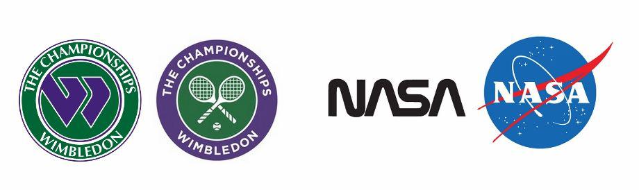
Courtesy of All England Club and NASA
The SEC logo has achieved distinctiveness in a roundabout fashion. At the time of its first use, the SEC pinwheel monogram would have appeared quite mundane, bearing a strong similarity to many other marks of its day. Today, however, the great majority of those similar monogram logos have died off, as shown in the graph below.
Courtesy of Emblemetric
As a result, the resurrected SEC monogram is left with a quite distinct appearance, particularly in relation to its fellow collegiate athletic conferences, many of whose logos have in recent years taken on a similar hyperitalicized, pointy-serifed, futuristic look.

Courtesy of SportsLogos
In fact, today the SEC logo bears less resemblance to the symbols of fellow American college sports conferences and more to the crests of many Brazilian soccer teams. These clubs likely adopted their emblems when the circular monogram style was in vogue and retained them ever since, avoiding the need for the type of anti-modern about-face done by the SEC.
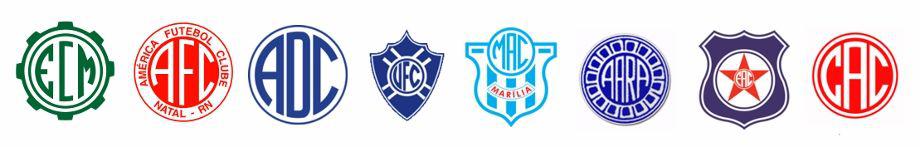
Courtesy of Wikimedia Commons