With every global sporting event come endless opportunities for branding and design, and the FIFA World Cup has inspired a slew of uninspiring commemorative stamp designs issued by participating countries, plus unofficial tributes like the lame soccer-themed stamps issued by North Korea, despite its failure to qualify for participation in the games.
Courtesy of MAAN
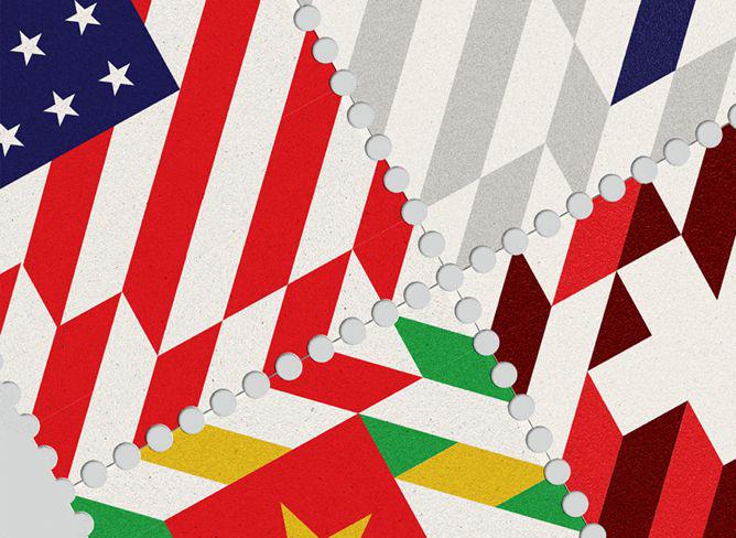
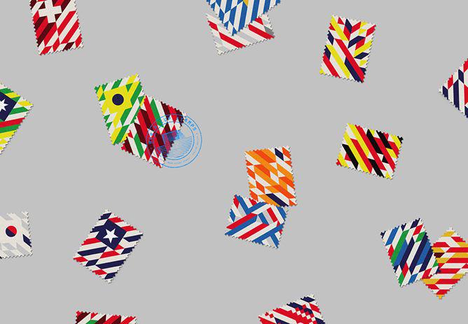
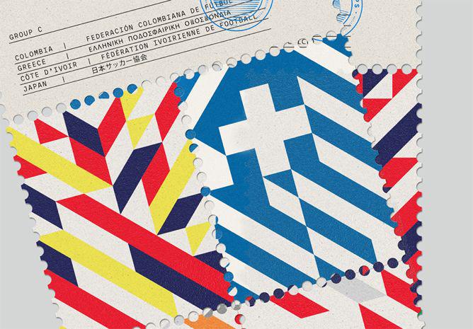
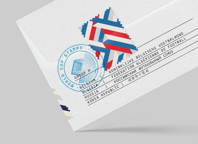
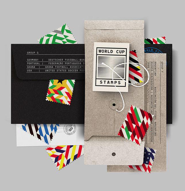
Portuguese graphic design studio MAAN has created an unofficial set of stamps for a self-initiated project called World Cup Stamps, which rivals government-issued versions and outclasses the postal services of the planet.
Courtesy of MAAN
“Since we are stamp collectors and true football (soccer) lovers we thought we could combine these two on a project,” the designers wrote in an email. They decided to come up with a dynamic design that would celebrate movement and travel across the national teams, without a soccer ball or muscled leg in sight.
Courtesy of MAAN
“It felt natural and the most logical approach creating a diagonal based grid system,” they wrote. “It helps with the visual rhythm but it also gave the composition formal context.”
Courtesy of MAAN
More images are online at the World Cup Stamps Tumblr.