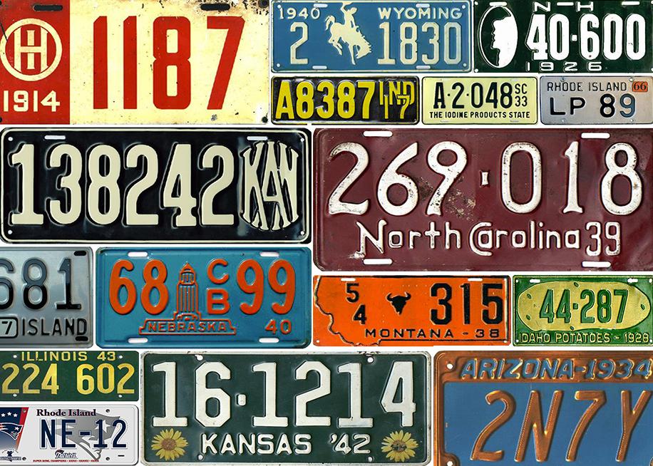
The license plate was once a thing of beauty. Most histories of American architecture focus on particular skyscrapers or the prairie style. But for their first hundred years, American license plates were among the best if most-unheralded pieces of good design. Created for vehicle identification, early license plates were legible, no nonsense, and often exceedingly handsome.
From very early on the states used license plates for self-promotion—advertising that was sometimes clever, usually primitively jingoistic, and occasionally downright funny. Maine was the first state to employ a motto (Vacationland), but by the Depression almost every state was touting something.
1920s and 1930s license plate design was noteworthy, featuring handsome fonts, intriguing logos, and state totems. For three years Arizona even produced a solid copper plate.
During World War II license steel plates were replaced by less valuable aluminum ones; some were made of soybeans pressed into a cardboard-like material that was neither substantial nor attractive (like the 1943 Illinois plate below).
License plates really started to decline in the 1970s, when reflectorized surfaces began to replace embossed and painted plates (a certain Minnesota mining and manufacturing company produced a surface called Scotchlite, a reflective coating that adhered to metal). Pearlescent plates allowed states to add all sorts of literal images, which they did with tasteless abandon. The difference was something like the one between letterpress and laser printing. The new processes allowed for the piling on of visual clutter—any kind of picture or scene, often featuring overly small details that muddied a license plate’s mission. At least embossing required a certain discipline to achieve legibility.
The combination of computerized graphics and the development of the specialty plate really did in the handsome, legible plate. While license plates have always been a source of some revenue, states began to realize there was more money to be made in allowing affinity groups—bowling leagues, colleges and universities, war veterans, Purple Heart winners, sports teams, and any number of charities and nonprofits—to be represented on license plates. Money collected from sales of such plates is usually divided between the states and the charity. Noble as many of these groups are, the results are ugly tableaux that are all content and little design; forget legibility. (Never mind that some of the affinity groups’ slogans, especially the religious-based, hardly belong on a state identifier.)
Not only has the cluttered license plate become a graphic disaster, but also the very act of sponsorship leads to snobbery or political posturing. Consider, for example, the newest affinity plate in Rhode Island, my home state. (There are fewer special plates here than in any other state, but we do offer Mr. Potato Head—to fight world hunger—as well as a sailboat and a lighthouse; we have no kittens or puppies as they have in neighboring Connecticut.)
Half of the money from the fees for this one goes to the Charitable Foundation of the New England Patriots. Maybe that’s a good cause, I don’t know. But using the abstracted Mussolini-modern minuteman logo (not to mention all the extra information about the charity and the history of Super Bowl titles) seems to me a rather poor (and almost unreadable) advertisement for the state founded by Roger Williams as a haven for religious freedom.
A license plate should be like one’s name, something that identifies you as someone of substance and probity, and says something about your roots, ideally without too much cleverness. So many plates now list a government website, as if, say, the word Pennsylvania alone did not conjure something of the past, of history, of a place. If you don’t bring that knowledge with you, a URL won’t help. Stopped at a traffic light behind a Nebraskan, will one be tempted to write down www.state.ne.us to later find out about the sandhill cranes or Willa Cather?
At this point, there is undoubtedly too much money invested in the whole license plate business to make a fundamental change. But shouldn’t designers argue for a restoration of basic number plates, something without mottos or state maps or landscapes or endangered animals? It’s time for the return of a well-designed license plate—something like the 1959 Rhode Island plate below, something as basic as a black telephone. A well-designed, simple license plate would do its putative job more effectively and add a welcome dose of dignity in the world of nasty government graphics. Most of all, a visually calm license plate would not shout for our attention, but once again be an object of sheer spare beauty.