
Over the past 25 years, Tobias Frere-Jones has created some of the world’s most widely used typefaces. He has taught at the Yale University School of Art since 1996, gives lectures around the world, and has work in the permanent collections of the Victoria & Albert Museum in London and the Museum of Modern Art in New York. Here at the Eye, Frere-Jones shares a post from his new blog about his frustration with the type design of letter-shaped children’s toys.
Letters are scattered all over the living room floor. Not designs of my own, but toys for our son. Letters for sticking on refrigerator doors, fitting into puzzles, stamping in finger-paint, or floating in a bathtub. There’s even a bag of gummy letters in the kitchen.
They’re all made by different hands, and in varying materials. As far as I can tell, they don’t aspire to any explicit style, but only to present the alphabet with minimum distraction. But there’s more noise and confusion here than their makers may realize.
Courtesy of Tobias Frere-Jones
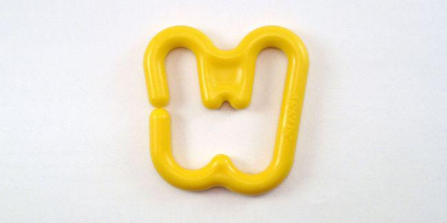
Most of these letters have rounded corners and terminals, which seems to be the prevalent style for toddlers. I think I understand the appeal: It’s fun and bouncy like a balloon, and you probably can’t poke yourself in the eye with it. Some letter sets got their intersections rounded as well, leaving them with a web-footed appearance, like this W:
Courtesy of Tobias Frere-Jones
Unfortunately, the rounding-off and curving-in can weaken critical features of letterforms. So it’s an especially unfortunate thing to put in front of a child trying to learn the alphabet and gain confidence in knowing its shapes. It’s like making someone wear earplugs while they try to learn an instrument.
Courtesy of Tobias Frere-Jones
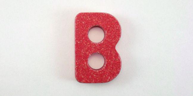
We learn letterforms by their tendencies, like the importance of asymmetry in the capital B. As that left-to-right contrast is turned down for the sake of style (or ease of manufacture) the letter becomes less and less of a B and more of an abstract lump.
Courtesy of Tobias Frere-Jones
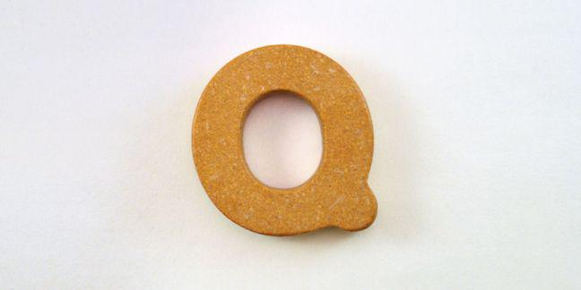
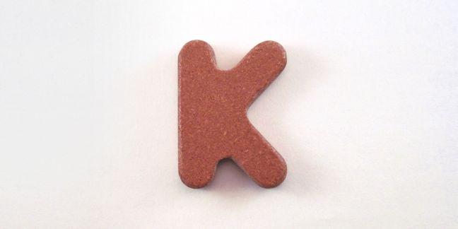
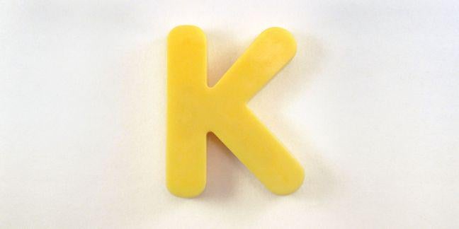
The shape of a K is all about diagonals and sharp intersections. Here, the manufacturer dispensed with the tight corners because the router apparently couldn’t handle it, and effectively skipped a letter of the alphabet.
As a type designer, I could hem and haw about the design of this next K. The top leg looks a bit too light. The lower leg seems to taper towards its end rather than its join. Degrees of curvature at the terminals seem inconsistent. As a father, I’m just grateful that this actually looks (and acts) like a letter of the alphabet rather than a Rorschach test.
Courtesy of Tobias Frere-Jones