Some of the best designs have a measured dose of wit, teasing the intellect without trying too hard to be funny. But jokey designs tend to be corny, as unappreciated as a gag gift.
What happens when a typeface tries to play the class clown?
It usually ends up looking cheesy at best, and wildly inappropriate at worst. The choice of typeface can play a surprising role in shaping a reader’s sense of the truth, as explored in this New York Times essay by Errol Morris. Tone-deaf typeface choices can rob serious scientific news announcements of gravity, undermine the reverence of papal retirement communications, and create unspeakable awkwardness when chosen for funereal correspondence.
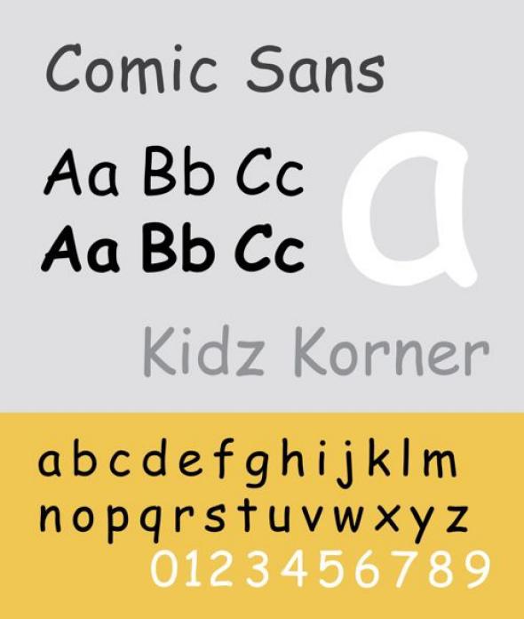
I’m talking, of course, about the ubiquitous Comic Sans. Modeled on the comic book fonts laying around his office in 1994 by then Microsoft designer Vincent Connare—whose Twitter page describes himself as “Creator of the world’s favourite font!?”—the typeface became wildly popular before the turn of the century as the go-to for levity.
Via Wikipedia
A 2011 video report from America’s finest news source on why Comic Sans is so hilarious indicated scientific evidence that “when people read Comic Sans, the same areas in the brain light up as when they view fat people or penguins.” Dutch airline KLM apparently still thinks it’s funny, holding an annual Comic Sans Day since 2009 on the first Friday of July to celebrate.
The undeniably popular typeface still has its defenders, but the prevailing consensus has long been that most people would not be caught dead using it. Just ask graphic designers Holly and Dave Combs of the website Ban Comic Sans, whose tagline is “putting the sans in Comic Sans,” and who claim to have fallen in love over their mutual hatred of what they call “a blight on the landscape of typography”. Or the makers of this Friends Don’t Let Friends Use Comic Sans T-shirt. (For a passionate self-defense from the beleaguered typeface, see McSweeney’s “I’m Comic Sans, Asshole.”)
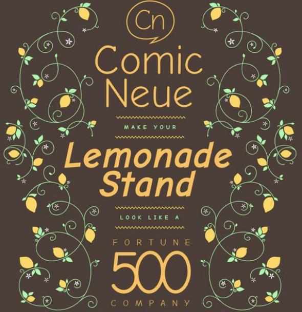
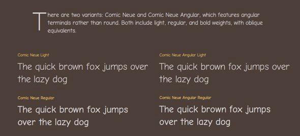
This week, Australian digital designer Craig Rozynski has released a revamped version of the typeface that everybody loves to hate with Comic Neue, which “aspires to be the casual script choice for everyone including the typographically savvy,” according to its promotional website (where you can currently download the new font for free). “The squashed, wonky, and weird glyphs of Comic Sans have been beaten into shape while maintaining the honesty that made Comic Sans so popular,” Rozynski writes. “It’s perfect as a display face, for marking up comments, and writing passive aggressive office memos.”
Courtesy of Craig Rozynski
The Verge calls Comic Neue “the illegitimate child of Comic Sans.” Mashable described it as a “new, funkier take on Comic Sans,” and Sploid declared that “ridiculed Comic Sans typeface gets its dignity back with Comic Neue,” adding that Rozynski “turned the horrible typeface into an actually attractive typeface.”
What does the father of Comic Sans think? Rozynski tweeted at him to find out, and he responded: