Smartphone apps have streamlined the check-in process for some travelers, and the paper boarding pass is surely headed toward obsolescence. But most people around the world are still required to carry around ugly, unwieldy boarding passes printed with a blur of numbers. Recall that ritual moment when an airline agent circles the gate number and/or boarding time to help focus a weary traveler’s eye on the most pertinent information, a sign that these documents are too cluttered.
Courtesy of Peter Smart
But while idle stretches in anonymous airports may have found some fleetingly considering the boarding passes’ flaws, British designer Peter Smart recently tried to figure out how to make them look and work better. His story was recently featured on NPR; the project was part of his effort to solve 50 problems in 50 days using design.
“I had spent 80hrs+ on 14 flights in 2 months and had therefore handled plenty of badly designed boarding passes,” Smart wrote me in an email. “It was the culmination of this frustration that led me to get out my sketchbook on my last flight home and start thinking.”
Courtesy of Peter Smart
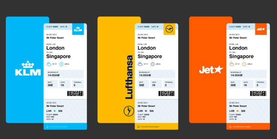
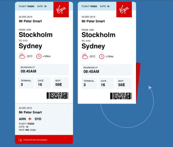
Smart was keen to design a boarding pass that would make key information more accessible and the card itself less awkward to handle. He tried to include crucial information found on standard boarding passes, sticking with the same card dimensions and using only black ink so that the redesign could be implemented using existing cards and printers at no significant additional cost.
Smart achieved this by tilting the card orientation, creating a shorter line length that makes information easier to locate and read. He placed flight and gate number at the top of the card for greater visibility; added perforation at the bottom of the card so that it could be folded to fit more snugly inside a passport; and added a weather at destination icon as a bonus.
Courtesy of Peter Smart
Some NPR commenters pointed out that Smart’s streamlined prototype doesn’t include a space for things like class of flight, frequent flyer numbers, and the PNR record locator numbers used when you have to call the airline about an issue with your flight.
“It’s been great to start conversations about what other people would like to see included and how this solution and other parts of airline travel can be improved,” Smart wrote.
Information is printed in easy-to-read Helvetica and the design was created to be universally adopted by multiple carriers. “Millions of boarding passes are printed every year and this will be the case for years to come,” Smart wrote. “Airlines are certainly looking to invest much more heavily in digital solutions rather than physical. However, the most important part about this project isn’t the solution, it’s the thinking. I’m now talking with airlines about how this thinking can be applied to the full experiences they offer their customers.”