Recently the Wall Street Journal reported on a growing trend among major American food brands: Marketing various foodstuffs specifically to men. Apparently, men have discovered grocery shopping but need to be convinced that it’s safe to buy staples such as bread and yogurt with testosterone-injected packaging design.
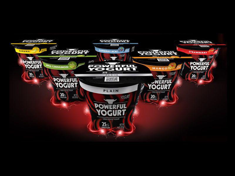
Perhaps the most flagrantly macho packaging belongs to Powerful Yogurt, named Best Yogurt of 2013 by FoodBev’s Dairy Innovation Awards program for its unapologetically dude-centric design.
Powerful Yogurt claims that it is “the first yogurt in the U.S. specifically designed for men and men’s health needs.” What makes it different from any other Greek-style yogurt currently on the market? According to the company, its “man-sized” 8-oz. portion size containing a super-charged 25 grams of protein and zero fat.
The company has chosen a bold red-and-black packaging design with ab-like contours on the side of its larger-than-average container to echo the brand’s “find your inner abs” tagline.
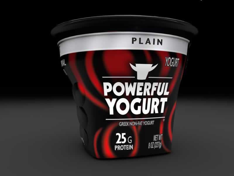
Photo courtesy Powerful Yogurt
“We wanted our packaging to reflect our target market, which is why we debuted the first black cup in the industry with a masculine-looking red, white and black label,” CEO Carlos Ramirez told Package Design magazine. “Our container has contoured abs on its sides to remind guys whenever they reach for our container that they’re making a healthy choice that’s part of the larger picture of health, fitness and overall quality of life.”
Do health-conscious men really need manly packaging to convince them that it’s safe to eat yogurt? Isn’t this just as condescending (and embarrassing) to men as pastel-colored girly yogurt packaging is to women? Does putting abs on a yogurt container really make men want to eat more yogurt?
While Powerful Yogurt is the most obvious about its man-grabbing intentions, and plans to expand into Ireland and the U.K. in 2014, the masculine package design trend is catching on elsewhere. And it seems that just about everybody got the memo about using bold graphics and lots of black. The makers of Pro Yo, a “high-protein frozen yogurt,” use male-friendly packaging including a black-and-white logo that signals it’s acceptable bro yo. Newly rebranded “Ultimate (Hamburger) Helper” also has bold black packaging and is being marketed to young men.
In addition to its red, white and black ab cups, Powerful Yogurt’s company logo features a pair of bull’s horns.
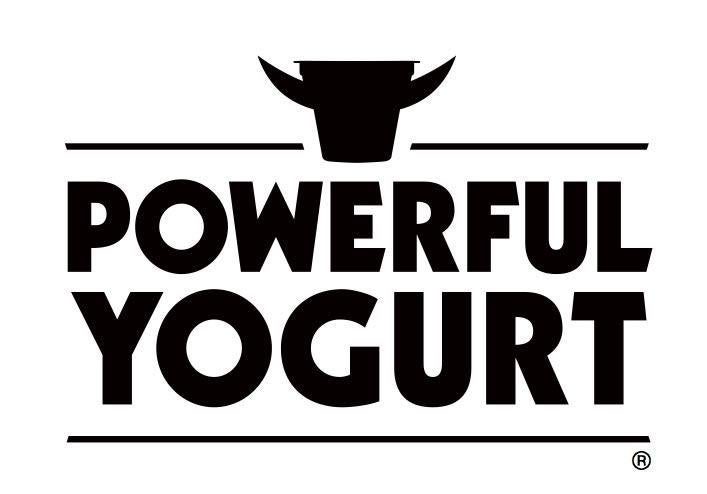
Image courtesy Powerful Yogurt
As leading social anthropologist Stephen Colbert commented on his show the other night: “Yes, bull horns. This yogurt is extra manly because evidently it’s made from bull milk. Very difficult to acquire. But the bull will thank you.”