In the age of the e-reader, the paper book is an ever more rarefied object. Publishers are paying new attention to design as a way to create books that people will want to buy and display, an effort previously lavished on those image-heavy, content-light home décor accessories known as coffee table books.
Dutch graphic designer Irma Boom has long been interested in the possibilities of the book as a design object. She has produced more than 250 books, including 50 that are part of the permanent collection at the Museum of Modern Art in New York. The designer marries typography, images and structure in surprising ways and has created a singular body of work that has made her “one of the world’s best book designers—some say the best,” according to New York Times design critic Alice Rawsthorn.
A retrospective of Boom’s work is on now through December 15 at the Institut Néerlandais in Paris. Irma Boom: The Architecture of the Book is a reminder of the form’s exciting possibilities.
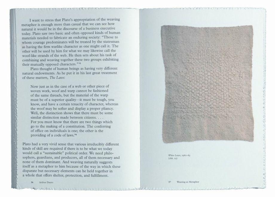
Photo courtesy Institut Néerlandais Paris
Whereas book designers generally follow a design brief set out by a publisher, Boom insists on having full control over the visual outcome of a project, interpreting and reassembling the text and images in her own way, playing with typography, binding, fold-outs and other irreverent techniques. She has printed books on coffee filter paper or paper of her own fabrication, imbued books with scent, omitted page numbers, designed unapologetically blank covers.
“I hate briefings, I never read briefings,” she said in a TED talk in 2011, to much laughter from the audience. “Don’t read it, do what you like. I think that’s always better.”
Boom said her aim is to organize and showcase information so that people will actually read the books she designs. In a video interview, Boom revealed that despite the tactile and multi-sensory nature of her book designs, she “hates” a handmade aesthetic, finding any traces of handicraft “disgusting.” Books should be reproduced and widely distributed, she said.
Photo courtesy Institut Néerlandais
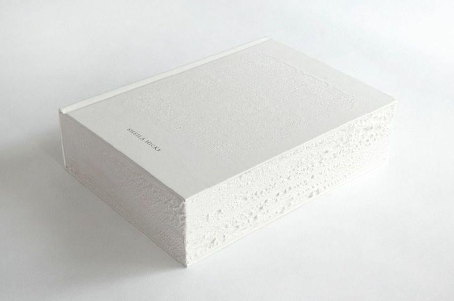
Her design for American artist Sheila Hicks’ book Weaving as Metaphor in 2006 was white (publishers hate white, she says, because it gets dirty). It had a blank cover; rough, frayed edges gave it a tactile quality and mimicked the artist’s textile designs. She used giant typeface that gradually got smaller. The publisher, she said, was convinced it wouldn’t sell. It was a hit. And it helped to raise Hicks’ profile and her own, winning The Most Beautiful Book in the World award at the Leipzig Book Fair.
One of Boom’s most famous commissions was a 1996 book that she produced for Dutch company SHV Holding, a 5-year project in which she created a not-for-sale book about the company’s 200-year history. She calls it a “fat book,” at 2136 pages. Not that it has page numbers.
Boom’s books aren’t always so massive. An integral part of her design process involves manufacturing a half dozen or so roughly 2-inch mini prototype books in order to test her ideas and have a sense of the book’s architectural structure.
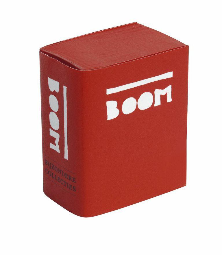
Photo courtesy Institut Néerlandais Paris
For a 2010 show in Amsterdam, she produced a mini book as catalogue, with type on the cover designed by the architect Rem Koolhaas, with whom she has collaborated since 1998. For the Paris show, she made a revised 2013 edition, an overview of her work from 1986 to the present with more than 800 pages and 450 images in a tiny presentation box roughly 1.5 by 2 inches big.