One of Britain’s most identifiable symbols is the bar-and-circle Transport for London roundel, which has since its first incarnation in 1908 become not just a globally recognized commercial transport logo but a cultural icon in its own right.
The design of the roundel (which until 1972 was referred to as the bull’s-eye) is attributed to no one person and its marriage of abstraction, typography, and form symbolizes nothing in particular. But the crisp, memorable shape that makes it an easy-to-read train station marker has retained its integrity while adapting to changing eras and expanded uses with tweaks to color or typography, all while retaining its power as a symbol, for London’s transit system and the city itself.
Dr. David Lawrence, a design historian who teaches at Kingston University, has written a new book on the history of the roundel, A Logo for London, that is being released today by Laurence King Publishing.
Lawrence’s book traces the history and development of the transport logo, illustrating its many variations and uses with posters, photographs, and other previously unpublished graphic material from the archives of the London Transport Museum and private collections.
“There has never been a history of one of the world’s most powerful and recognizable symbols of modern times,” Lawrence told me.
Below is a selection of images that Lawrence chose to illustrate the evolution of what has become one of the most widely emulated and highly effective symbols of corporate branding ever designed.
Perhaps British transport administrator Frank Pick, who was largely responsible for using design to build the corporate identity of the London Underground in the first half of the 20th century, said it best: “Design is not a mode that enters in here and there and may be omitted elsewhere. Design must enter everywhere.”
The winged wheel designed in 1905 was an early precursor of the now iconic Transport for London bar and circle design. This cap badge issued to bus crews from 1910-14 featured the winged wheel logo of the London General Omnibus Company.
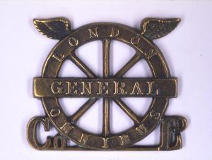
Photo courtesy of David Lawrence
A streamlined impression of the original Underground bar-and-disc symbol from a design of 1908, recreated in 1955 by former Underground officer W.H. Hilton, reveals the abstract nature of the symbol’s bare bones.
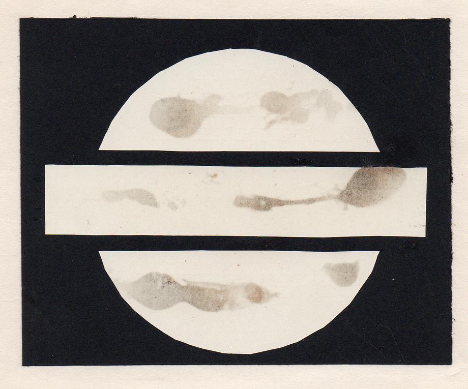
Photo courtesy of David Lawrence
The signing of subway stations like London’s Covent Garden used this bar and disc with the signature color scheme of red and blue in 1908.
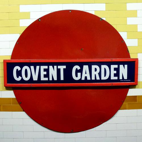
Photo courtesy of David Lawrence
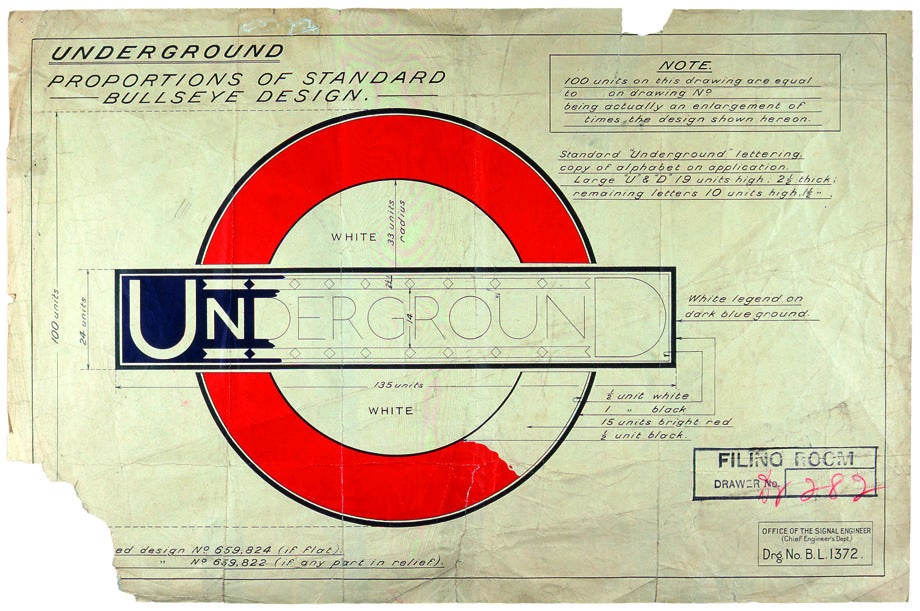
Edward Johnston altered the proportions of all parts of the symbol, including redrawing letters to a bolder weight, fractionally increasing the size of the bar and expanding the white space at the center of the logo. Johnston’s fully formed Underground symbol was born in 1919. This London Passenger Transport Board (LPTB) symbol is from 1933.
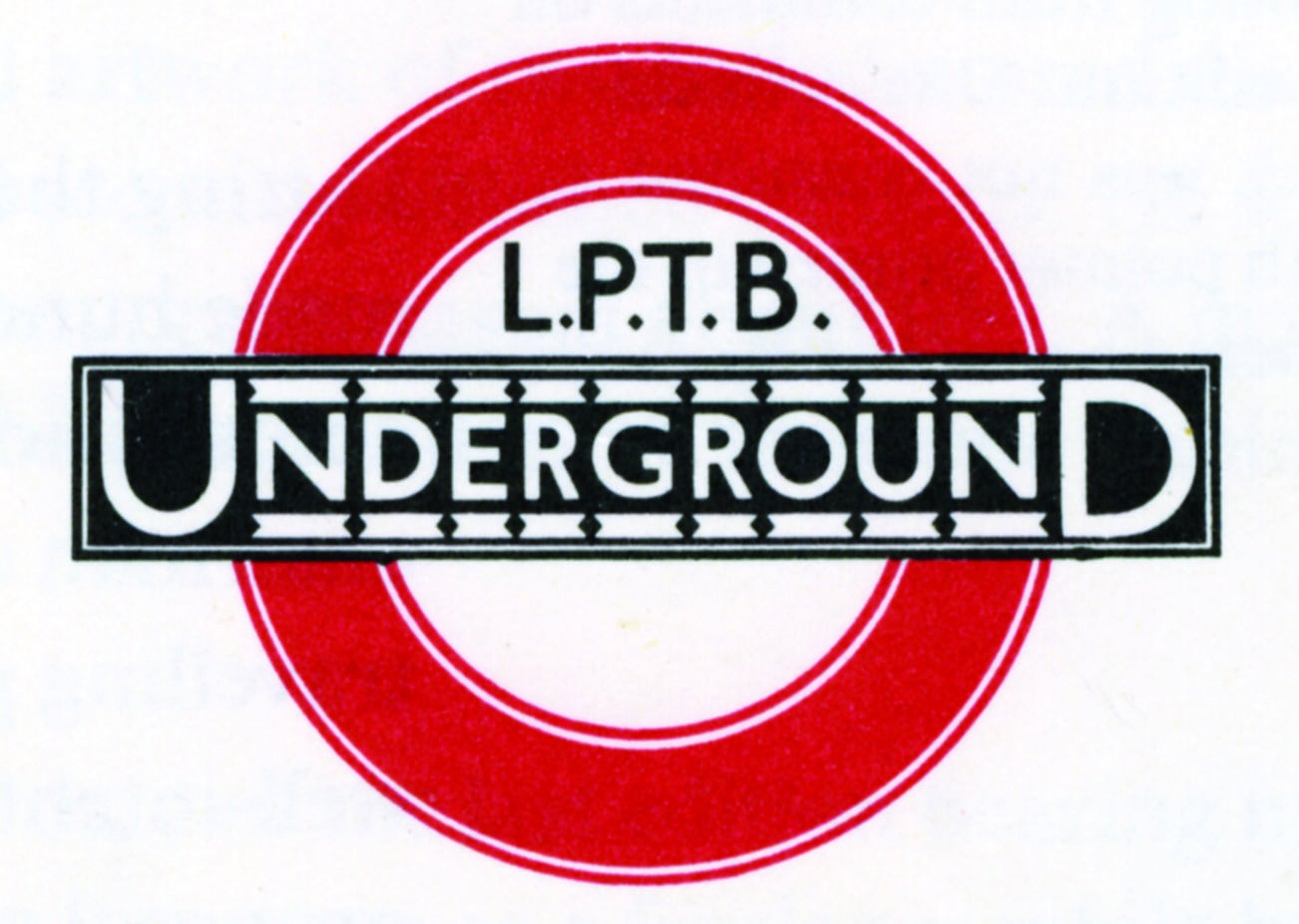
Photo courtesy of Justin Howes/Capital Transport Publishing
The London trolleybus—an electric vehicle powered by overhead cables—began operating in southwest London in place of trams in May 1931. This logo shows how a family of corporate symbols was developed from the original design.
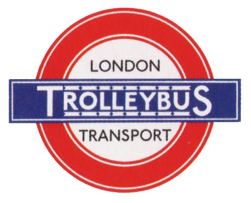
Photo courtesy of David Lawrence
Under the influence of experimental artists and designers, including Man Ray and Hans Schleger, the symbol was transformed into a universal graphical metonym for London’s transport. The bar and circle is rendered in three dimensions as a planet by Man Ray in this 1938 poster.
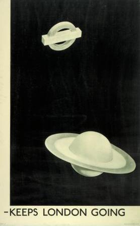
Photo courtesy of the London Transport Museum
German designer Hans Schleger reimagined Edward Johnston’s bull’s-eye while creating signage for a system-wide collection of fixed vehicle stopping places in 1935. This bold, innovative red, black and white graphic of 1936 drew on developments in modern art with its spare, abstract nature and has continued to influence the London Transport aesthetic to the present day.
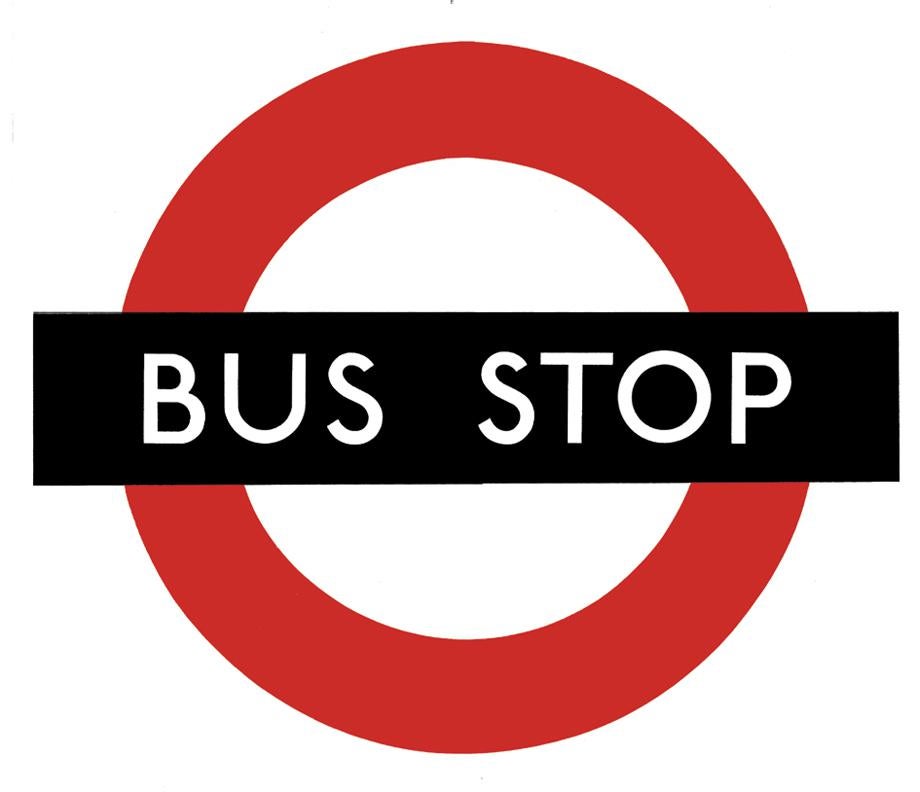
Photo courtesy of David Lawrence
In the early 1950s the corporate symbol is finally streamlined and stripped of its pre-war details, as shown in this railways folder map cover from 1954.
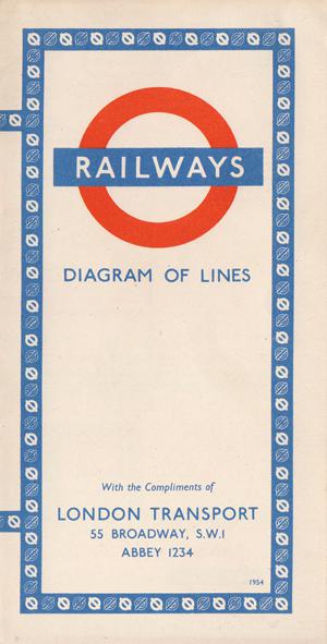
Photo courtesy of David Lawrence
The present red-and-blue color scheme of the Underground roundel at North Greenwich is the most recognized and widely appropriated version of the logo, which has been used as pop cultural shorthand by nightclubs, fashion labels, and the Occupy London movement.
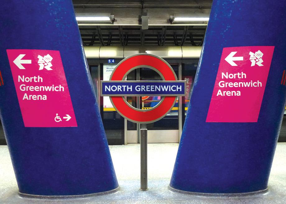
Photo courtesy of David Lawrence
Transport for London publishes a corporate design standards manual to ensure that correct colors and typography are used in every incarnation of the roundel throughout the transport system and beyond. The organization has recently begun seeking corporate sponsors for its expanding transport network, resulting in this Emirates airline cable car sign from June 2012.
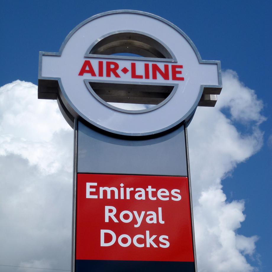
Photo courtesy of David Lawrence