This question originally appeared on Quora, the best answer to any question. Ask a question, get a great answer. Learn from experts and access insider knowledge. You can follow Quora on Twitter, Facebook, and Google Plus.
Answer by Abhinav Sharma, product designer:
I’m red-green colorblind, and I work as a product designer at Quora. My colorblindness is on the stronger side (about 1 percent of all men instead of a more common kind that affects about 5 percent). My short answer for this is that in the grand scheme of things, making a color choice between a green and brown is the kind of decision we make rarely enough that you can ask for help and it really isn’t a big deal. Make no mistake, it is a handicap, but for me it is a minor one. I do wonder what it’s like to be, for example, a fashion designer or interior designer, where you’re making a lot more color decisions. I’d imagine it would be harder. When people first find out, I often get a “You’re a colorblind designer?!” reaction. My usual response is two part:
Colorblindness is really hard to describe if you don’t have it. My closest experience to not being colorblind is wearing EnChroma glasses, through which I can distinguish between green and brown, as well as see red as a much stronger color than I do otherwise. It was while wearing those that I first understood why a red dress is such a powerful image. My reaction to most of the spectrum, with the exception of red, green, and brown, is like anyone else’s.
Most of the time, I’m using a color from a palette that we’ve already agreed upon. Sometimes, we have a problem for which I’d have to create a palette. I usually know when I’m getting close to a color I’m weak with and just ask for help.
Overall, I feel like the handicap makes me a better product designer (emphasis on product because I’m not sure it would make me a better fashion or interior designer) for the following two reasons:
- I have to be more disciplined with color and rely on systems and patterns more. This helps ensure consistency.
- I represent 5 percent of the male population within a design team, so 2.5 percent of potential users. I can tell the other designers when we make something that is not colorblind-friendly. I once took over a Web page that was full of a brown text that to me seemed closer to red and really “popped” as if everything was calling out for attention in red. For 95 percent of people, this was “Meh, doesn’t matter, we could’ve picked any of these colors and we’d be fine,” but for a small minority, it was a really janky experience. My favorite story about this is that Facebook is blue because Mark Zuckerberg is red-green colorblind and just didn’t want to deal with it. Nobody’s really complaining about it 10 years down the line.
On that note, I’d like to add that designing for colorblind people is not that hard—tools like Color Scheme Designer have a colorblind-friendly mode that simply won’t let you pick a palette that’s inaccessible. I really recommend using these on any product
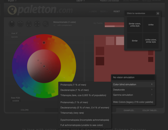
Screenshot via Color Scheme Designer
Colorblindness is a huge consideration when building a safety-related product. You really don’t want to use the wrong red and green on a stop/go sign, for example. (For the record, traffic lights are very, very easy to distinguish between.) That’s really the gist of it.
I’ve generally made it pretty clear upfront when looking for jobs that I’m colorblind, and most good employers start out asking if it has affected my work in the past. An immediately negative reaction is usually a sign of incomplete understanding of how colorblindness works. I’m really curious to hear if there are colorblind designers in fashion, interior, or graphic design, and how this affects their work.
What Is It Like To Be A Color Blind Designer? originally appeared on Quora. More questions on Quora: