This question originally appeared on Quora.
Answer by Craig Weiland, art director:
This is a fascinating question.
I’m a font guy. I love type, and I love studying and using typefaces. “How do I choose the right font?” is such a simple question, yet there are so many ways to answer it.
For one thing, I’ve been paying attention to fonts my whole life. Ever since my parents got me The Print Shop on my Commodore 64 when I was 13 years old, I’ve been aware of how typefaces have personality and that personality is suitable for some uses and wildly improper for others.
For instance, does this logo’s typeface communicate the kind of things you’d go to a massage parlor for? I’d expect to walk out of there bruised and bloody. Or would you trust your financial well-being to a CPA with this logo? It’s not even spelled correctly. Ashley must not be a “details person.” Would you drop your children off here? “Leave your payment in a brown paper bag near the bench in the park. Cash only, nonsequential bills. We’ll tell you where to collect your child.” Here are a few more examples of these for further illustration.
It helps to be aware of a lot of different kinds of fonts and to be able to identify them by name. It does you little good for you to say, “You know, I really like the font they use on Law & Order. I want to use that for my project.” (Of course, something like that can probably be found quickly using a well-phrased Google search. And if you have a sample of the font you’re looking for, you can upload it to WhatTheFont! and usually get a correct answer.)
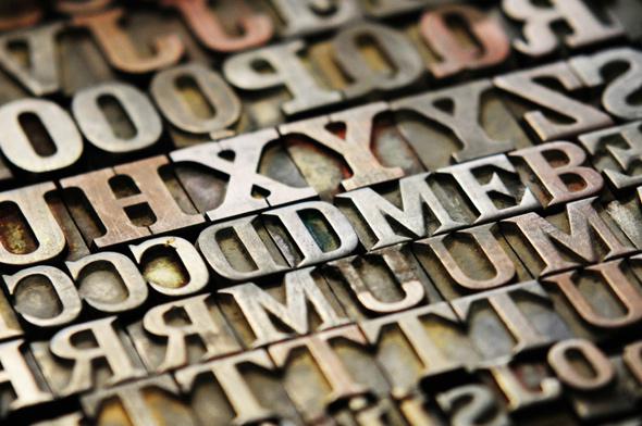
Get a “periodic table of typefaces” poster and put it on your office wall (or set it as your desktop background). Study it. Stare at it when you’re meditating. Lose yourself in it when you’re zoning out. It’s awesome. Absorb the shapes and let yourself pair them with the names. It’s not as great a resource as the huge poster I had on my office wall when I was first starting out—sadly, I can’t seem to find it anywhere on the interwebs, or I’d show it to you—but it’s an excellent and handy resource to help familiarize yourself with the greats. (And be sure to check out some of the links provided at the bottom of the poster, like this one.)
A designer also has to be aware of the basics of type usage. Serifed type is often used for long copy, like books and magazines. This is because the serifs make the characters more recognizable and the text easy to read in bulk at small sizes. Serif body copy usually pairs well with sans-serif display type. There are mountains of exceptions, but you have to understand the rules before you can effectively break them.
I test a lot of fonts when I design a logo. I’ll sometimes go through 20 to 30 different faces looking at how the characters relate to one another, the overall mood presented by the forms, readability at large and small sizes, how I might use color, how the letterforms create negative spaces and how I might use them, and so forth. I need to have a solid understanding of the attitude I want to project. For instance, in the massage logo example, the attitude communicated is strength, confidence, power, and pride. A massage parlor should be welcoming, warm, relaxing, and soothing. The typeface chosen must broadcast these attributes, or at least not be in conflict with them.
Fonts, to me, can also be very personal. For a long time, I was a huge Apple fan. (I’m less of one now, but that’s another story.) I used to collect Apple advertisements and brochures. All through the ‘80s and most of the ‘90s, Apple used a customized tooling of Garamond for all their marketing materials, called Apple Garamond. It looks like this.
I loved that font. For a time, I wanted to use it on everything, like my college papers. It’s beautiful, professional, and so friendly (compared to, say, Times New Roman).
Gag. What a boring, lifeless, colorless character set. It says, “I don’t really care what typeface it is.”
I started to realize that although I loved Apple Garamond, it was not working in my favor. The characters are very narrow. When you’re writing college papers, often assigned using page count as a metric, a narrow character set makes more work for me. A font with a wider stance, say, Bookman …
Now that’s a font for term papers. And anyway, Apple Garamond is Apple. It screams Apple. Apple used it for so long, so effectively, that they basically owned it. (They did, literally, own that face.) As a professional, when I wanted to spec a font for a design project and tested Apple Garamond, I had to be able to answer the question, “Does the use of this font say, ‘We wish we were Apple?’ ” Only if the answer was no and the font was right on all the rest of the criteria could I use it. I almost never did.
A few years later, I discovered Stone Print.
Look at that! I thought. It’s a beautiful, narrow serif face, with great professional personality, and it’s not Apple Garamond! I fell in love with it and at the same time instantly knew I would never use it for anything else but my own personal stuff. My resume. My correspondence. Over the demands and threats of my grad school, I typeset my thesis in Stone Print and turned it in that way. That’s my font, baby. None of my professional projects get to use it. I’m possessive about a handful of other fonts in the same way.
Sometimes a font’s established use really gets in the way of my wanting to use it and makes it frustrating. A good example is Gotham.
Gotham is an amazing contemporary (2000) face. So modern, so strong, so accessible and welcoming, yet still confident and secure. Beautiful like Helvetica but definitely not Helvetica. I would love to use Gotham a lot more, but Barack Obama’s campaign used Gotham so extensively in 2008 and 2012 that the font became inextricably linked to him, like Apple Garamond blazes Apple even when it’s not talking about computers. Gotham is the Obama Font, here in the U.S. at least. Unless my target demographic is known to favor the guy, I have to avoid this font if I want to avoid the association.
As a designer, you should be always paying attention to design in your environment and media. If you notice a cool typeface in something, like a movie poster or a billboard, see if you can track it down later using Google searches or WhatTheFont, so you can add it to your arsenal for future use. And be conscious of trends. In the 1990s, a font called Officina Sans was quite popular. It was used everywhere that someone wanted to project “contemporary office chic.” Today, I can’t use it at all. It’s worn out. It only projects: “We think it’s still the ‘90s.” You can’t pick up things like that if you aren’t paying attention to the design world around you.
More resources:
So You Need a Typeface is a fantastic and lighthearted primer on how to choose fonts. It’s also a great jumping-off point for beginning graphic artists who don’t know many fonts by name and want to broaden their font horizons.
“The Eight Worst Fonts in the World” is a brilliant article about fonts to avoid. It’s long, but anyone serious about learning font usage (and misusage) should give it a read.
If you are looking for new, fresh typefaces and want to peek at the cutting edge once in a while, you should sign up for MyFonts email newsletters. (No, I don’t work for them in any way.) I get a lot of bulk email every day (most of it is just spam), but when a MyFonts thing shows up, I stop and read it. They are excellent. And I’ve discovered some amazingly great typefaces through their Rising Stars one.
Finally, I use FontExplorer X Pro to manage my font libraries. As you can probably guess, I have quite a few fonts on tap.
More questions on Typefaces: