
We may live at a time when hedge fund managers and CEOs are busily stockpiling dynastic fortunes that, like giant suns warping spacetime, will probably reshape our social fabric for generations to come. But while it’s patently obvious that America’s rich are, in fact, stupefyingly rich, some new research should remind us that economists still haven’t quite agreed on how big the wealth gap actually is.
Economists Emmanuel Saez and Gabriel Zucman appeared to upend much of the old wisdom about America’s wealth distribution in 2014, when they released an innovative study that gave readers a peek into the exploding fortunes of the top 0.1 percent. Previous research, based on government surveys, found that unlike income in recent decades, household wealth had not concentrated much further into the hands of the most affluent. If anything, data suggested that the share of U.S. net worth belonging to the top 1 percent had declined since the mid-1990s. But Saez and Zucman, both now professors at the University of California–Berkeley, worked backward from tax data to show that inequality of wealth—families’ assets minus their debts—was in fact roaring back to 1920s levels. The top 1 percent’s portion of the nation’s pie had climbed to 42 percent. The top 0.1 percent’s share had more than tripled, from 7 percent in 1978 to 22 percent in 2012.
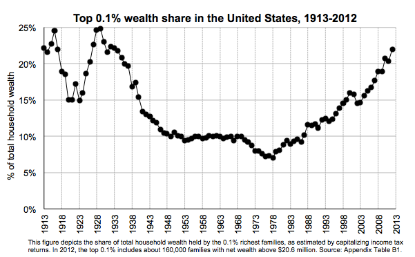
Saez and Zucman, 2016
The findings seemed like a blockbuster sequel to Saez’s work with Thomas Piketty, with whom he popularized the idea of using tax information to trace income inequality. They also seemed to dispel the idea that the wealth gap wasn’t growing in line with the income gap. Piketty himself endorsed the new numbers, saying they were more reliable than the statistics he had used in his best-selling book Capital in the Twenty-First Century.
But now they seem to be facing some stiff criticism. In a working paper presented during a recent Brookings conference, a group of economists from the Federal Reserve Board and the University of Pennsylvania argue that while wealth inequality is indeed growing, its rise has been much slower and less dramatic than the surge depicted by Saez and Zucman. Their qualms focus on abstruse issues involving data measurement and adjustment that, to be totally honest, put me to sleep in front of my laptop one night this week. But if you step back from the minutiae, the debate at least demonstrates just how fragile our statistical understanding wealth concentration still is.
The disagreement between the two sides starts with their data sources (like I said, this gets obscure fast). For many years, the Federal Reserve’s triennial Survey of Consumer Finances was considered the most important trove of information on American wealth. But Saez and Zucman chose to rely on tax data instead, arguing that it was more likely to capture the wealth of the extremely rich, who respond to government surveys less frequently than other Americans. Because the IRS doesn’t actually track anybody’s net worth, however, the duo had to reverse-engineer their estimates using what’s known as the “capitalization” method: First they looked at IRS records to find the distribution of income from things like stocks and bonds, then they calculated how much wealth would be required to generate that money based on likely rates of return.
In their new paper, the Fed-Penn team contends that the Survey of Consumer Finances in fact does a fine job tracking down the superaffluent.1 There is one major omission, however: The survey purposely doesn’t include any members of the Forbes 400, the decades-old ranking of America’s richest (so no Warren Buffett or Donald Trump). To fix that flaw, the authors construct a new wealth measure that uses the Survey of Consumer Finances as a base, then adds the Forbes data (which makes the rich look richer), along with the total value of all defined-benefit pensions (which makes the middle class look richer). The final outcome: A relatively gentle but sustained rise in inequality since the 1980s, such that the top 1 percent now claim about 33 percent of household wealth (9 percentages points below Saez and Zucman’s estimate), while the top 0.1 percent claimed less than 15 percent (about 7 percentage points below Saez’s and Zucman’s estimate).
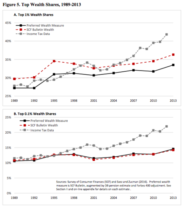
Bricker, Henriques, Krimmel, Sabelhaus 2016
Why does their approach find such lower levels of wealth concentration? The authors offer three main reasons.
First, while the Survey of Consumer Finances tracks families, Saez and Zucman’s data are based on “tax units.” Since many couples file separate returns, there are about 40 million more tax units in the country than there are families. Analyzing IRS returns thus makes the 1 percent seem like a larger group, and makes wealth concentration seem more severe.
Second: Owner-occupied housing is lower in the national accounts that Saez and Zucman rely on in their study than it is in the Survey of Consumer Finances. Because the middle class put more of their savings into housing, that ultimately makes the top 1 percent look relatively wealthier in the Berkeley pair’s analysis.
Finally, it’s possible that Saez and Zucman are overestimating how much wealth the top 0.1 percent have stowed away in bonds and similar assets because they are underestimating interest rates. Their math seems to imply that investors have been accepting yields that are significantly lower than the 10-year Treasury rate, which in turn would require the rich to have acquired massive bond holdings in order to explain the interest income they’ve been earning. That scenario seems a tiny bit implausible, even if if we are living in the era of negative sovereign debt yields.2
So, are Saez and Zucman’s findings all wrong? When I watched a room full of top economists react enthusiastically to the Fed-Penn paper last week, I thought maybe that was the case. But the most recent version of Saez and Zucman’s own study, which they directed me to after I emailed them for comment, points out another interesting reason why their estimates on inequality might differ from tabulations based on the Survey of Consumer Finances. The Fed’s data seem to be missing lots of capital income from assets like stocks and bonds that shows up on federal tax returns. That may mean the rich are simply underreporting their earnings to the government’s survey takers.
None of this changes the big-picture narrative of the last few years: The wealth gap is large, and it’s been growing lately. But given how heavily the inequality debate leans on bold, slogan-ready statistics, it’s useful to remember that a few tiny, mind-numbing methodological changes can vastly change how we picture the distribution of assets in the U.S. It’s nice when numbers are simple. These ones aren’t.
1 For those interested: Basically, they use administrative tax data to check whether there’s any systematic difference between rich people who respond to the survey and those who don’t and conclude that there isn’t.
2 Or maybe not. Yields are low to negative these days because there’s an insatiable global demand for safe debt, even if it pays literally nothing. Perhaps the bad returns/massive bond stockpiling story isn’t crazy.