“Once upon a time,” begins an epic rant by two former Apple designers, “Apple was known for designing easy-to-use, easy-to-understand products.”
Apple is still widely known for that, of course. But it shouldn’t be, say Bruce Tognazzini and Don Norman, who worked for the company in an earlier era. Tognazzini was an early Steve Jobs hire and wrote Apple’s first human-interface guidelines. Norman’s career at Apple spanned the interregnum between Jobs’ departure in 1985 and his return in 1996. The two now work together as partners in a design consulting firm, the Nielsen Norman Group.
Their broadside against their former employer, published on Fast Company’s Co.Design blog, is titled, “How Apple Is Giving Design a Bad Name.” Running nearly 5,000 words, it blasts today’s Apple designers for abandoning the precepts that Tognazzini and his colleagues laid out decades ago. They write:
Now, although the products are indeed even more beautiful than before, that beauty has come at a great price. Gone are the fundamental principles of good design: discoverability, feedback, recovery, and so on. Instead, Apple has, in striving for beauty, created fonts that are so small or thin, coupled with low contrast, that they are difficult or impossible for many people with normal vision to read. We have obscure gestures that are beyond even the developer’s ability to remember. We have great features that most people don’t realize exist.
This isn’t just a matter of inconvenience for Apple’s customers, the authors argue. It’s a veritable crime against the profession, afflicting the broader design world:
Apple is destroying design. Worse, it is revitalizing the old belief that design is only about making things look pretty. No, not so! Design is a way of thinking, of determining people’s true, underlying needs, and then delivering products and services that help them.
Tognazzini and Norman point their sharpest criticism at iOS, the mobile operating system for the iPhone and iPad. By moving to a touch-based interface and doing away with clearly marked buttons and menus, they say, Apple has fetishized visual elegance at the expense of usability. Among their specific gripes:
- The default font is too small and thin.
- It isn’t clear from the screen what actions and gestures are available to the user.
- The “undo” function—triggered by shaking the phone—is obscure, and it doesn’t always work.
- It’s too easy to touch the wrong thing, and when you do, there is no universal “back” button or gesture.
Apple used to justifiably boast that its products didn’t need a manual, the designers note. Now, they say, that boast is empty.
Their critique appears to have touched a nerve, as more than 10,000 people have liked or shared the post since it was published on Nov. 10. Clearly there is pent-up frustration among Apple users who feel like chumps when they struggle to operate devices that have a reputation for simplicity and ease of use. No doubt the piece’s fans also include Android and Windows partisans tired of hearing about Apple’s legendary design prowess.
As for the authors’ specific complaints, some are fairer than others.

Screenshot/iOS 9
They’re right that a growing number of gesture-based functions are difficult to intuit, the “shake-to-undo” feature among them. “Undo” is a crucial feature in almost any computing environment, yet it’s possible to use an iPhone for years without ever discovering its existence. (Hence the enormous popularity of my colleague Forrest Wickman’s 2014 blog post, “Your iPhone Has a Secret Undo Button.”) It can also be hard to keep track of what happens when you swipe down from the top of your phone, swipe up from the bottom, or swipe from left to right.
Apple’s inconsistency in implementing a “back” button is another source of unnecessary exasperation. Some apps, including the Safari browser, offer a back button, although it quickly disappears from view when you stop scrolling, and it’s easy to accidentally tap some tiny link when you try to bring it back. How many times have you found yourself whisked without notice to the App Store to download some app you never wanted? In iOS 9, Apple has finally tried to address the problem with a “back” feature that returns you to the previous app. It should have done this long ago.
Yet Apple’s fumbles with the “undo” and “back” features also illustrate a crucial—and rather obvious—point that Tognazzini and Norman scarcely mention: the inevitable constraints of a pocket-sized device. They worked at the company in an era of desktop computers, when keyboards came standard and screen real estate came cheap. Now space is at a premium, posing design challenges they never dreamed of. Drop-down menus and fixed buttons would be nice, sure, but they’d hopelessly clutter a 5-inch screen. Apple has no choice but to hide them. For a designer working in this context, visual simplicity isn’t a fetish. It’s a prerequisite.
The proliferation of features and functions whose existence can’t be inferred from the interface is a trend that’s hardly specific to iOS. For better or worse, it has become the norm in mobile software design. It’s the reason oldsters like me find Snapchat so confusing. Yet mastery of these “hidden” features is also a source of pride to the people who take the time to learn them. There’s much to be said for the design principle of “discoverability,” as Tognazzini and Norman put it—the tenet that users shouldn’t need a manual to find out what options are available to them on any given screen. But there can also be value in features that are accessible primarily to power users, provided they aren’t essential to a program’s everyday use. (“Undo” should not be among those.) In many cases, with screen space so tightly constrained, the only viable alternative is to leave them out.
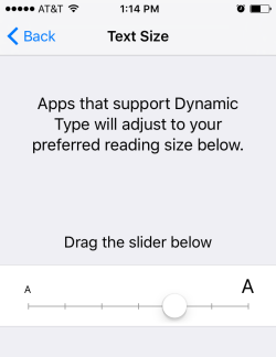
Screenshot/iOS 9
The sense that Tognazzini and Norman are pining for the glory days of the desktop computers is reinforced by their complaints about the font size and contrast level. At age 70 and 79, respectively, it’s understandable that the two find the text on their phones hard to read, and they’re certainly not alone in that. (Plenty of younger users find the default font eye-straining as well.) That said, Apple has always allowed users to increase the font size. The authors were irked that this option used to be part of the “accessibility” menu, which seemed to imply that people were handicapped if they couldn’t read the font in default size. Yet Apple mostly remedied this problem back in 2013 with the introduction of “dynamic text” in iOS 7, which provides a sliding scale for text size. And, as the authors acknowledge, the company’s latest design guidelines rightly restore the principle that fonts must be, above all, legible.
Finally, it’s worth noting: While Apple’s software has become less intuitive over the years, and its design perhaps less elegant and consistent, the same is not true of the company’s hardware. Its iPhone, iPad, and MacBook Air continue to set design standards that no rival in the industry can match. Granted, they come at a higher cost than most rival products. Yet millions of people are willing to pay a premium for them, because they are among the most beautifully and thoughtfully designed devices in the history of personal technology. Just hold an iPhone or iPad in one hand and a rival device in the other. You’ll sense which one is the luxury item, even if you can’t articulate why.
If you’re interested in design, Tognazzini and Norman’s full post is well worth your time. They’re bona fide experts in the field, and you’ll learn a lot from their piece that you won’t get from my summary of it. They make a convincing case that Apple has at times been guilty of conflating design with aesthetics. But until some other company designs a more intuitive mobile operating system than iOS, it’s a stretch to claim that Apple is “destroying design.” The company is simply grappling with design challenges much greater than the ones it faced in the past.
Previously in Slate: