
When you write about the economy every day for a living, you can start feeling numb toward charts about income inequality. After all, the story doesn’t change much week to week, and usually neither do the visualizations. But this one, from Bard College economist Pavlina Tcherneva, somehow still feels astonishing, and has stirred up a bunch of attention today. It shows how much of U.S. income growth has been claimed by the top 10 percent of households during economic expansions, and how much was claimed by the bottom 90 percent. Guess who’s gotten the lion’s share in recent years?
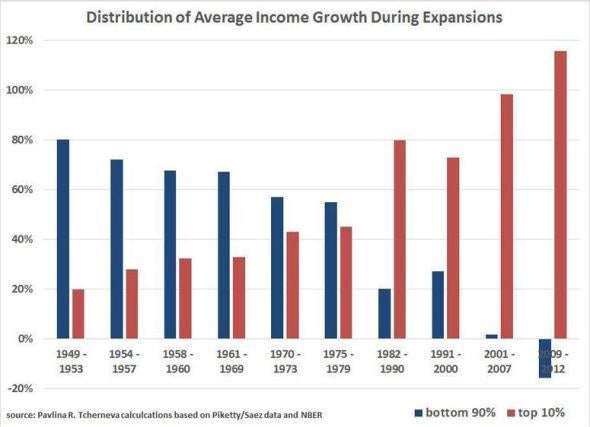
Through midcentury, when times were good economically, most of the benefits trickled down to the bottom 90 percent of households. Then came the Reagan era and actual trickle-down economics. Suddenly, the benefits started sticking with the rich. Since 2001, the top 10 percent have enjoyed virtually all of the gains.
This isn’t a totally new story. But it is a vivid and visceral illustration of what we’ve basically known to be true for a while (the graph is updated from this paper). Meanwhile, as a point of comparison, The Week’s Ryan Cooper points to a similar graph of Sweden, where, until recently, economic gains were much more evenly dispersed. As he notes, even in the era of globalization and high finance, it’s clearly possible to structure an economy so that it benefits someone other than the rich.