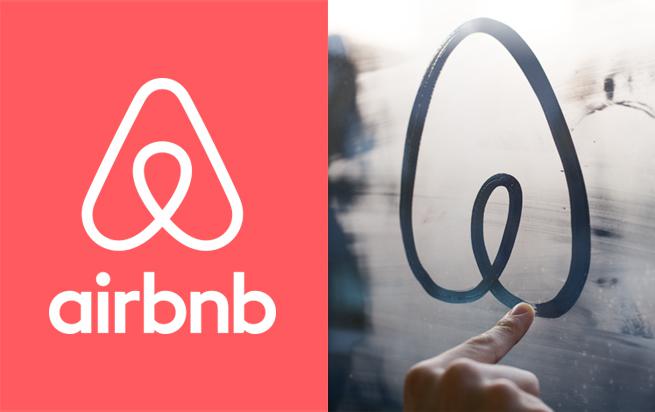
Today, hotel alternative Airbnb unveiled a new logo that’s so much more than a logo—it is, as Airbnb founder Brian Chesky wrote on the company’s blog, “a universal symbol of belonging,” called the Bélo. “Belonging has always been a fundamental driver of humankind,” Chesky explained. “So to represent that feeling, we’ve created a symbol for us as a community. It’s an iconic mark for our windows, our doors, and our shared values.” In other words, it’s exactly what the Hobo Code would have been if Don Draper had grown up in the Mission circa 2014.
Many, many observers saw a different kind of universal symbol in the Bélo. “Airbnb’s new logo is a vagina,” Valleywag’s Nitasha Tiku declared. “In a rare display of design virtuosity,” Tiku added, “it also kind of looks like a butt.” Chicago typeface design studio Okay Type tweeted, “It looks like testicles.” Lots and lots of people on Twitter and in comment sections and in the offices of Slate invoked the term “boobs.”
So the Bélo is definitely some kind of shape-shifting body part. But what is it as a feat of graphic design? We decided to ask some actual graphic designers, none of whom had seen or heard about the logo beforehand. For a maximally pure response, we sent them only the Bélo without the accompanying “Airbnb” identification.
Their responses ranged from the innocent to the carnal, sometimes at the same time.
“It looks like a cute paperclip to me. I would guess it’s for an office supply company, probably focusing on startups, probably with an ‘A’ in its name.” —Bryan Young, interactive designer
“Those are boobs. Is it for breast cancer awareness?” —Dayna Gonzalez, Web designer and animator
“It looks like a paperclip, boobs, or a flame. I’m thinking it would be for a gas company.” —Tripper Allen, founder of creative company Oxford + Bond
Georgia Natural Gas
“It has something to do with the female body. Is it an inverted heart? Or a pair of breasts? I’m guessing it’s for a breast cancer awareness campaign, but really badly done. It also reminds me of the British Heart Foundation logo.” —Adrian Kinloch, Web and print designer
British Heart Foundation
“Is it a paper clip? But it’s also vaguely sexual, with two lobes at the bottom—boobs? Testicles? Labia? Rotate it 180 degrees and it’s a heart.” If it were a logo for a brand or company, what would it be? “Hm, could be a nun’s habit with hands up in prayer—some kind of charity? Or a technology startup since it’s a little Möbius strip–like.” —a New York City graphic designer who prefers not to be named
“I see a paper clip and a vagina. It also reminds me of a logo that Graphic Thought Facility did for Habitat.” —Prem Krishnamurthy, founder of Project Projects
Graphic Thought Facility
“It’s a heart-shaped paper clip. Looks like a writing blog icon—a soft-shaped pen nib. So, it’s for a women’s blog.” —Elizabeth Matthews, greeting card designer
So there you have it: According to our crack team of graphic design minds, Airbnb would most ideally relaunch itself as an office supply company by women, for women. But why pigeonhole the Bélo? In containing multitudes, in its sheer Rorschach-like Freudian capacity, the Bélo is a perfect “universal symbol,” applicable to all anatomies seeking rest, respite, and a convenient way to organize their paperwork in a welcoming Airbnb shelter. Bravo and brava!