If you’re ever starting to suspect that we’ve left the Great Recession behind for good, I sincerely recommend reading The House of Debt blog. Launched by economists Amir Sufi and Atif Mian in advance of their upcoming book, it’s a fast-acting cure for misplaced optimism. While browsing it, I was struck by the graph below, illustrating how the housing bust is still hamstringing American spending. The blue line traces the consumer-spending trend in states where home prices fell the least, while the red line traces it in states where they fell the most. Each group contains about 20 percent of the U.S. population. And as you can see, the crash states are still well behind. Before adjusting for inflation, their spending had just barely returned to 2006 levels as of 2013.
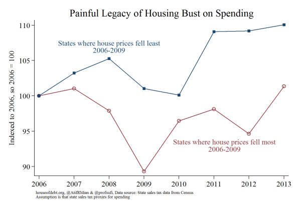
Sufi and Mian have made the academic case that spending before the recession really was driven by the “wealth effect” of rising home prices. People saw their housing values rocket up, and felt richer. Often, they took out second mortgages to spend. When the market crashed, so too did their finances. It may sound like an intuitive point to some, but it’s a key part of understanding why the recovery has been so underwhelming. The difference between states that got the full brunt of the housing collapse and states that didn’t, as shown in this chart, suggests that its scars are still very much with us. And they probably will be for a long while.