Here are a couple of great charts from the Lawrence Livermore National Laboratory which show the flow of energy through the American economy and its evolution over the past few years.
This is 2008 (click for big view):
And this is 2012 (big view):
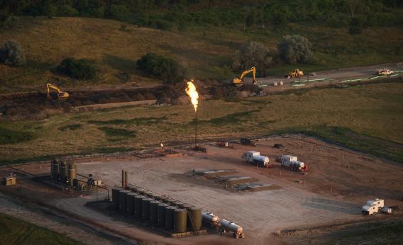
One thing you see here is the growth of natural gas, which comes out to a lot in aggregate but actually launched from a fairly high base. By contrast, solar remains a small niche player in the energy mix but almost tripled over five years while wind more than doubled.
But perhaps most interesting of all is the story of conservation here. The decline in coal and oil use was much larger than the growth in renewables since less energy overall was consumed.