Andrew Heisel’s Lexicon Valley article last year on single versus double quotation marks piqued the interest of Keith Houston, author of Shady Characters: The Secret Life of Punctuation, Symbols, and Other Typographical Marks. What follows is a condensed and updated extract from his book on the origins of the quotation mark and the confusion between its single and double variants.
* * *
The punctuation mark is a storied character. Its family tree extends all the way back to the second century B.C., when its earliest ancestor sprang into being at the ancient Library of Alexandria. The so-called diple, or “double,” was an arrow-shaped character (>) named for the two strokes of the pen required to draw it, and it was just one of a clutch of proofreading marks devised by a librarian named Aristarchus to help edit and clarify the library’s holdings. Aristarchus drew inspiration from his predecessor Zenodotus, who had created the first such mark a century earlier: by marking superfluous lines of text with marginal dashes, or lines (—), Zenodotus had invented the field of literary criticism quite literally at a stroke. Named for the Greek obelos, or “roasting spit,” the image of a dash transfixing erroneous text was later said to be “like an arrow, [which] slays the superfluous and pierces the false.”
Finding the obelos to be necessary but not sufficient to the task at hand, Aristarchus took Zenodotus’s dash and created an array of additional symbols to aid his work. The obelos reprised its role of marking spurious lines, but Aristarchus allied it with a new symbol called the asteriskos, or “little star.” Alone, the dotted, star-like glyph (※) called out material that had been mistakenly duplicated; together with an obelos, it marked a line that belonged elsewhere in the text at hand. Lastly, Aristarchus placed diples alongside lines that contained noteworthy text, while the diple’s dolled-up sibling, the diple periestigmene (⸖), or “dotted diple,” was used to mark passages where he differed with the reading of other critics.
The diple’s pointed shape belied its use as a comparatively blunt instrument. Highlighting anything from an engaging turn of phrase to some notable historical incident, the cryptic diple bore mute witness to whatever lay in the text. There is something of interest here, the diple announced, but you must find it for yourself. Even handicapped by this vague remit, however, the diple stuck around. Some ancient scribes preferred to indent or outdent notable lines, but for many others the diple remained the pre-eminent means of calling out important text.
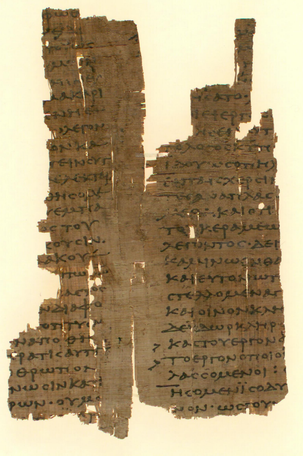
P.Mich.inv. 3689; Recto. Image digitally reproduced with the permission of the Papyrology Collection, Graduate Library, University of Michigan.
* * *
As valuable as Aristarchus’ critical marks had been to the pagan Greeks, they were of even greater importance to the new Christian establishment. The “Fathers of the Church” sought to clarify and disseminate the words of God’s Son and his greatest disciples, and so the asteriskos, obelos, and diple were all pressed into service in the name of the new religion. In the process, the diple’s use as a jack-of-all-trades was honed to a fine point: under Christianity, Aristarchus’ mark would gain a meaning worthy of its form.
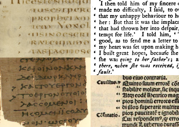
The volume of literature produced by and for Christians exploded along with the spread of the Church. Roughly 1 in 50 of all known second-century Western manuscripts are of Christian origin, but by the eighth century the ratio had risen to a staggering 4 out of every 5. Authors praised, commented upon, and attacked each other’s work, supporting their arguments with liberal quotations from the Bible—and what symbol could be more appropriate to the marking of this most noteworthy of texts than the familiar diple? By the time St. Isidore of Seville came to write about punctuation in his encyclopedic seventh-century book Etymologies, his description of the diple could be curt and unambiguous: “Our scribes place [the diple] in books of churchmen to separate or make clear the citations of Sacred Scriptures.”
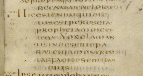
British Library, MS Harley 1775, f. 22. Licensed under Creative Commons CC0 1.0 Universal Public Domain Dedication.
Within the growing corpus of Christian writing, the diple branched out into roles beyond that of a marker of Biblical quotations. In a fifth-century manuscript titled Apology Against Jerome, a scholar named Rufinus of Aquileia berated his one-time friend and ally St. Jerome for subscribing to and later repudiating certain controversial beliefs. Then, as now, flip-flopping was not admired, and Rufinus was incensed by Jerome’s self-serving changes of heart. Taking care to distinguish his own words from those of his craven opponent, Rufinus wrote in his introduction that
In order that the insertions I am now making in this work from elsewhere may cause no confusion to the reader, they have single marks at the beginnings of the lines if they are mine and double ones if they are my opponent’s.
The “marks” Rufinus spoke of were diples, deployed singly or doubled up (>>) to distinguish between extracts from his own, earlier works, and those of Jerome. Readers who recall the early days of the Internet may find Rufinus’ doubled diple familiar: denizens of early online bulletin boards often used right-pointing angle brackets at the start of quoted lines to indicate the level of the reply. For instance:
>> Hello, how are you?
> I’m fine. How are you?
I’m also fine.
Though the diple kept its special place in Christian writing (and hence, in writing in general), it was buffeted over the centuries by successive leaps in scribal practices. Latin succeeded Greek as the language of record in the West; papyrus scrolls gave way to paged parchment books; and lowercase “minuscule” letters muscled in on traditional uppercase “majuscule” scripts. Amongst all this upheaval, the diple spawned an increasing variety of successors: by degrees, a series of “corrupt” or “debased” diples (to use the sniffy terminology of Patrick McGurk, a learned twentieth century chronicler of early citation marks) began to appear in its stead. Some writers decorated the traditional “>” with a dot in the wedge between their pen strokes, while other manuscripts of French origin rotated this form to yield a V-shaped mark that cradled the dot in upraised arms. Other writers played with the arrow-like form of the diple itself, creating alternative symbols that resembling the letters s or r, along with curved marks reminiscent of the modern comma. Curiously, Britain alone used a distinctively Anglo-Saxon variant consisting of two dots and a comma-like mark (..,).
By the close of the eighth century the plain old “>” was nowhere to be seen, and for the next seven centuries manuscripts hosted a messy riot of imposters acting in its place. Only the arrival of printing could deliver the defibrillating jolt necessary to bring this ragtag army of “debased” diples into line.
* * *
Writing and punctuation were fundamentally and permanently changed by the invention of movable type. Time-consuming luxuries such as hand-painted illustrations and elaborate, decorative marks of punctuation fell victim to the economies of scale enabled by this new means of production. The marking of quotations was affected too, and deeply so: For some reason that has never been fully understood, early printers were reluctant to cut punches for the diple or its divergent ranks of descendants and so the earliest printed books relied on a battery of temporary measures for marking quoted text. Quotations were rendered in alternative typefaces, enclosed in parentheses, or called out by means of nontypographic methods such as verbs of speaking. Some books, such as Gutenberg’s own Bible, did not bother to distinguish quotations at all.
But then, at the start of the 16th century, the diple was rebooted. The army of divergent handwritten diples was replaced, en masse and overnight, by simple double commas (,,). Derived from the slanted virgule (/), used to indicate a brief pause, the comma in its modern form was a relative newcomer in the world of punctuation, and its adoption by printers in lieu of the diple seems to be entirely without precedent. It was as though some anonymous printer had one day reached into a type case and pulled out the first mark that resembled a softened, curved diple—and that every printer afterward had slavishly mimicked them.
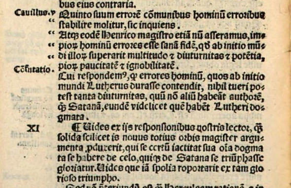
Tentatively at first, but with increasing assertiveness, the double comma made itself known in the new body of printed work. Published in 1525, Bishop John Fisher’s Defensio Regie Assertionis contra Babylonicam Capituitatem (roughly, Defense of the King’s Assertion against the Babylonian Captivity)—a short book with a long title, and one written in the finest traditions of internecine theological squabbling—provides a snapshot of the comma’s early usage as a quotation mark. In Fisher’s screed, doubled commas hung in the margin indicated lines containing quoted text, though not precisely where on those lines the quotation began or ended. Unlike the inward-pointing diple, Fisher’s commas were oriented so that they “opened” toward the text: Commas in the outer margin of right-hand pages were set as normal (,,), but those on left-hand pages were rotated by 180 degrees (“). Though the name would not be coined for another 250 years, the “inverted comma” had been born.
Despite the mostly familiar appearance of the quotation marks in Defensio, their usage was still in flux. Fisher used these double commas to indicate statements made by his opponent Martin Luther, but quotations from other sources (notably England’s King Henry VIII, in whose defense the book had been written in the first place) received no special treatment other than a parenthesized (inquit), or “he said.” Most tellingly, the scriptural quotations that were once the diple’s bread and butter were equally undistinguished. In the new humanist world, religion was beginning to lose its grip.
* * *
As the 16th century wore on, printers experimented with other methods of setting quoted material. The 1549 edition of a French book entitled Champ Fleury, for instance, set Latin quotations in italics, creating a precedent for later books to employ quotation marks or italics to call out text that their authors felt was worthy of note. The marking of such “gnomic utterances or sententiae”—weighty, proverbial or otherwise notable aphorisms—was immensely popular among readers and writers of the time: Writers had sententiae rendered in italic type or called out by quotation marks, while readers annotated them with symbols like the manicule (☞) or copied them into “commonplace books” for later reference. When a modern writer italicizes a word or words that they consider to be of particular importance, they are echoing a very old practice indeed.
There was, at the same time, a growing awareness of the distinction between the different kinds of quotations a writer might employ. John Whitgift’s deliriously titled 1574 book The defense of the answere to the admonition against the reply by T[homas] C[artwright] was stuffed with sententiae, general quotations, and points to be refuted, and he gave each one a different typographic treatment—yet somehow managed to do without quotations marks altogether. The author’s words were set in gothic script, while those of his opponents appeared in smaller letters in the same style; Latin quotations were rendered in italic and their translations in roman, as were references to scripture. Whitgift’s pathological avoidance of the quotation mark was not unique: The first printed editions of Shakespeare’s plays, published a few decades later, also made do without quotation marks. Where one character repeated the words of another, either the Bard or his printers had seen fit to use a simple colon or comma to introduce the quotation.
Then, around the end of the 16th century, quotation marks took two significant steps toward their modern form. First, inverted commas moved from their splendid isolation in the margin into the main body of the text itself, taking up station at the leftmost edge of each line in a quotation. The second breakthrough came in 1574, when a book of cautionary poems called The Mirour for Magistrates first used quotation marks to indicate direct speech:
“ O queane (quoth shee) that cause of warres hast beene,
“ And deadly ate, the like was neuer seen.
“ Come on, for these my handes shall ridde thy life,
“ And take reuengement of our mortall strife
Perhaps skeptical of the average reader’s critical faculties, and unable to use the inverted comma in its diple-esque role of inviting especial attention to a line, the printers of the later 1587 edition took the precautionary measure of prefixing pithy nuggets of wisdom with five-pointed stars. On occasion, these typographic stars were in alignment with quotations of direct speech:
“ Bee faithfull all: as brethren ought agree :
“ For ★ concord keeps a Realme in stable stay:
“ But discord brings all kingdomes to decay.
Unfortunately, the Mirour’s use of quotation marks in this way was a false dawn. The dizzying array of quotation marks, italics, and other typographic distinctions remained, with little sign of agreement on standard conventions of use. Handwritten documents, too, mirrored the indecision displayed by printed works: Direct and reported speech could be signaled by any one of a number of competing techniques such as virgules, underlining, or verbs of speaking, with inverted commas largely reserved for sententious remarks. The confused jungle of quotation methods had grown unruly once again.
* * *
When the inevitable pruning came, it originated in the 18th century’s newest form of literature, the novel. Eschewing the paraphrased, reported speech favored in earlier romances, the new breed of novelists presented readers with their characters’ unvarnished words, and with this new directness came a need to separate speech from narration.
Experimentation with new methods of setting dialogue accelerated. The 1765 edition of Defoe’s Moll Flanders indicated changes in speaker with paragraph breaks, though marginal inverted commas were retained for the occasional sententious quotation, which were also indented to further distinguish them from the body of the text. The 1748 edition of Samuel Richardson’s epistolary novel Clarissa also clung to traditional, per-line quotation marks when quoting from letters, though it made intermittent use of a new innovation: a single opening quotation mark (‘) was sometimes placed at the exact point at which a quotation began, with a pioneering “mark of silence,” or closing quotation mark (’), bookending quotations where they ended. For spoken dialogue, however, Richardson preferred to separate speakers with dashes or new lines. The early part of the eighteenth century also saw the words of alternate speakers set in roman and italic typefaces, while some works took the brute-force approach of presenting dialogue as stage play–like scripts, with each spoken line introduced by its speaker’s name.
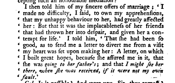
Gradually, the wayward scrum of previous centuries began to converge on a recognizably modern style. Samuel Richardson’s practice of explicitly opening and closing quotations was imitated in other works, and by the end of the eighteenth century marginal quotation marks had largely disappeared in favor of economical opening and closing marks. Verbs of speaking retreated first to parentheses within the dialogue itself and were later ejected from quoted speech entirely to lie between separate quotations, as demonstrated in The history of Eliza Warwick, an anonymous novel published in 1778:
‘Yes,’ answered I, ‘but I will soon follow you—your Huntley shall protect you in the unknown world you are launching into—he shall be your safeguard, your attendant, ever.’ “No,” cried she, with a firm voice, “no, I charge thee […]”
Not everything was settled yet. This quotation from Eliza Warwick highlights the problem that Andrew Heisel broached in the pages of this esteemed organ back in October: what were printers to do when both single and double quotes were available? Double commas had become so prevalent by the time Eliza Warwick was printed that type foundries usually cast them on single blocks of lead, making it easier to typeset a quotation than with pairs of individual commas, but precisely how these newly minted marks should interact with their singular siblings was still up for grabs. Eliza Warwick alternated between single and double quotes to differentiate between speakers in a dialogue; The Sorrows of the Heart, a contemporary work, used them instead to distinguish between direct and reported speech.
Finally, as the 18th century rolled over into the nineteenth, the growing pains of the double comma began to subside. Printers on both sides of the Atlantic had largely agreed on a practice of enclosing quoted text with matching pairs of opening and closing marks (“ ”), while the marginal marks that once followed quotations onto new lines were increasingly considered anachronistic. Direct speech, too, was now enclosed by double marks, with reported speech set off by their singular equivalents (‘ ’). Lastly, technical terms, ironic statements, and words as themselves—almost anything worthy of being quarantined from regular text, really—were most often set in exculpatory double quotes. Mr. Heisel’s favored pattern had been set: For everything bar reported speech, it was double quotes or nothing.
But trouble was brewing across the pond. For much of the past century, British writers and printers have set speech in precisely the opposite way to their American counterparts: direct speech in books published in the United Kingdom is most often enclosed by single inverted commas, with double quotes relegated to reported speech. It may have been that “Scotch” printers were responsible for introducing this deviation from the norm, as the English printer Henry Beadnell surmised in his 1859 Guide to Typography, but wherever this reversal of polarities had originated it went on to become standard practice in almost all British writing. Perhaps not unrelatedly, British writers have also historically tended to set technical terms, ironic statements, and the like in single quotes. All in all, the current confusion in American writing, as lamented by Mr. Heisel, bears more than a passing resemblance to established British practice.
There may yet be hope of reconciliation. Of late, Britain’s contrarian speech marks seem to be reverting to the once and future norm, and perhaps its ‘technical’ terms will one day do the same. Until that day arrives, take heart that whether you prefer single or double quotation marks, someone, somewhere, will be in agreement with you. The quotation mark, in both its guises, is still in rude health.
* * *
Excerpted and updated from Shady Characters: The Secret Life of Punctuation, Symbols, and Other Typographical Marks. Copyright © 2013 by Keith Houston. With permission of the publisher, W. W. Norton & Co. Inc. All rights reserved.
Follow @lexiconvalley on Twitter and on Facebook.