When you spend all your time in a book, you think you know it. All the editors at Merriam-Webster know Webster’s Third Edition, but now that we’re undertaking a revision of the beast, we’re ears-deep in it, drowning in stuffy single-statement definitions. Each of us breathes a bit shallower when we start futzing around with Philip Babcock Gove’s defining style, waiting for his ghost to dock our pay or perhaps cuff us upside the head as we sully his great work.
Add to this the fact that, it’s true, familiarity does breed contempt. At least once a batch, I look at a perfectly constructed definition, accurate and dispassionate to the point of inhumanity, and wish I could add a wildly inappropriate example sentence just to liven things up a bit, like
begonia n … 3 : a deep pink that is bluer, lighter, and stronger than average coral (sense 3b), bluer than fiesta, and bluer and stronger than sweet william—called also gaiety
I lit up like a used car lot. As I was at my desk on the editorial floor, and my cubemate was in a foul mood owing to an email he had received about the thesaurus entry for love, I very carefully laid my palms flat on my desk to keep myself from clapping and merely mouthed the words “average coral (sense 3b)” four times. It was, as far as I could tell, an accurate definition—but it was so evocative and full of personality that I began to wonder if it had been slipped in after Gove shuffled off this mortal coil and joined the editorial floor invisible.
So began a deep-pink goose chase through the Third, as I looked for fiesta, then sweet william, and then average coral. I eventually ended up at coral, where sense 3c yielded up the fresh wonder, “a strong pink that is yellower and stronger than carnation rose, bluer, stronger, and slightly lighter than rose d’Althaea, and lighter, stronger, and slightly yellower than sea pink.” Carnation rose was clearly the color of the pinkish flower on the tin of Carnation Evaporated Milk, and Rose d’Althaea was clearly Scarlett O’Hara’s flouncy cousin, but it was the last color that captivated me. “Sea pink,” I murmured, and incurred the harumphing wrath of my neighbor. As he stalked off to find a quieter corner, I wanted to stand up and shout, “I grew up 1,500 miles from an ocean! I didn’t know the sea was pink!”
The Third’s color definitions became my break from defining or proofreading. After staring into the middle distance for a few seconds, I’d think of a color and look it up in the Third, invariably ending my chromatic excursions with a fool grin on my face.
Vermillion: “a variable color averaging a vivid reddish orange that is redder, darker, and slightly stronger than chrome orange, redder and darker than golden poppy, and redder and lighter than international orange.”
Lapis lazuli blue: “a moderate blue that is redder and duller than average copen and redder and deeper than azurite blue, dresden blue, or pompadour.”
Cadet: “a grayish blue that is redder and paler than electric, redder and duller than copenhagen, and less strong and very slightly redder than Gobelin.”
Electric! Copen! International orange! Prior to begonia, the Third was a middle-aged management man with a Brylcreemed combover, in well-pressed shirt sleeves and pants that were a bit too tight at the waist, full of busy self-importance. Now, he was the same middle-aged manager, but unbeknownst to the rest of the office, he danced flamenco on the weekends.
How did all this flamenco dancing slip past Gove, the authoritarian curmudgeon who oversaw the creation of Third?
Of course, nothing of this magnitude would have slipped past Gove. The color definitions in the Third were very carefully engineered in accordance with Gove’s vision of a dictionary that was not only completely objective and precise, but was also the most scientifically minded dictionary of its day. One only need look as far as the masthead of the Third to see the lengths that Gove went to: 202 lengths, all listed under the tidy heading, “Outside Consultants.” These consultants were pedigreed and heavily degreed experts in their respective fields, and their job was to provide direction for specialty areas that in-house editors may not have had much experience with, such as the Mayan calendar, traffic regulations, and (gasp) coffee. Gove took his color definitions seriously. There are seven consultants listed for color; there are only four total consultants for mathematics and physics.
The color definitions in the Third are a meeting of old and new. The chief color consultant for the Third was Isaac H. Godlove, a man whose name means nothing to you unless you study the history of color theory. Since fewer people study the history of color theory than do lexicography full time, I will tell you that Godlove was the chairman of the Committee of Measurement and Specification of the Inter-Society Color Council, a member of the Colorimetry Committee of the Optical Society, director of the Munsell Research Laboratory (which gave rise to the Munsell Color Co., a company that was evidently formed specifically to standardize colors), and a guy whose business cards must have been double-thick fold-out jobbies. He was also the color consultant forWebster’s Second New International Dictionary.
For Webster’s Second, Dr. Godlove developed a system of defining colors by hue, saturation, and brilliance. Cherry, for instance, is defined in the Second as “A bright-red color; specif., a color, yellowish-red in hue, of very high saturation and medium brilliance.” If this doesn’t call to mind an exact color—and I don’t see how it could unless you were a colorimetrist—the Second helpfully requests that you also see the entry for color. The entry for color is three columns long in the Second, begins with the label “Psychophysics,” and includes a lively discussion on the different ways to measure hue, the nature of light waves, and the neurochemical impulses that, when combined, potentially yield the sensation we refer to as “color.” There are graphs and two color plates. It is serious business.
Godlove’s work as a colorist was brilliant, and Gove likely knew it. (He may have been a workaholic perfectionist who pioneered the Rule of Silence, but he wasn’t a moron.) To duplicate this sort of defining system would have cost time and money, and Gove hated anything that breathed inefficiency. It seemed best, then, to use the framework that Godlove had set up for the Second.
There was one snag: These standardized definitions that appealed to an objective standard set up by The Standards People couldn’t stand on their own. Every definition followed the same pattern: “a color, [color name] in hue, of [high/medium/low] saturation, and [high/medium/low] brilliance Cf. COLOR.” But apart from one reference to an indistinct and very subjectively observed color, like “yellowish yellow-green” at “holly green,” there was nothing in the definition to orient the casual reader apart from the color plates given at the colossal brain-twisting entry at color. And, of course, there weren’t color swatches for every color defined in the Second. “Holly green” is only the yellowish yellow-green that is of low saturation and medium brilliance, whatever that may be.
Gove called Godlove back in to work on the color definitions of the Third, and to entice him, he gave him a team of color theorists to boss around. As astonishing as it sounds, color names had been increasingly standardized since the 1930s, and their use had even been analyzed in mass-marketing—very sciencey!—and these guidelines and findings were to be incorporated into the Third. Who better to do this than the man who helped pioneer color standards?
The working files for the Third begin with the Black Books: our editorial style guide as written by Gove and adhered to by editors under pain of death (or a stern note from Gove, which was essentially the same thing). The Black Books are 600-plus pages of single-spaced directions filed in loose-leaf black binders, and they used to sit on the top of one of our long banks of citation drawers, lending that little warren an air of regimented malevolence. You only had to look at them to feel the ghost of Gove march past you, wondering why you were gawking instead of busting your hump on the E file.
The Black Books have much to say on many things, but less to say on the color definitions than you’d think. Perhaps the very first sentence is all that Gove needed to say: “Godlove’s psychophysical defs of color names and their references had better be regarded as sacrosanct.” Full stop. General editors were absolutely not to be mucking about in the color definitions.
Gove let Godlove use the latest scientific techniques in discussing color: There are color plates in the Third, as there were in the Second, and there is an entire page devoted to explaining the color charts and descriptive color names in the Third, as well as a five-page long dye chart tucked neatly in between the first and second homographs of the word dye. (The explanation of color charts in theThird abandons the discussion of psychophysicality and favors equations. Very Cold War.) But there are two big differences between the Second and the Third.
The first is that the color definitions in the Third were to be relational—that is, every color could be defined as being more or less of something than another color entered in the Third. Formulaic statements regarding the hue, saturation, and brilliance (now called “lightness”) of a color were insufficient. The other revolution is that the analyzed work of “color specialists from Sears Roebuck and Montgomery Ward,” as Gove put it, would be used in defining the color names in the Third. In other words, users of the Third were not just going to get the names of colors that were considered scientific standards: They were going to get the names of this fall’s fashions in the Monkey Ward’s catalog. Gove sums up: “The range therefore is in the direction of the layman.”
And what a kaleidoscope the layman got. You could spend an hour alone getting lost in cerise (“a moderate red that is slightly darker than claret (sense 3a), slightly lighter than Harvard crimson (sense 1), very slightly bluer and duller than average strawberry (sense 2a), and bluer and very slightly lighter than Turkey red”). No doubt people did. That may explain why we don’t define colors this way anymore.
The Third, with its zeal for modernism and science and objectivity, sometimes lost sight of the forest for all the xylem and phloem. As specific as the definition of cerise is—and as smart as I am—all I get out of that is that cerise means “moderate red” and that there is more than one sense of “Harvard crimson,” which must really piss Yale off.
Let’s also take into account that if we’re doing our job—defining from citations—then colors are frustratingly, pound-on-the-desk difficult to pin down. Text-only citations give you absolutely nothing to go on: “Misses large, available in Cranberry, Olive, Cinnamon, Ochre, Cadet, Holly, Taupe.” These might as well be the names of the Seven Dwarves for all the information they give me.
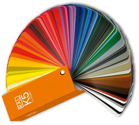
Clearly, then, you need a color swatch. That should make matters easier. Here’s a swatch for you:
That is a quick Google image search for “taupe color swatch.” Some of those colors are distinctly not what I think of when I think of “taupe.” And that’s part of the problem.
Even taking printing or monitor differences into account, the fact is that the use of color names is standard, but the things those names represent are not. One man’s taupe is another’s beige is another’s bone is another’s eggshell is another’s sand is another’s tan. By the time I came around, we had given up on Godlove’s precision and instead gave the very first part of the Third’s definition for most colors: Cerise is, in the Collegiate, “a moderate red.” That’s not terribly specific, but it does allow for variations in reproduction, marketing uses, and psychophysical observations of a wide variety of colors that are called “cerise.” (Please do not tell me you are red-green colorblind.)
The only place where a little poetry comes back into the dictionary is at the definitions for the basic ROYGBIV: the colors of the visible spectrum. In defining those colors, we hearken back to generations of lexicographers before us (even back to Grumpy Uncle Noah) and play a bit of word association: When I say “blue,” the first thing you picture is … what?
For some poor schmuck, stuck indoors at some point in the 1850s revising Webster’s 1847 dictionary, blue was the clear sky. Collegiate definers have determined that red is blood or rubies. Green is growing grass, or maybe it’s emeralds, and yellow is ripe lemons or sunflowers. Whimsy does still take a backseat to practical matters, though. Orange presented problems—after all, what’s orange? Oranges, of all things, and you can’t say, with a straight face, that the color orange is the color of oranges without deserving a good smack.
You’d think that this word association would work well enough, but there’s always tweaking that needs to be done. Cerise, for instance, is the color of … what, exactly? I’ll tell you what: It is the color of a suit set my grandmother owned and only wore to Christmas brunches at the Aviation Club, where she would sit me down in my velveteen layer-cake of a holiday dress and demand my silence while she and Mrs. Tannendorf would drink mimosas and bloody marys and pine for the good old days of Eisenhower. That suit is, I am telling you, exactly cerise, but that doesn’t do you much good, does it?
You also can’t make sweeping assumptions about your reader. Sunflowers are yellow—but chances are good that if someone learning English knows what the word sunflower means, they probably know what yellow means as well. We had to get a bit more creative when we wrote our own ESL dictionary (here the ghost of Gove frowns): Orange in our Learner’s Dictionary is not a color between red and yellow, as it is in the Collegiate. It is the color of fire or carrots.
It’s not that these picturesque color definitions are more correct or incorrect than the definitions before them. But defining colors is a bit like defining the word love: likely to make you sound like a nitwit in the real world. You could argue that a straight-up scientific approach is best, that no comparisons should be made at all in color definitions. But after the labyrinth of the Third’s “cerise,” the simplest route is beguiling: Yellow is the color of the sun or ripe lemons. Green is grass; red is blood, brown is coffee or chocolate. And blue is still the color of the clear sky.
(Please do not tell me you are blue-green colorblind.)
A version of this post appeared on Harmless Drudgery.
Follow @lexiconvalley on Twitter or on Facebook.