The following is the third of three excerpts from Keith Houston’s new book, Shady Characters: The Secret Life of Punctuation, Symbols, and Other Typographical Marks.
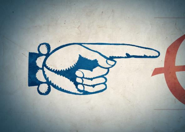
Unlike the pilcrow, which wended its way from K for kaput to the more familiar ¶ over a millennium, or the octothorpe, which metamorphosed from “lb” to ℔ and then #, the manicule’s bluntly representational form has remained nearly unchanged since its earliest reported instances. Once, there were no manicules; then, springing fully formed into existence, there they were.
The earliest attested manicules appeared in the Domesday Book, the exhaustive survey of England carried out for William I in 1086. The “Winchester Roll” or “King’s Roll,” as it was called at first, was intended to be an authoritative record of land ownership—a “doomsday” judgment from which no deviation would be brooked, occasioning the book’s later nickname. Frustratingly, the only direct reference to the manicules used in this nine-hundred-year-old document is a brief aside in a rambling 1824 treatise on the art of Typographia. Its author, John Johnson, lists “☞” (no name is given) alongside other “marginal references” such as the Maltese cross (✠), the ancient Greek asteriskos (※), the dagger (†), and a bevy of apparently abstract geometric symbols, then dismissively writes that these inscrutable marks “in most instances explain themselves.” He says no more on the subject.
The manicule next surfaced in the twelfth century, though solid facts about its use in this period are thin. Geoffrey Ashall Glaister’s comprehensive Encyclopedia of the Book describes the symbol as the “digit,” and alleges that it was “found in early twelfth century (Spanish) manuscripts.” As with Johnson’s dismissal of the Domesday Book’s “self-explanatory” reference marks, Glaister’s factoid is dashed off with no corroboration (this author has come across at least one twelfth-century English book displaying a manicule), and detailed information about this early chapter of the manicule’s life remains tantalizingly out of reach.
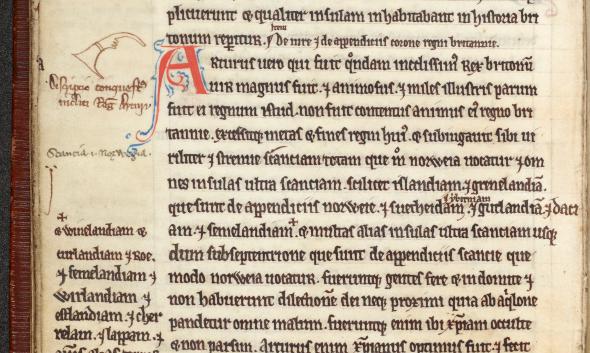
Ryland Medieval Collection, Latin MS 155, fol. 70 recto. Reproduced by courtesy of the University Librarian and Director, The John Rylands Library, The University of Manchester.
Starting in the fourteenth century, life in Europe began to shift away from medieval norms. New trade routes to the Orient and the assimilation of Arabian trading practices broadened Western horizons, while the fusty ranks of monks and theologians who had dominated academic study for centuries gave way to a new breed of “humanists” emanating from Florence, Naples, and other wealthy Italian city-states, and who concerned themselves with matters of earthly rather than divine import. In 1453, this flowering of intellectual life intersected with two seismic political events felt across the Continent: Constantinople fell to the ascendant Ottoman Turks, sending a stream of Greek scholars and ancient texts to the West, and the cessation of the Anglo-French Hundred Years’ War brought peace—if only a temporary one—to northern Europe. The Renaissance was in full bloom, and by some definitions the modern world itself was at hand.
Whatever its status had been in the murk of the eleventh and twelfth centuries, the manicule became a firm favorite of the Renaissance humanists. Commenting and building on classical works once derided as pagan frippery, for the next three hundred years, humanist scholars populated the margins of their Ciceros, law manuals, and notebooks with pointing hands drawn in a remarkable variety of styles. The most basic were nothing more than fists with an index finger extended to indicate some word or line of interest, though the appearance of even these simple pointing hands varied according to the artistic gifts of their creators. The fourteenth-century Italian scholar Petrarch (often credited as the father of humanism) had the disconcerting habit of giving his manicules a thumb and five fingers, whereas a hundred years later, those of his countryman Bernardo Bembo1 were the very model of anatomical accuracy.
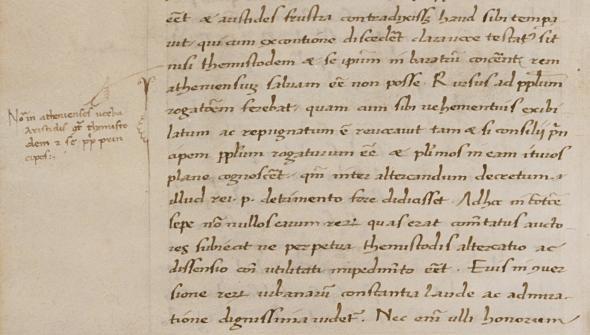
New York, Columbia University, Rare Book and Manuscript Library, Plimpton MS 025, fol. 56 verso.
Some manicules terminated abruptly at the wrist, while others emerged from sleeves of varying sophistication to reveal, in turn, something of the fashions of their time. Petrarch’s flowing sleeves, for instance, gave way to delicate, lace-trimmed cuffs in later centuries, and continuing the trend, modern-day manicules often show the sober cuff of a suit-wearing businessman. Cuffs and sleeves also provided convenient containers for notes on the pointed-to material, binding a note to its target text.
If a reader’s interest stretched to a few lines or a paragraph, a manicule’s fingers could be elongated to bracket the required text; in some extreme cases, inky, snake-like fingers crawl and intertwine across entire pages to indicate and subdivide relevant text in a horror-film parody of the hand’s physical form. Very occasionally, manicules were not manicules at all; in one fourteenth-century Cicero a five-limbed octopus curls about a paragraph, and in a seventeenth-century treatise on the medicinal properties of plants, tiny penises point out discussions of the male genitalia.
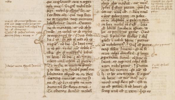
BANC MS UCB 045. Part 1, text 1, fol. 1 verso. Courtesy of the Bancroft Library, University of California, Berkeley.
Despite the familiarity and ease with which readers deployed manicules, the mark somehow contrived to go without a commonly accepted name for much of its life. In studying the symbol, William H. Sherman discovered no fewer than nine distinct terms by which it was known: in addition to Sherman’s preferred “manicule,” at one time or another the ☞ was called a “hand,” “hand director,” “pointing hand,” “pointing finger,” “pointer,” “digit,” “index,” or “indicator.” “Indicule,” “maniple,” and “pilcrow” have also been bandied around as names for this severed mitt, though all three are incorrect: “indicule” is most likely a simple mishearing or conflation of “indicator” and “manicule,” “maniple” denotes a handkerchief-like vestment sometimes worn by Catholic priests, and veteran punctuation-philes will no doubt perceive a simple case of mistaken identity behind the erroneous use of the word “pilcrow.”
This welter of competing aliases may stem from the intensely personal nature of the mark. Though the manicule was part of the furniture of the written page for centuries, it was not a mark of punctuation provided by the writer for the edification of the reader but a part of the apparatus of reading itself, a visual breadcrumb inked into the margin by and for one particular reader. A manicule placed to the right of a line may be of vital significance to me, for instance, but utterly unimportant to you; one reader’s manicule is another’s nuisance to be ignored, avoided, or removed. Indeed, some book collectors prefer to “restore” the cluttered margins of annotated books to their original, pristine cleanliness—or barren emptiness, according to your interpretation—and it may simply be that the manicule never warranted an agreed name.
The term “manicule” itself, taken from the Latin maniculum, or “little hand,” is only used of necessity; having granted the symbol a common name, paleographers can finally get on with investigating the many hands pointing the way through the margins of Renaissance life.
________________________________________
1Bernardo Bembo was the father of Cardinal Pietro Bembo, whose account of a journey to Mount Etna was published by the Venetian printer Aldus Manutius. Manutius commissioned his punchcutter, Francesco Griffo, to create a new type for the work; modern versions of the elegant, readable typeface Griffo designed for De Aetna are still in use today and are named Bembo after Manutius’s eminent client. Notably, Griffo also went on to cut the first italic letters, modeled on the handwriting of Niccolò Niccoli, an earlier Renaissance humanist.