The following is the second of three excerpts from Keith Houston’s new book, Shady Characters: The Secret Life of Punctuation, Symbols, and Other Typographical Marks.
Just as the Latin word kaput stood for a section or paragraph, so later the diminutive capitulum, or “little head,” came to be used in the same fashion. Even though the Roman letter C had all but seen off the older Etruscan K by 300 BC, the orphaned K for kaput persisted in written documents for centuries more. By the twelfth century, though, C for capitulum had taken K’s job, and many of the religious documents that formed the bulk of Western civilization’s written works were studded with C’s dividing them neatly into capitula, or “chapters.”
The interdependence of Christianity and the written word is nowhere better illustrated: C for capitulum was enthusiastically adopted by the monks who painstakingly copied the Church’s books, and their use of capitulum to denote a section of a written work ultimately gave us the name and concept of the “chapter.” Capitulum and “chapter” were so closely identified with ecclesiastical documents that they soon permeated Church terminology in a bewildering number of ways: monks went ad capitulum, “to the chapter (meeting),” to hear a chapter from the book of their religious orders, or “chapter-book,” read out in the “chapter room.”
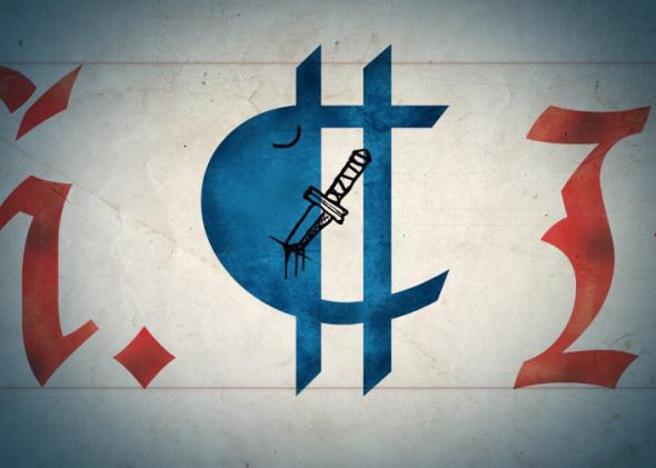
Monastic scriptoria worked on the same principle as factory production lines, with each stage of book production delegated to a specialist. Depending on the relative wealth of a given monastery, this process sometimes began even before a scribe put pen to paper, with the preparation of animal-hide parchment using the skins of livestock reared on the monastery’s land. With parchment in hand, whether produced by the monastery itself or bought from a professional “parchmenter,” a scribe would then painstakingly copy out the body of the text, often by lamplight (candles were forbidden because of the risk of fire). He would take care to leave spaces so that a “rubricator” could later embellish the work with elaborate initial letters (or “versals”), headings, and other section marks. Named for the Latin rubrico, “to color red,” rubricators often worked in contrasting red ink, which not only added a decorative flourish but also guided the eye to important divisions in the text. In the hands of the rubricators, C for capitulum was soon accessorized by a vertical bar, as were other litterae notabiliores in the fashion of the time; later, the resultant bowl was filled in and so ¢ for capitulum became the familiar reversed-P of the pilcrow.
New York, Columbia University, Rare Book and Manuscript Library, Plimpton MS 092, frag. 1 & 2 verso.
As the symbol’s appearance changed, so too did its usage. At first it only marked chapters, but soon after it started to pepper texts as a paragraph or even sentence marker, breaking a block of running text into meaningful sections as the writer saw fit. ¶ This style of usage yielded very compact text, harking back, perhaps, to the not-so-distant practice of scriptio continua. Ultimately, though, the utility of the paragraph overrode the need for efficiency and became so important as to warrant a new line—prefixed with a pilcrow, of course.
¶ The pilcrow’s name—pithy, familiar, and archaic at the same time—moved with the character during its transformation from C for capitulum to independent symbol in its own right. From the Greek paragraphos, or paragraph mark, came the prosaic Old French paragraphe, which subsequently morphed first into pelagraphe and then pelagreffe. By 1440 the word had entered Middle English, rendered as pylcrafte—its second syllable perhaps influenced by the English crafte, or “skill”—and from there it was a short hop to its modern form. The pilcrow had been given form, function, and name.
¶ Having attained such a singular importance, the pilcrow then did something remarkable. It committed typographical suicide.
¶ Taking pride of place at the head of every new paragraph, the pilcrow had carved out a niche for itself at the heart of late medieval writing. Boldly inked by the rubricator, the marks grew ever more elaborate and time-consuming to add. Unfortunately, the deadline is not a modern invention. On occasion, time would run out before the rubricator could complete his work, leaving undecorated the white spaces carefully reserved for pilcrows, versals, and other rubricated marks. With the advent of the printing press in the mid-fifteenth century, the problem was compounded. The first printed books aped handwritten works as closely as possible, leaving gaps in the printed text for the rubricator to later fill by hand, and as the volume of printed documents grew exponentially, it became increasingly difficult to attend to them all.
¶ The rubricated pilcrow became a ghost: its brief reign as the de facto paragraph mark was over, usurped by the indented paragraph.