In perhaps the biggest emoji news since the loss of Apple’s peach butt last November, Google is saying goodbye to the blob. At its annual I/O developers conference Thursday, the company announced what it’s billing as a “full redesign of the Android emoji font,” scrapping its infamous blob-like emoji in favor of more conventional, circular icons. The move coincides with the upcoming release of a new version of Google’s Android operating system, Android O, and will become available across all the company’s platforms this fall.
Unless you’ve seen them in action (or sent them yourself), it’s tough to convey just how bizarre the blob emojis really are. On Thursday, Google’s creative director, Rachel Been, and product manager Agustin Fonts delicately described them as “asymmetric and slightly dimensional shape[s]” in a Medium post. But they’ve also been in the targets of less flattering language. “Emoji intended to represent people look more like thumbs,” joshed the Verge’s Chris Welch. The icons “look like someone dropped Bart Simpson in a deep fryer,” groused David Goldman of CNN. UPI’s Eric DuVall dubbed them “a cross between melted lemon drops and the yellow ghost in Pac Man.” And as Shona Ghosh quipped in Business Insider, “Some of them are downright scary, others have a quirky charm to their squished expressions.”
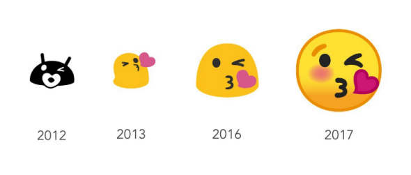
Google’s blob emojis first burst onto the scene way back in 2013 with the release of Android 4.4. They’ve been ubiquitous ever since 2014 when, as Emojipedia’s Jeremy Burge wrote last Wednesday, a system upgrade codenamed “Lollipop” gave smiley emojis and Android’s more human-looking icons the blob treatment, standardizing them across the company’s various platforms. But the pace of blobification slowed last year with the release of a new version of Google’s Android operating system, the Android N, which shaved off some of the emoji’s girth and left them looking like emotive gumdrops, the Guardian reported Tuesday. Android O, N’s successor due out this fall, gets rid of the bottom-heavy blobs entirely, purging them from Gmail, Google Plus, and Google Hangouts.
As Fast Company’s Mark Wilson reported Thursday, the change is the result of an 18-month-long design slog to reinvent Google’s approach to emojis. According to Wilson, Android N’s introduction of detailed, human-looking female emoji “clashed with Google’s existing, dumpy, gum drop” style. “We started asking, ‘do we need a stylistic overhaul to bring in one cohesive piece?’ ” Google’s Rachel Been told Fast Company. As UPI reported, critics also knocked Google emoji’s small size, which left some users squinting in an attempt to discern what moods their contacts were trying to convey.
But Google’s squat blobs aren’t merely a vestigial aesthetic quirk—they’re also a competitive disadvantage in the very serious emoji business. Apple’s iOS 10 featured “a higher a level of detail in the designs—and an adoption of the standard round yellow faces for smilies” that Google’s blobs were hard-pressed to compete against, said the Guardian. Android’s redesigned rounded icons also take after those of Microsoft, another top competitor. Google didn’t prominently tout the recent changes at I/O, suggesting some sense of sheepish defeat on the company’s part, Fortune reported Thursday.
According to CNN, Android O’s redesigned emoji will include a slate of cartoon countenances designed by Unicode, a nonprofit tech industry consortium that works to ensure that the icons display identically across different species of smartphone. “We spent a long, long time making sure that we addressed cross-platform emotional consistency,” Been and Fonts wrote Thursday. “Because one of our main goals with the redesign was to avoid confusion or miscommunication across platforms, we wanted to assure the user that when they sent an emoji to a friend, the message was clearly communicated regardless of whether they are on iOS, Windows, Samsung, or any other platform.”
And as Mashable reported Friday, Android O will also do away with the pesky problem of emojis that show up as blank icons if users haven’t updated their software lately, filling in the reimagined visages with older versions. The redesigned emojis will also be the default choice, preventing users from reverting back to the old versions once they’ve updated to Android O (whose beta version dropped Friday).
You wouldn’t think that a round, yellow smiley face, popularized by such decades-old properties as Walmart and the Watchmen series of graphic novels, would clear the bar of digital-age technological innovation. Google’s change is the quirky product of an online communications landscape increasingly dominated by images. In this ecosystem, emojis either have to shape up or blob on out. As the New York Times so bluntly put it in January, “The Internet is brutal to mediocrity.”