On Monday, Google rolled out its new Maps design. You’ve probably already forgotten what the old one looked like, but the new version is cleaner and makes more sophisticated use of its power to show different features at different zoom levels.
It also represents the company’s ongoing efforts to transform Maps from a navigational tool to a commercial interface and offers the clearest proof yet that the geographic web—despite its aspirations to universality—is a deeply subjective entity.
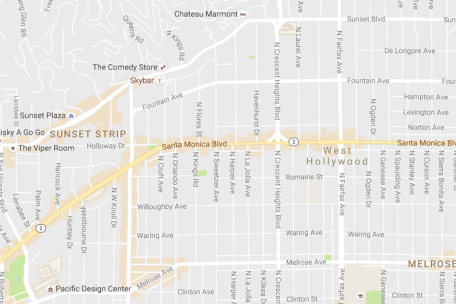
Instead of promoting a handful of dots representing restaurants or shops at the city-view level, the new interface displays orange-colored “areas of interest,” which the company describes simply as “places where there’s a lot of activities and things to do.” In Los Angeles, for example, there’s a big T of orange blocks around Wilshire Boulevard and Vermont Avenue in Koreatown, and again on Wilshire’s Miracle Mile, stretching up La Brea Avenue.* In L.A., areas of interest tend to cling to the big boulevards and avenues like the bunching sheath of an old shoelace. In Boston, on the other hand, they tend to be more like blocks than strips. In Paris, whole neighborhoods are blotted orange.
Roads and highways, meanwhile, take on a new, muted color in the interface. This marks a departure from Google’s old design, which often literally showed roads over places—especially in contrast to Apple Maps, as Justin O’Beirne, who writes about mapping apps, has shown. The new map is less about how to get around than about where to go.
“Areas of interest,” the company’s statement explains, are derived with an algorithm to show the “highest concentration of restaurants, bars, and shops.” In high-density areas, Google candidly explains that it is using humans to develop these zones. Algorithms, of course, are tuned by human engineers. But like Facebook with its News Feed, Google has decided that some attributes of the digital world need a human touch firsthand.
Screenshot via Google Maps
You can learn a lot about a city from its patterns of commercial development, as a planner and a visitor. To me, Google’s new interface is an invitation to explore. Commercially busy districts are the ones where the people are. That’s good walking. It’s a flâneur’s guide to the city.
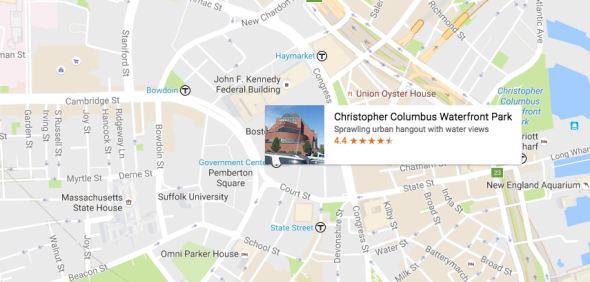
That’s not all, of course. Zoom in further to an “area of interest” and commercial establishments pop out like mushrooms after the rain. It’s been only seven years since Google added places to its maps, and for several years, the company stuttered through a series of half-measures to integrate commerce and mapping. But with Google My Business, which debuted in 2014, the company has made it easier for retailers, restaurants, concert venues, and everyone else to update their own information in the map. The platform has since absorbed much of the Yellow Pages and more. The interface shows virtually everything about a restaurant or store that Yelp does—and also shows what times of day people visit and in some cases, interior maps.
Google seems to be betting that its map, as much as its search function, will lead you to spend money in the real world. Mobile usage surpassed desktop usage for Google Maps way back in 2011, and globally, consumers are buying more than six times more smartphones than computers. The more we research our designations on the go, the greater the influence of the map on real-life commerce.
Even with its sliding scales, Google Maps can’t fit every shop in Tokyo in a two-dimensional map. So who gets a spot? It’s not an obvious choice: Analyzing Apple and Google’s maps of New York and London, O’Beirne found that the two companies’ maps had just 10 and 12 percent of their place labels in common. (Likewise, different people will have different businesses pop at them—try it with a friend.)
With “areas of interest,” Google expands its geographic influence with methods that aren’t totally obvious. In New York, it’s not clear to me why Second Avenue in the East Village (orange) takes precedence over 1st Avenue (white), or why SoHo’s Prince Street (orange) takes precedence over Spring Street (white). And yet: if I had an afternoon in a new city, I’d sooner take a walk in an “area of interest” than elsewhere. Google Maps aims to capture the experiences of city-dwellers with its choices, and it will shape them too.
Tourist office paper maps have long done something similar, highlighting or enlarging commercial streets where their sponsors ply their trade. But the scale of Google’s enterprise, obviously, is quite different.
I’m sure internet cartographers are hard at work analyzing the distribution of “areas of interest” and where they fall. One thing I’ve noticed so far is that they don’t correspond to commercial density in a way that is neat or simple. Broadway in New York’s SoHo is not an “area of interest,” though it is among the busiest commercial thoroughfares in the world. It doesn’t need Google’s seal of approval. But why doesn’t it have one?
Mapping has always been as much art as science, less mathematical or objective than it purports to be. The new Google Maps makes that easy to remember.
Correction, April 15, 2019: This article originally misidentified Justin O’Beirne as a cartographer. He writes about mapping apps.
Correction, July 27, 2016: In an earlier version of this post, Wilshire Boulevard was misspelled.