When it comes to climate change, it’s often difficult to convey an appropriate sense of urgency. After all, this is a problem that been building for decades, and will take decades of coordinated effort to solve.
Still, something especially troubling is happening at a planetary scale this year. The first three months of 2016 have been so ridiculously warm that our planet is already a shoo-in to record the warmest calendar year since records began. El Niño is a big factor in why this global step-change is happening right now, but it’s not the whole story. Most of the current warming, at least when compared to pre-Industrial Revolution levels, is the direct result of greenhouse gas emissions.
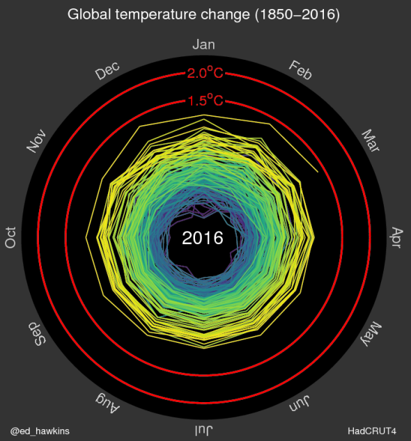
Using data from the U.K. Met Office’s Hadley Centre, Ed Hawkins, a climate scientist at the University of Reading, constructed an affecting animation:
The first thing you’ll notice is that the outward progression (warming) of the temperature spiral is picking up the pace in recent years. This year, temperatures are flirting with 1.5 degrees Celsius above pre-industrial levels, and it’s easy to see that 2 degrees isn’t that far off.
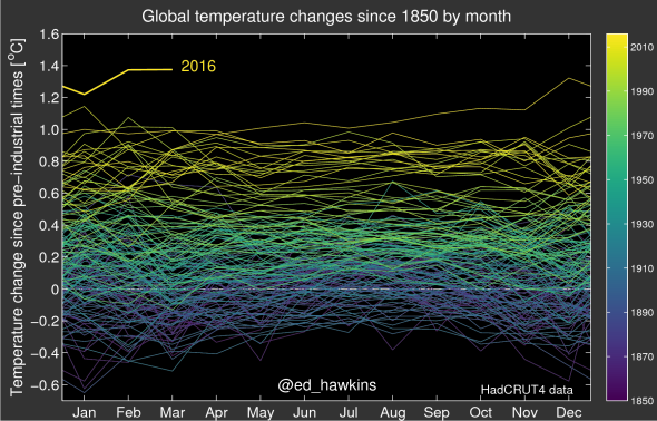
Hawkins says the idea for the animation came from his fellow climate scientist Jan Fuglestvedt, a vice chair of the Intergovernmental Panel on Climate Change, after Fuglestvedt saw one of Hawkins’ previous visualizations of global temperature (below) and suggested a spiral version.

Ed Hawkins
Earlier this year, according to a slightly different base line, global temperatures briefly crossed the 1.5 degree Celsius level—which vulnerable small island states warned at last year’s Paris climate negotiations was a dangerous threshold. Not coincidentally, over the past few months, large sections of coral reefs around the world have been killed by the abnormally warm temperatures—further stressing the fragile ecosystem and economic base on which many island societies depend.
Depending on how you calculate the years that define “pre-industrial,” humanity has probably already locked in crossing 2 degrees Celsius sometime in the next 15 years, at least briefly. That’s because there’s a lag in the climate system related to how long it takes the oceans to absorb the atmosphere’s excess heat. It’s at that point, or perhaps sooner, that further impacts will appear—like a virtually ice-free Arctic Ocean during the summer.
When looking at the spiral animation, Hawkins says, “the pace of change is immediately obvious, especially over the past few decades.” The dangerous acceleration of global temperatures as humanity approaches these thresholds is also clear, Hawkins says, “without much complex interpretation needed.”
Good visualizations won’t be enough for us to ramp up climate change efforts. But this particular visualization is just about the best I’ve ever seen.
