It’s easy to forget sometimes how much the aesthetics of the Internet have changed in the past 20-odd years. Now, however, Berlin-based Web designer Fabian Burghardt has developed a site that makes it easier to remember just how far we’ve come.
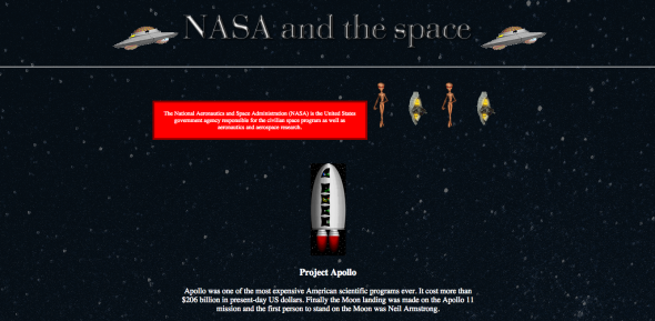
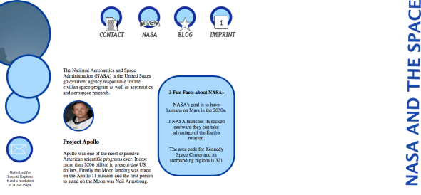
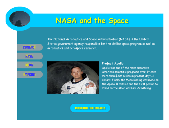
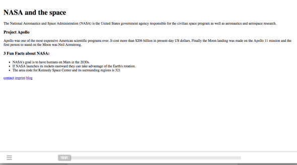
Burghardt’s “Evolution of Webdesign” invites us to take a stroll through the past, looking at how the same Web page might have appeared at regular intervals over the decades, from 1991 to 2015—an “imitation” of changing trends, as he puts it. Simulacra rather than true copies, the pages don’t actually reflect NASA’s own understanding of design, but instead simply serve to reflect Burghardt’s research into the history of Web stylistics more generally. With the help of a scroll bar at the bottom of the screen, visitors can jump backward and forward in time, examining different versions of an imaginary informational page about NASA and the Apollo program. Though each version presents the same basic details, in sequence they tell a compelling story about the gradual transformation of stylistic norms.
fabianburghardt.de
Some members of Reddit’s r/InternetIsBeautiful have complained that Burghardt’s project presents a limited vision of the Web’s history. One user writes that it reflects personal website design more accurately than it does Internet aesthetics as such, linking to cached versions of NASA’s own Web pages for evidence. Burghardt, for his own part, acknowledges that his approach has limitations. On his site’s “About” page, he writes, “It was hard to reduce every year to some specific features and it’s kind of relative for each person, but I hope you enjoy this little journey.”
fabianburghardt.de
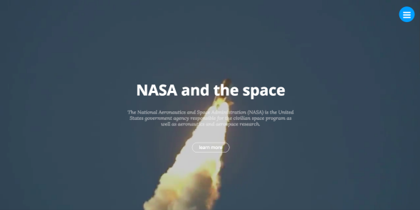
Despite that difficulty, many of the years feel uncannily accurate. The 1999 take, for example, features cheesy, primitive animated GIFs of aliens and flying saucers, while an unkillable audio track plays in the background. For me, these images bring up slightly embarrassing memories of my own early fumbling in HTML. By contrast, 2015 looks as if it were developed directly from a Squarespace template. Though it’s far more elegant than its antecedents, it also lacks the dopey personality that many of them exhibit.
fabianburghardt.de
While it’s probably best not to slip into nostalgia for a vanished past, there’s something admirable about the relatively spare quality of the “earlier” pages on Burghardt’s site. As one Reddit user argues, the aggregate experience suggests that we may have let things get too complicated over the years. And though we probably won’t be going back to the simplicity Web 1.0 any time soon, at least we have Burghardt’s playful time machine to remind us that it wasn’t all bad.
fabianburghardt.de