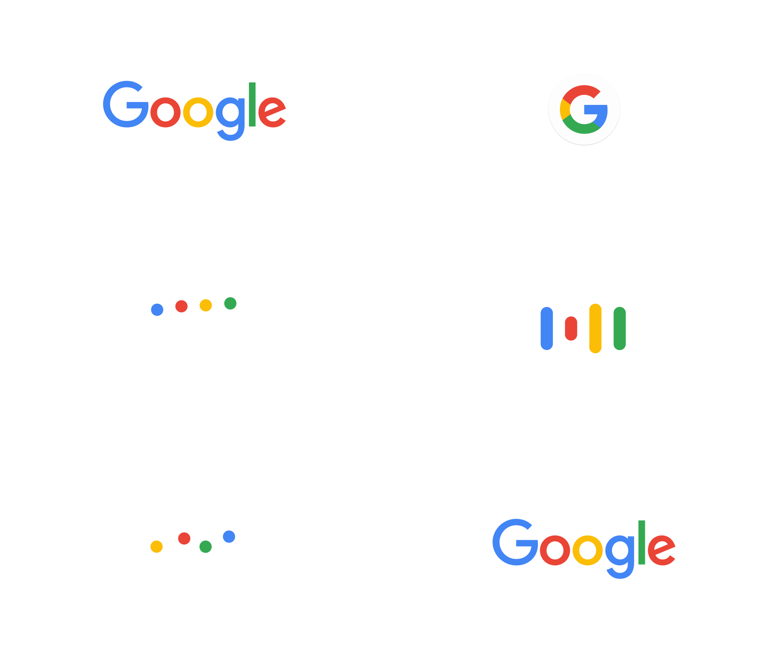
Google unveiled a new logo on Tuesday morning, and it’s already been the subject of a slew of aesthetic critiques, including a positive review by Slate Web designer Derreck Johnson. When it comes to corporate logos, details like font and color matter, as do stylistic flourishes like an upward-tilted “e.”
But Google’s new logo isn’t just about looks. It’s about scalability and action, and it tells us a lot about the future of branding in a world of smartphones, smartwatches, GIFs, and mobile video.
As Fast Company’s Mark Wilson explains, sans serif fonts like Google’s new “product sans” are more legible than serif fonts when shrunk to fit on tiny screens, like those on Google Glass or Android Wear devices. Phablets and the HoloLens notwithstanding, the screens on which we do our computing are not likely to be getting much bigger anytime soon.
It isn’t just Google that needs to adapt its marketing to the mobile age. As other brands follow suit, serifs may be headed the way of calligraphy.
It’s also worth noting that Google’s new logo isn’t just one logo. There’s a new version of the iconic four-color, six-letter “Google” logo that appears when you visit Google.com, yes. But there’s also a new, four-color “G” that will stand in for the full word in more compact settings, like the Google app icon. (It replaces the plain blue lower-case “g” in these contexts.)
Most interestingly, as you can see in the GIF at the top of this story, Google’s logos no longer just sit there on the page. Rather, they’re built to respond to certain actions with animations that convey the type of computing that’s going on. For instance, Fast Company’s Wilson notes, when you begin a voice search:
The Google logo will morph from “Google” into the dots, which undulate like water in anticipation of your query. As you talk, the dots will become an equalizer, reacting to the sound of your vocalizations. Then when you’re done talking, the waveform become dots again, which spin as Google looks up your results. Then once the results are presented, the dots return to good old “Google” again.
The animation is a clever touch, and one that makes particular sense for a brand like Google whose products are fundamentally interactive. Yahoo started down this path a couple of years ago with a new logo whose exclamation point dances. Dropbox has an animated box logo that opens and closes while you wait for something to happen. Among the first to animate its logo on the Web was Netscape, whose animated “N” became a symbol of the frustration involved in waiting for a bloated browser to load.
Google’s logo change is emblematic of the Web’s broader move from static, skeuomorphic, “page”-based design to something more fluid and adaptable. For better or worse, dancing logos could become as much a fabric of the mobile Internet as responsive design and autoplay videos. (Of course, Internet companies didn’t invent the animated logo—think of Pixar’s lamp, or even MGM’s roaring lion.)
In Google’s case, the animation is meant as a visual cue that something is happening: speakers listening, cloud servers processing. But I doubt other brands will feel constrained to limit their logo-motion to such apt use cases. For advertisers, animated logos may become just another way to grab an instant of your attention in a mobile landscape where it’s more precious than ever.
