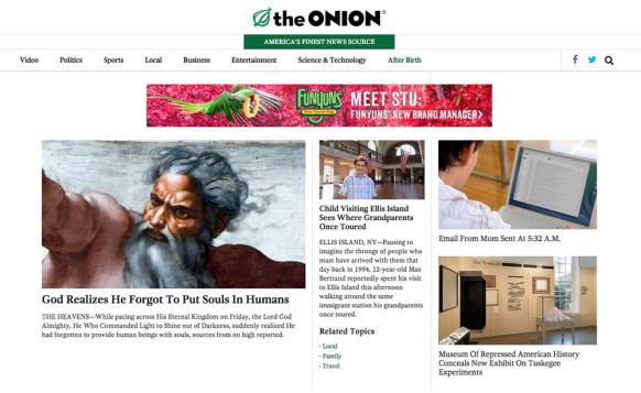
The Onion’s redesigned website now has parallax scrolling, so, according to the satirical news organization, you can “ignore any impulse to eat, drink, or sleep, instead devoting all your time and energy to scrolling further and further and further.” It also flags recommended content to assist “dimwitted, incompetent, and effectively brainless” readers. And in preparation for the soon-to-launch Onion Studios, the site designers “completely redefined the online video experience” by creating more video channels.
In fact, with the new design the Onion has completely redefined the news. Hell, it has revolutionized the Internet. Yep, the new Onion is genius.
Of course, the descriptions of the redesign are couched in hyperbolic jargon. The Onion redesigned and streamlined its site—that much is true—but decided to announce it with a landing page that skewers the way other news sites have proclaimed their own makeovers. “When people do these [redesigns], one of the things that’s the most over the top are these splash explanatory pages, where they’re so triumphant and grand and act like it’s the be all end all,” says Cole Bolton, the Onion’s editor in chief. He could be referring to the New York Times, the Atlantic, and the Huffington Post (or, um … Wired), all of which revealed their new sites on splashy “welcome” pages. “They seemed like they were really high on themselves,” Bolton says.
Bolton’s (and the Onion team’s) grievances with self-satisfied redesigns can be boiled down to three universal mistakes: (1) those inflated announcement pages, (2) the patronizing tone news organizations use to explain their design thinking, and (3) the pretense that readers are privileged over advertisers.
When the New York Times announced its new look, it wrote that it would be “sleeker,” “faster,” and “more intuitive,” and that it had “streamlined our article pages and created a more responsive interface with faster load times.” Over at the Atlantic, the editors described the relaunch “as an inception more than a culmination,” one that “makes a new priority of visual presentation.” It all sounds like something a startup founder would say onstage at a tech conference.
Plus, Bolton says, it talks down to readers. “In the New York Times one, there was some awful stuff on there,” Bolton says. “But then they were also like, ‘Hey, we’re also speaking in this cool down-to-earth tone.’ It’s this grand language that they use to triumphantly announce the fact that they have bigger pictures on the page. It’s infantilizing the reader in a way.” This gets perpetuated, says Hassan Ali Khan, senior vice president of marketing at the Onion, when these sites skim over any mentions of how ads fit into design. “Talking about how design is better, there’s more real estate—ultimately what that comes down to is how you’re using your page for advertisements,” he says.
The irony is that, in order for the Onion to effectively poke fun at a newspaper, it has look and feel like one. As other news sites prioritize more white space and larger headline typography, the Onion has followed suit. “For our parody to sing, and our satire to work, it has to mimic what everyone else is doing down to every level,” Bolton says. “That’s one of the secret ingredients to making it work: We look like the other news organizations, and then we take the air out of them.”
Also in Wired:
Cuba Has a Lung Cancer Vaccine—And America Wants It
You Should Google Everyone, Even Your Therapist
What Cities Would Look Like if Lit Only by the Stars
