The point of an infographic is to use visual cues to convey information more clearly and readily than would be possible using text alone. This is a great infographic. So is this. Great infographics can be absurdly simple or dizzyingly complex, so long as they’re intelligible and coherent.
The Internet has democratized many things, for better and for worse. So far, the democratization of infographics has been for worse. Much worse. The proliferation of build-your-own-infographic tools has led to a deluge of hideous charts, graphs, and lists—many of them compiled by marketers of one ilk or another—that have so befouled the concept of the infographic that it may be years before it fully recovers.
Many are utterly pointless, amounting to little more than a bunch of bullet points dressed up with ugly colors and slapped onto a pukey background. (Hint: If your infographic needs a list of “highlights” at the end, you may be doing it wrong.) Others are simply inane, applying bar charts and pie charts seemingly at random to answer questions that no one was asking in the first place. Still others are so bewildering as to make one yearn for a good old block of text instead. But to me, the most galling of all are those that imply some sort of relationship or equivalence between a bunch of numbers that have almost nothing to do with one another. These infographics aren’t merely a crime against aesthetics, they’re a crime against statistics and an affront to rationality itself. In many cases, they leave you with a poorer understanding of the topic at hand than you possessed before you read them.
All of which may help to explain why this infographic by Zach Weinersmith and Ross Nover is one of my favorites in quite some time. Not only are the gripes about sketchy sourcing, irrelevant data, and incoherent hyperbole on point—“ever!”—but the use of a terrible infographic to convey those gripes is fully justified according to the standard I laid out above. That is, it makes its point more strongly and clearly than would be possible with words alone. Which is why I’ll shut up now and just let you read it.
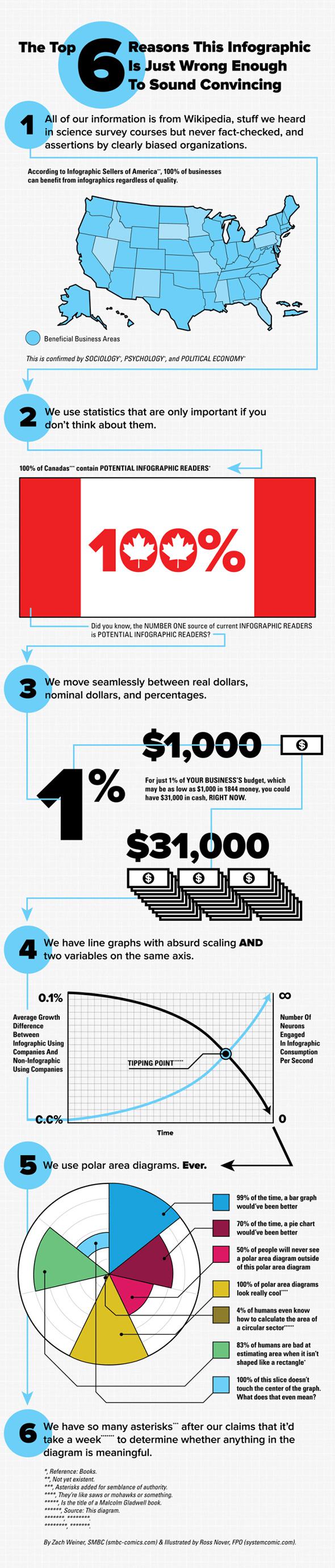
Illustration by Zach Weinersmith and Ross Nover
The full infographic, and more by cartoonist Zach Weinersmith, are available on his webcomic site Saturday Morning Breakfast Cereal. Thanks to Weiner for letting me embed this one below.