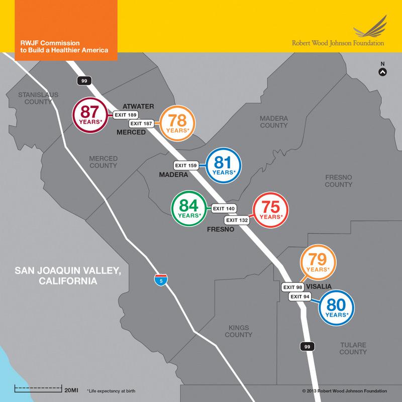
A new series of maps from the Robert Wood Johnson Foundation illustrate, to great effect, the vast discrepancies in life expectancy that exist between different socio-economic classes in America. This fact should come as no surprise to people—the richer you are, the longer you’re likely to live, and vice versa—but what’s shocking is how you can see the years drop away just by comparing neighborhoods. In 2012, the foundation also sponsored an interactive map that ranked the counties in each state based on health metrics like medical care, smoking rates, education level, and so on.
“Just a few metro stops can mean the difference between an extra five to ten years added to your lifespan,” says the foundation. “Where we live, learn, work and play can have a greater impact on our health than we realize.” Take, for instance, the 20-year difference between those who live in the French Quarter of New Orleans and the residents of the much more gentrified Lower Garden District a few miles away. A similar map of London’s transit stops, produced by researchers at University College London, demonstrates the same discrepancies.
Being born in one neighborhood—where public services are lacking, violent crime rates are high, and poverty is common—can mean all the difference. The five maps—representing the areas around New Orleans; the San Joaquin Valley, Calif; Washington, D.C.; Minneapolis and St. Paul, Minn.; and Kansas City, Mo.—are worth taking a look at because of how much they reveal about our society in such short order. And if you’re at all familiar with one of the areas represented then I recommend trying to reflect on what factors might be to blame for those missing years.

Map courtesy the Robert Wood Johnson Foundation.
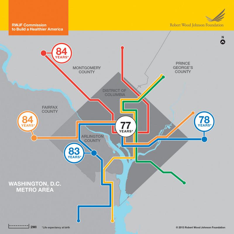
Map courtesy Robert Wood Johnson Foundation.
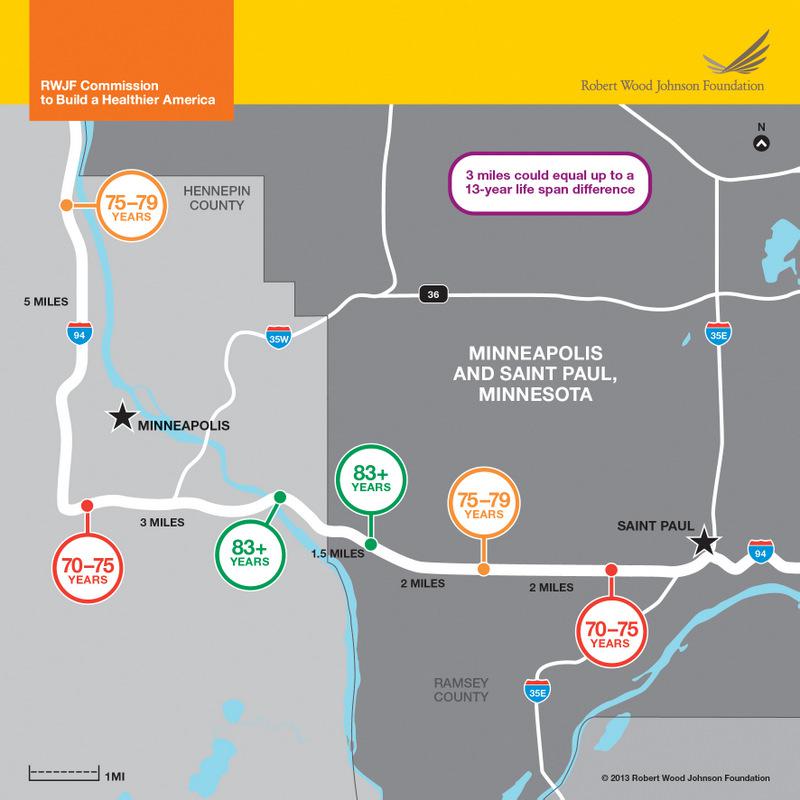
Map courtesy the Robert Wood Johnson Foundation.
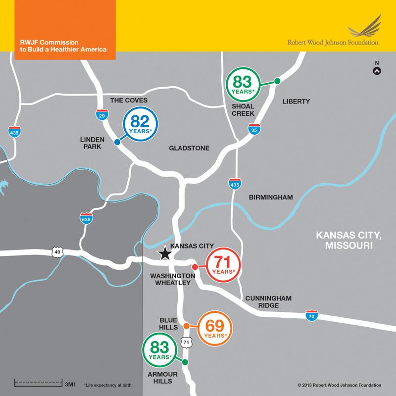
Map courtesy the Robert Wood Johnson Foundation.