
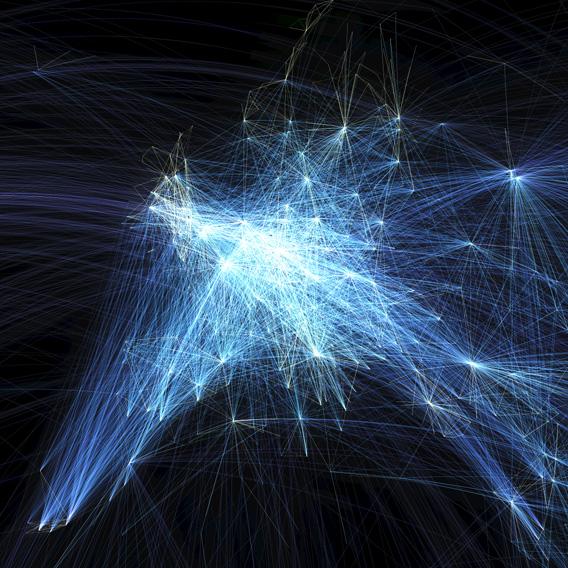
The United States and China may be the world’s biggest economic engines, but on this gorgeous map of the world’s flight paths, Europe glows brighter than either one.
The map, designed by a young Canadian GIS consultant named Michael Markieta, traces some 60,000 routes on major and regional airlines around the globe. The flight paths aren’t precise, but the departure and destination cities are. Marketa’s map shows shows relatively faint blue lines for each individual route and bright white nodes where multiple routes intersect or overlap.
One of the things that leaps out at first glance is the plethora of connections in the Eastern United States, East Asia, and most of all Europe, which makes sense given those regions’ wealth and population density.
Courtesy of Michael Markieta/Arup
By contrast, almost the entire Southern Hemisphere is dim, save for a few bright spots in cities such as Sao Paolo and Syndey. The relative brightness of vacation spots like the Canary Islands compared to nearby African countries like Morocco highlights the persistent economic disparities in air travel patterns.

Courtesy of Michael Markieta/Arup
The busiest U.S. airport is Atlanta, but the Washington-New York-Boston corridor appears to be the most heavily traveled overall. A 2009 Brookings study found that the busiest city pairs were New York-Miami and Los Angeles-San Francisco.

Courtesy of Michael Markieta/Arup
Perhaps the most fascinating thing about the map is that there’s no “base layer” tracing the outlines of countries or continents. Instead, the flight routes themselves sketch the edges of the world’s major land masses, because so many people live in and travel between coastal cities.
Markieta, who works for the global engineering and design firm Arup,* has answered questions about the map on Twitter and Reddit, and he explains his methodology in depth in this blog post.
*This post has been updated to note that Markieta works for Arup.