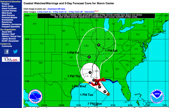
If you’ve seen a Hurricane Isaac forecast, you’ve surely seen the “cone of uncertainty,” that white or lighter-shaded zone around the storm’s predicted path. You probably had a vague idea that it showed the areas most likely to be hit by the gale. But if you can say with certainty just what the cone actually represents, scientifically, you’re in the minority.
Does it show the areas most likely to be affected by the storm to one degree or another, or just the areas over which the storm’s eye is most likely to pass? If you live outside of the cone entirely, what are the chances that you’ll suffer a direct hit anyway? Where the cone grows wider, does that mean the storm is likely to spread out and dissipate? Does the shape of the cone vary depending on the nature of the storm?
The short answers are:
1) The cone does not show the extent of the storm or how widespread its damages might be—just the areas over which its very center is most likely to pass.
2) If you live outside of the cone entirely, you could still get hit by the eye of the storm. The chances of the storm’s center straying outside the cone are about one in three.*
3) Not necessarily. Where the cone grows wider, it simply means that there is more uncertainty about where exactly the storm will strike.
4) No, the shape of the cone—that is, how narrow or broad it is at any given point—has nothing to do with the individual storm. It is determined prior to each hurricane season based solely on the accuracy of past predictions, and is the same for every storm that season.
The cone, which since 2002 has been the National Hurricane Center’s default mechanism for visually portraying a storm’s possible path, is a useful tool in many ways. Importantly, it serves to remind the public that storms are both somewhat predictable and somewhat unpredictable. Forecasters have gotten much better over the years about predicting with confidence the rough path that a given storm will take over a period of a few days. On the other hand, the cone rightly implies that you shouldn’t feel safe just because your home doesn’t lie along the hurricane’s exact predicted path.
For all its virtues, though, the cone also has its limitations. Kenny Broad, an environmental anthropologist at the University of Miami, has spent years studying how people perceive environmental risk. In 2007 he co-wrote a paper on how the public interpreted—and, just as often, misinterpreted—the cone of uncertainty in the runup to Hurricane Charlie in Florida in 2004.
Among his findings was that many people thought that the cone represented the storm’s likely geographical extent. It actually says nothing about how large the affected area will be, or how intense its effects might be in different places. It just indicates the areas most likely to find themselves in the exact eye of the storm.
Perhaps even more confusingly, Broad noted, the cone “is not tailored to the size, severity, or previous behavior of each individual storm.” Its shape is entirely determined in advance based on the average error of all official storm forecasts in the region over the previous five years.
Broad says the NHC and media outlets have gotten better in recent years at trying to explain to the average viewer what exactly the cone means. But he thinks there’s still plenty of room for improvement.
So why can’t the National Hurricane Center come up with a more intuitive default visualization? Perhaps it could—but storms’ behavior is so complex and their effects so multifaceted that no single visualization would give people all the information they really need. For instance, Broad notes, people whose lives depend on electricity—e.g., for life-sustaining medical equipment—might care most about the likely wind speeds where they live. But those in low-lying areas might be more worried about storm surges.
Over the years, the NHC has diversified its array of visualization tools, and it now offers more than a dozen options on its homepage, including wind speed probability and storm surge probabilities. And then there are its text-based warnings, which come with their own pros and cons. An NHC spokesman told me that the center still considers its cone of uncertainty visualization to be the best “one-stop shop” for evaluating at a glance where a hurricane might travel. But asked to explain in some detail how to intepret the various maps, he declined, saying he didn’t have time to delve into such complexities at a time when a big storm was bearing down and people needed immediate information.
For those who do have time for the complexities, the NHC’s official definition of the cone is here.
*Correction, Aug. 27, 2012: This post originally stated that if you live outside the cone, your chances of being hit by the eye of the storm are roughly one in three. It should have said that the chances of the storm’s eye passing out of the cone are roughly one in three. The chances that any one location outside of the cone will be hit are presumably far lower than that.