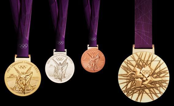
Though there’s been a lot of talk about the design of the Olympic medals—they feature the London 2012 logo, the goddess Nike, and the River Thames among other gewgaws—less attention has been paid to the lustrous purple ribbons on which they hang. This must not stand!
If you thought the IOC just went out and bought a couple of rolls of ribbon at a craft store, you would be incorrect. The ribbons are the work of Futurebrand, the international design and marketing firm responsible for unifying and implementing the look of the London Olympics. Futurebrand is charged with taking the logos, fonts, and pictograms designed by various studios and deploying them in a clear, aesthetically pleasing way. The defining element of this unifying look? A bunch of intersecting lines that riff on Wolff Olins’ ubiquitous Olympics logo.
That brings us back to the ribbons, which are purple in honor of Queen Elizabeth’s 50th year on the British throne and have been woven from three different types of thread. The eagle-eyed among you will notice that the front of the ribbon looks textured. Mark Thwaites, creative director at Futurebrand, told me this was done “to create a sense of luxury and touch.”
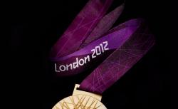
Photo by LOCOG via Getty Images
The ribbons are also emblazoned with a small set of Olympic rings, the words “London 2012,” and those abstract, intersecting lines on the back—a design that looks like several unsteady electrical towers. These criss-crossed lines can be found throughout the games: on signage, on the courtesy cars, in the seating design for various Olympic stadia. In the blog Designboom, Futurebrand’s Matt Buckhurst says the lines are meant to evoke ‘a burst of energy,’ ” and praises the design as one that’s distinct yet adaptable. “The ensuing look is provocative, unexpected, distinctive and bursting with life,” he says. “It captures the youthful spirit of London and the energy of the games.”
If you’re watching from home, though, you might not have noticed this grid motif, and you might have wondered why the Olympic ribbons are decorated with what looks to be a spider web. Wonder no more: It’s a unifying grid, dummy!