
This post originally appeared on Business Insider.
Uber unveiled a new logo and app icon on Tuesday. The new look debuted alongside the latest Uber app update, version 2.118.8.
Uber’s new app icon is already causing quite a stir on Twitter, with many quick to declare the app icon ugly. Of course, that’s not uncommon when a hugely popular app significantly changes its look—just look at the uproar that sprang up when Spotify changed the specific shade of green it used in its app.
Aside from the new app icon, the only major change immediately noticeable in the update was a new splash screen that comes up when you first open the app. The splash screen shows off the new logo and icon, and we also get a brief glimpse of what the new icon looks like on a stark black background (which does make it somewhat resemble the Death Star from “Star Wars”).
The typeface of the Uber logo has also been changed, firming up some of the small text flourishes found on the old one.
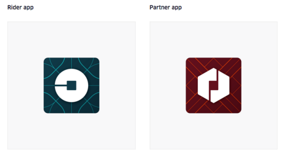
Uber has also announced the visual re-branding in a blog post, which details how the app’s icons will change depending on regional colors and patterns.
Uber says that the “heart” of its new app icon is something it’s calling “the bit,” or the central square in the new logo. While that bit will remain the same throughout Uber’s apps and website, the background and even the shape surrounding that tiny square will change to reflect a specific region or design theme.
Interestingly enough, Uber CEO Travis Kalanick was also personally involved in the new design, according to the blog post.
Uber
“One of the big changes over the years is that Uber no longer moves just people; we’re now moving food, goods, and soon maybe much more,” Uber CEO Travis Kalanick writes in the blog post. “With the potential for many apps with many app icons, we needed one approach that connected them all. So we came back to our story of bits and atoms. You’ll see that both rider and driver icons have the bit at the center, and then the local colors and patterns in the background. This is a framework that will also make it easy to develop different icons for new products over time.”
You can read more about Uber’s new look by checking out the official blog post, or head on over to Wired for a deep-dive into the new design.
See also: An 18-Year-Old in Poland is Making the First Messaging Service for the Deaf