This post originally appeared in Business Insider.
Here’s a fantastic chart that basically explains all of economic history. It was annotated by James Plunkett, and it’s based on a chart from inequality economist Branko Milanovic.
What it shows is income growth between 1988 and 2008 for every income percentile. The chart allows you to see how various income groups have thrived or stagnated over the past few decades (it stops at 2008, but it’s safe to surmise the chart doesn’t look much different today).
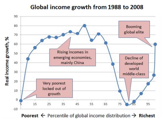
In the chart, you can see how lower income percentiles have seen monster growth since the late 1980s. This growth represents the emerging economies and the rise of the Chinese middle class. Then you have the developed world middle class, which has seen almost no real income growth over the last few decades (which probably explains a lot of the current angst over inequality). And then you have the rise of the ultra-elite, the global 1 percent, which has done fantastically well during all this time.
As Plunkett puts it, every elite in Davos ought to see and understand this chart.
See also: Here’s a Map of the Internet From 1969